REFERENCE
- Gallery page: https://magpui.com/en/i/trip-cards-that-fold-into-rows-78b947
- First frame (image): https://dnioievkvxejjbxgwvko.supabase.co/storage/v1/object/public/media/trip-cards-that-fold-into-rows-78b947/shot.jpg
- Clip (mp4): https://dnioievkvxejjbxgwvko.supabase.co/storage/v1/object/public/media/trip-cards-that-fold-into-rows-78b947/clip.mp4
- Original post: https://x.com/abtste11a/status/2119889892113273275 by @abtste11a
Before building, download the first frame and look at it. If ffmpeg is available, download the clip and extract frames (ffmpeg -i clip.mp4 -vf fps=2 frame-%02d.png), then study the motion frame by frame. Match what you see; the text below describes it, the frames are the truth.

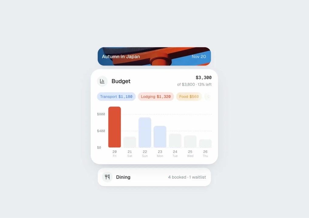
BUILD: Build a compact travel-card stack with one expanded item and slim summary rows around it. Selecting a row reveals its detail panel while the previous card folds back into a row. Keep the interaction quiet and precise, not a full travel application.
DESIGN SYSTEM: Use an approximately 300px-wide stack on a pale cool-gray #EDF0F2 surface. White cards have 18px corners, subtle 0 6px 20px #0000000A shadows and 8px vertical gaps. Collapsed rows are about 44px tall with 14px corners, a small monochrome icon and label on the left and muted summary on the right. Use a neutral sans-serif at 12–14px, 10px metadata and 24px destination codes. Expanded panels are around 210px tall, padded 16px. Text is #202428 and secondary labels #9CA2A7. A cover card uses a placeholder landscape with white text near its lower edge.
MOTION: On row activation, expand its height from 44px to about 210px while collapsing the previous panel over 420ms with cubic-bezier(0.22,1,0.36,1). Animate neighbouring positions in the same transaction. Fade departing details out over 120ms; reveal incoming details with opacity and 6px vertical movement over 220ms after an 80ms delay. Keep rounded corners continuous and clip overflowing contents. Do not add rotation or particle effects. These timings are implementation targets.
SECTIONS: Include a cover, flight, route, stays, dining and budget entry. The cover shows a destination caption; flight shows origin and destination codes connected by a dotted arc, times and a small metadata footer. Route shows sparse waypoint dots with short labels on an uncluttered pale panel. Dining expands to a compact list of reservations with times and subtle status pills. Remaining panels can use neutral placeholder travel data. Each collapsed row retains a useful summary. Only one card is active at once.
IMPLEMENTATION: Use React and Motion layout animations for the changing card sizes and neighbouring positions, with keyed content presence transitions. Draw the flight connector and route markers in SVG. Use native buttons for row triggers, aria-expanded and associated region IDs. Support Enter and Space, clear keyboard focus and stable tab order. Under prefers-reduced-motion, switch panels immediately without spatial movement. Keep at most six cards mounted and avoid animation loops or expensive blur filters.
ADAPT TO THE PROJECT: Reuse the project's existing design tokens, components and fonts. Map the suggested colors to the closest existing tokens. Never copy logos, brand names, photos or illustrations from the original; use placeholders.
SUCCESS CHECK:
- Selecting a summary opens exactly one detailed card and collapses the previous one without overlap.
- Compact rows remain legible and the stack fits narrow screens with 16px outer padding.
- Keyboard operation, visible focus and reduced-motion behaviour work without losing the selected item.