REFERENCE
- Gallery page: https://magpui.com/en/i/folders-unfold-with-quiet-motion-793f0f
- First frame (image): https://dnioievkvxejjbxgwvko.supabase.co/storage/v1/object/public/media/folders-unfold-with-quiet-motion-793f0f/shot.jpg
- Clip (mp4): https://dnioievkvxejjbxgwvko.supabase.co/storage/v1/object/public/media/folders-unfold-with-quiet-motion-793f0f/clip.mp4
- Original post: https://smoothui.dev/docs/components/file-tree by Edu Calvo
Before building, download the first frame and look at it. If ffmpeg is available, download the clip and extract frames (ffmpeg -i clip.mp4 -vf fps=2 frame-%02d.png), then study the motion frame by frame. Match what you see; the text below describes it, the frames are the truth.

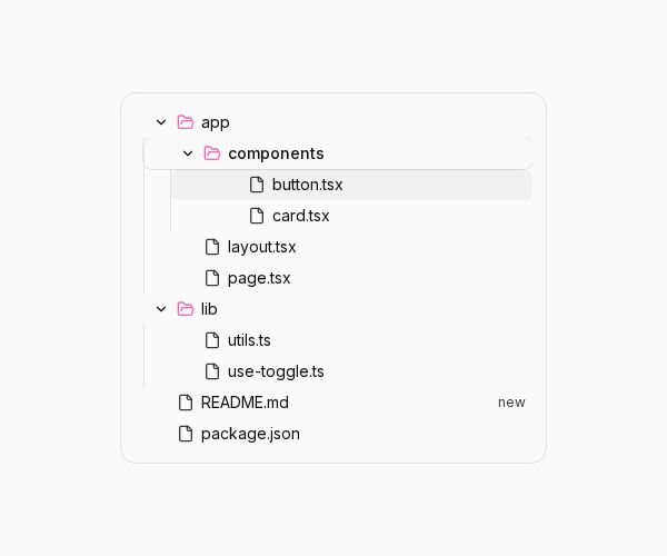
BUILD: Build a compact interactive file tree with nested folders and files. Opening a folder should feel like gently making room in the list, not launching a separate panel.

DESIGN SYSTEM: Use a roughly 380px-wide pale card with a 1px #e7e7e7 border, 12px corners and 18px padding. Rows are approximately 28px high with 14px neutral sans-serif labels in #222222. Use 20px indentation per nesting level, thin #eeeeee vertical guide lines, small outlined document icons, pink #ec78ae folder icons and modest chevrons. Use a faint gray rounded row highlight and a tiny right-aligned new badge on one file. Keep the surface white and the surrounding area uncluttered.

MOTION: On folder activation, expand or collapse its nested child group by animating its clipped height between zero and content height over about 220ms with cubic-bezier(0.22,1,0.36,1). Rotate the chevron from right to down over 180ms with the same easing. Subsequent rows follow the changing group height without jumping. Fade row highlighting over 120ms, cubic-bezier(0.2,0,0,1). These timings are rebuild targets estimated from the captured interaction.

SECTIONS: Root tree; expandable app folder containing another folder and two files; independent library folder with two files; two root files, one with a small status badge. Support expanded, collapsed, hovered, focused and selected rows. Preserve independent expansion state per folder.

IMPLEMENTATION: Use React, Motion height transitions and shadcn-compatible primitives. Use semantic tree/treeitem/group roles, aria-expanded and aria-selected, roving tabindex, Up/Down navigation, Left/Right collapse and expansion, Home/End and typeahead. Keep focus on a visible ancestor after collapse. With reduced motion, snap height and chevrons. Only mount visible branches for large trees and avoid animating every descendant separately.

ADAPT TO THE PROJECT: Reuse the existing project tokens, components and fonts; map estimated colors to the closest tokens. Never copy logos, brand names, photos or illustrations from the original; use placeholders.

SUCCESS CHECK:
- All described states render without clipping on narrow screens.
- Keyboard controls work and focus stays visible.
- Reduced motion preserves the same usable states without decorative loops.