REFERENCE
- Gallery page: https://magpui.com/en/i/folder-fans-out-its-files-e95868
- First frame (image): https://dnioievkvxejjbxgwvko.supabase.co/storage/v1/object/public/media/folder-fans-out-its-files-e95868/shot.jpg
- Clip (mp4): https://dnioievkvxejjbxgwvko.supabase.co/storage/v1/object/public/media/folder-fans-out-its-files-e95868/clip.mp4
- Original post: https://smoothui.dev/docs/components/folder-reveal by Edu Calvo
Before building, download the first frame and look at it. If ffmpeg is available, download the clip and extract frames (ffmpeg -i clip.mp4 -vf fps=2 frame-%02d.png), then study the motion frame by frame. Match what you see; the text below describes it, the frames are the truth.

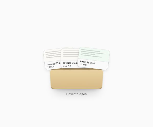
BUILD: Build one compact interactive document folder. On hover or activation, three file-preview cards rise and fan outward behind the front flap, with tactile but restrained depth.

DESIGN SYSTEM: Center a roughly 200px-wide by 140px-high manila folder on a neutral #fafafa surface. Use an SVG back panel with a raised tab at the top left, rounded joins and a separate front flap. Estimate the back as #c8b27c, the front as #dec895 and the highlight as #eadbb5. Add an inset shadow in the inner well and a soft contact shadow below. Show three approximately 110x76px document cards with near-white and pale mint fills, gray preview lines, 10px filenames and 8px file sizes. Keep the front flap above the lower part of the documents. Add a compact folder label on the tab and a quiet helper caption below.

MOTION: On pointer enter or activation, lift cards by approximately 55px and rotate the outer cards to -10 and 10 degrees while leaving the middle nearly upright. Stagger cards by 35ms; use 360ms cubic-bezier(0.22,1,0.36,1). Subtly widen and deepen the folder contact shadow during opening. On exit or repeated activation, return cards behind the flap in about 260ms cubic-bezier(0.4,0,0.2,1). Retain a small paper edge above the closed flap. Values are reconstruction estimates.

SECTIONS: Closed folder with tab, inner well, shaded front flap and peeking paper; open state with three fanned document previews; focus and pressed states; label and optional helper caption. Do not build a surrounding file manager.

IMPLEMENTATION: Use React, Motion transforms, CSS layers and one SVG folder silhouette; reuse shadcn-compatible focus and button styling. Keep the flap above the document bases with explicit stacking. Gate hover behind fine-pointer capability and support click/tap and Enter/Space. Reflect state with aria-expanded and connect a semantic preview list. Reduced motion switches states without fan animation. Use placeholder filenames and CSS preview lines rather than copied document artwork; avoid continuous animation.

ADAPT TO THE PROJECT: Reuse existing project tokens, components and fonts; map estimated colors to the closest tokens. Never copy source logos, brand names, photographs or illustrations. Use placeholders.

SUCCESS CHECK:
- All described open/closed or pinned/unpinned states render without clipping.
- Pointer, touch and keyboard controls work and focus stays visible.
- Reduced motion remains usable and component fits narrow viewports.