REFERENCE
- Gallery page: https://magpui.com/en/i/a-tiny-record-controls-playback-90de60
- First frame (image): https://dnioievkvxejjbxgwvko.supabase.co/storage/v1/object/public/media/a-tiny-record-controls-playback-90de60/shot.jpg
- Clip (mp4): https://dnioievkvxejjbxgwvko.supabase.co/storage/v1/object/public/media/a-tiny-record-controls-playback-90de60/clip.mp4
- Original post: https://smoothui.dev/docs/components/music-toggle by Edu Calvo
Before building, download the first frame and look at it. If ffmpeg is available, download the clip and extract frames (ffmpeg -i clip.mp4 -vf fps=2 frame-%02d.png), then study the motion frame by frame. Match what you see; the text below describes it, the frames are the truth.

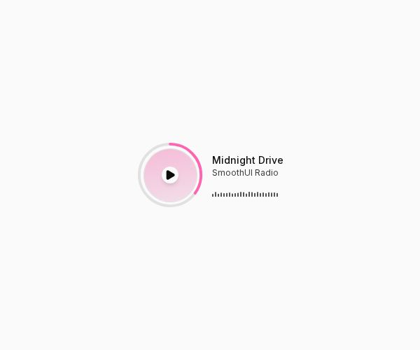
BUILD: Build a small inline music control with a record-like play/pause button, a thin progress arc and a short waveform beside track metadata. It should feel lightweight and calm rather than like an audio dashboard.

DESIGN SYSTEM: Arrange a roughly 88px circular control and a metadata column horizontally, separated by 14px. Use a pale #f5c5da record face, white inner center, subtle #e4e4e4 outer ring and a pink #ef5da8 progress arc. Center a small dark play or pause glyph inside the white center. Put a 14px medium-weight track title above a 12px muted secondary line. Below, fit a 95px-wide waveform of very thin dark bars. Use a neutral white surface with no card chrome or cover artwork.

MOTION: When playback starts, replace the play glyph with pause using a restrained opacity/scale transition of about 160ms, cubic-bezier(0.2,0,0,1). Animate the waveform bars between approximately 2px and 16px height on staggered 500–800ms cycles; when paused, settle them to low static bars over 220ms, cubic-bezier(0.22,1,0.36,1). Keep the progress ring continuous and update its arc from playback progress without moving the metadata. Timings and measurements are estimated rebuild targets, not measured source constants.

SECTIONS: Circular play/pause button; surrounding progress ring; title and secondary metadata; tiny horizontal waveform. States are paused and playing, with visible keyboard focus. Use placeholder track names and no supplied audio by default.

IMPLEMENTATION: Use React, Motion for icon and waveform transitions, SVG circles with stroke-dasharray for progress, and a native button for playback. Keep demo playback local and user-initiated; only wire audio when the host project supplies an authorized src. Expose an accessible Play/Pause label with track metadata and aria-pressed. For a seekable ring, use slider semantics and arrow/Home/End keys. With reduced motion, stop waveform looping and snap state changes while preserving playback and progress. Animate transforms rather than layout and pause loops whenever the control is offscreen.

ADAPT TO THE PROJECT: Reuse the existing project tokens, components and fonts; map estimated colors to the closest tokens. Never copy logos, brand names, photos or illustrations from the original; use placeholders.

SUCCESS CHECK:
- All described states render without clipping on narrow screens.
- Keyboard controls work and focus stays visible.
- Reduced motion preserves the same usable states without decorative loops.