REFERENCE
- Gallery page: https://magpui.com/en/i/dark-security-console-cards-6ee847
- First frame (image): https://dnioievkvxejjbxgwvko.supabase.co/storage/v1/object/public/media/dark-security-console-cards-6ee847/shot.jpg
- Original post: https://x.com/yurygok/status/2116097244218757500 by @yurygok
Before building, download the image and look at it. Match what you see; the text below describes it, the frames are the truth.

BUILD
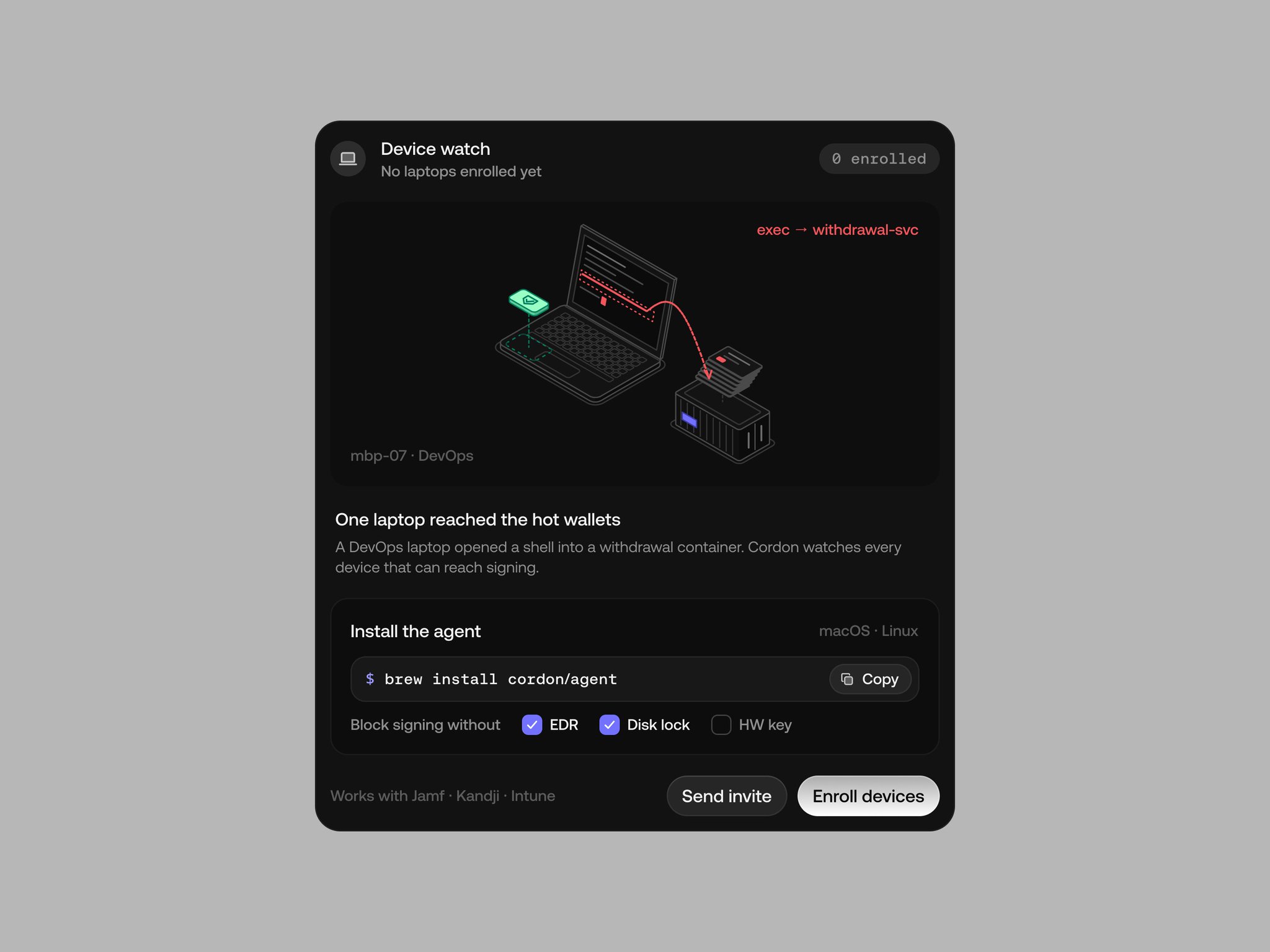
A set of five dark product cards for a security console, sharing one visual language: 1) Device watch: an empty-state onboarding card with an isometric line illustration (laptop, shell arrow, server), an incident caption, an install command with copy button, policy checkboxes and two actions; 2) Nonce race: a small line chart with a shaded danger zone and a tooltip; 3) Recovery: a grid of dots (green recovered, red lost) with a legend of asset rows; 4) Attack path: a horizontal timeline with lanes per system and colored event bars; 5) Withdrawal guard: a table of devices with permission squares and status pills, plus a session settings panel with a dropdown and a dot-slider. The feel is calm, precise, high-density but airy.

DESIGN SYSTEM
- Canvas: neutral gray #B9B9B9 behind the cards for presentation.
- Card: #141414, radius 20px, 1px border #262626, inner panels #1B1B1B radius 14px, padding 16px; shadow 0 20px 40px rgba(0,0,0,.25).
- Text: primary #F2F2F2 14-15px medium; secondary #8C8C8C 12-13px; numbers and code in a monospace 12-13px; card title 15px with a 28px round icon chip #222.
- Accents: danger red #F0524F (with tinted bg rgba(240,82,79,.14)), success green #3DDC84 / #2FBF71, warning amber #E8B03A for a paused pill, violet checkbox fill #6D5DF6, link blue #6EA8FF used sparingly.
- Pills: 22px high, radius 999px, 11-12px text, tinted fill + 1px border of the same hue at 35%.
- Buttons: secondary #232323 with 1px #333 border; primary light gradient #F5F5F5 to #D9D9D9 with #111 text, radius 999px, 36px high.
- Charts: 1px grid lines #262626, axis labels #6B6B6B monospace 10px, red hatching for danger regions, dots 8px with 4px gaps.

MOTION
- Cards enter with opacity 0 to 1 and translateY 8px to 0, 320ms, cubic-bezier(.22,1,.36,1), 60ms stagger.
- Chart line draws with stroke-dashoffset over 700ms, cubic-bezier(.65,0,.35,1); recovery dots fill in a diagonal wave with 6ms stagger.
- Timeline bars grow from their start time, scaleX 0 to 1, 400ms, 40ms stagger per lane.
- Copy button: icon swaps to a check for 1200ms. Hover rows lighten to #1E1E1E in 120ms.

SECTIONS
- Device watch: header (icon, title, subtitle, monospace count pill), illustration panel with a red monospace annotation, incident title + body, install panel (command row with copy, checkbox row), footer with integrations text and two buttons.
- Nonce race: header, chart with shaded zone and tooltip, three stat columns, footer action.
- Recovery: header with green percent pill, dot grid, legend list with amounts in monospace, red total line, export button.
- Attack path: header with paused pill, legend, lanes with labels and bars over a time axis, three stats, two actions.
- Withdrawal guard: tabs (Devices, Policy, Audit), device table with permission squares and status pills, settings panel (session length dropdown, toggles, dot-slider), unsaved changes note with Discard / Save policy.

IMPLEMENTATION
Plain React + CSS (or Tailwind) for cards; SVG for the chart, dot grid and timeline so they stay crisp; the isometric illustration as an inline SVG with 1px strokes #5A5A5A and accent lines. Use Motion only for the entrance and the chart draw. prefers-reduced-motion: skip entrance and draw animations. Every interactive element gets focus-visible rings, the table is a real table, and the dropdown is a proper listbox.

ADAPT TO THE PROJECT
Reuse the project's existing tokens, components (buttons, pills, tables, dropdowns) and fonts; map the reds, greens and violet to the closest semantic tokens (danger, success, accent). Never copy the original product name, logo or wording: use placeholder systems, devices and amounts.

SUCCESS CHECK
- All five cards share the same surface, radius, type scale and pill styles.
- Charts, dot grid and timeline render from data arrays, not static images.
- Text contrast on the dark surfaces passes WCAG AA for primary and secondary text.