REFERENCE
- Gallery page: https://magpui.com/en/i/checkbox-that-grins-for-halloween-536e5a
- First frame (image): https://dnioievkvxejjbxgwvko.supabase.co/storage/v1/object/public/media/checkbox-that-grins-for-halloween-536e5a/shot.jpg
- Clip (mp4): https://dnioievkvxejjbxgwvko.supabase.co/storage/v1/object/public/media/checkbox-that-grins-for-halloween-536e5a/clip.mp4
- Original post: https://x.com/stevelauda_/status/2116093751714320510 by @stevelauda_
Before building, download the first frame and look at it. If ffmpeg is available, download the clip and extract frames (ffmpeg -i clip.mp4 -vf fps=2 frame-%02d.png), then study the motion frame by frame. Match what you see; the text below describes it, the frames are the truth.

BUILD
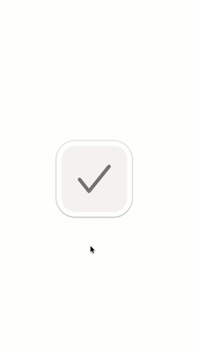
A single oversized checkbox micro-interaction with a Halloween easter egg. Unchecked it is a soft light tile with a gray tick outline; pressing it flashes gray, then it becomes a black tile with a white tick. When the pointer hovers a checked box, the tick morphs away and a white jack-o'-lantern face appears: two X-shaped eyes and a wide jagged grin, which flickers like candlelight. Leaving restores the tick. It should feel cheeky but still a real, accessible form control.

DESIGN SYSTEM
- Size: 88x88px tile inside a 96x96px outer ring (component can scale with a CSS variable).
- Unchecked: fill #F2F0EE, 1px inner border #E2DFDC, outer ring white #FFFFFF with shadow 0 1px 2px rgba(0,0,0,.08), 0 4px 12px rgba(0,0,0,.06); tick stroke #6E6E6E, 6px, round caps.
- Pressed: fill #8E8E8E, tick #6E6E6E at 40% opacity.
- Checked: fill #0A0A0A, tick #FFFFFF, 6px stroke.
- Face: white #FFFFFF; two X eyes (two crossed rounded strokes each, about 16px) set at 30% from top; a grin path about 56px wide with 8-10 sharp triangular teeth top and bottom and a small fang; a tiny triangle nose optional.
- Radius: tile 18px, outer ring 22px. Background of the demo: plain white.

MOTION
- Press: scale 1 to 0.94 on pointerdown, 90ms, cubic-bezier(.3,0,.5,1); fill crossfades to the pressed gray.
- Check: fill to black 160ms, tick draws in with stroke-dashoffset from length to 0, 260ms, cubic-bezier(.65,0,.35,1); release scale 0.94 to 1.04 to 1, 320ms, cubic-bezier(.34,1.56,.64,1).
- Hover on checked (after 120ms delay): tick shrinks and fades (scale 1 to 0.6, opacity 0, 140ms); grin wipes in left to right with a clip-path inset 200ms; eyes pop in scale 0 to 1 with 60ms stagger, cubic-bezier(.34,1.56,.64,1).
- Flicker while hovered: face opacity steps between 1, 0.55, 0.9, 0.35, 1 on an irregular 900ms keyframe loop; eyes occasionally dim to gray #8A8A8A for 80ms.
- Hover out: face fades 120ms, tick redraws 200ms.
- Uncheck: fill back to #F2F0EE 180ms, tick turns gray.

SECTIONS
Parts: outer ring, tile, tick SVG path, face SVG group (eyes, grin). States: unchecked, hover unchecked (ring shadow grows slightly), pressed, checked, checked + hover (face), focus-visible, disabled.

IMPLEMENTATION
A native input type=checkbox visually hidden inside a label, with an inline SVG for tick and face; CSS transitions and keyframes are enough, or Motion if the project already uses it. Focus-visible: 3px ring in the project accent offset 3px. Space toggles; aria-checked comes from the native input. prefers-reduced-motion: no flicker and no scale, swap states with a 100ms crossfade. Only animate transform, opacity and stroke-dashoffset.

ADAPT TO THE PROJECT
Reuse the project's existing tokens, radius scale and focus ring; map black and grays to the closest neutrals. Keep the face as a seasonal flag (e.g. a prop or a date check) so it can be turned off after Halloween. Do not copy any brand marks.

SUCCESS CHECK
- Clicking toggles the real checkbox value and the tick draws in smoothly.
- Hovering a checked box shows the flickering grinning face and leaving restores the tick.
- The control is keyboard operable with a visible focus ring and respects reduced motion.