REFERENCE
- Gallery page: https://magpui.com/en/i/credit-top-up-with-rolling-balance-013204
- First frame (image): https://dnioievkvxejjbxgwvko.supabase.co/storage/v1/object/public/media/credit-top-up-with-rolling-balance-013204/shot.jpg
- Clip (mp4): https://dnioievkvxejjbxgwvko.supabase.co/storage/v1/object/public/media/credit-top-up-with-rolling-balance-013204/clip.mp4
- Original post: https://x.com/Irakkkl/status/2122089058591527404 by @Irakkkl
Before building, download the first frame and look at it. If ffmpeg is available, download the clip and extract frames (ffmpeg -i clip.mp4 -vf fps=2 frame-%02d.png), then study the motion frame by frame. Match what you see; the text below describes it, the frames are the truth.

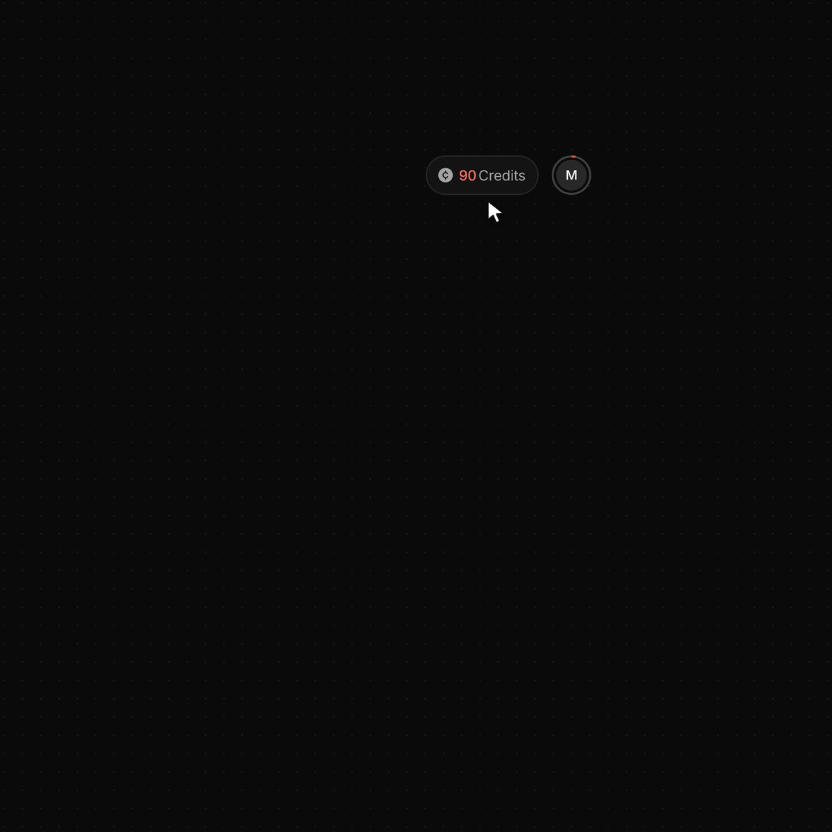
BUILD: Create a compact account balance badge that opens a dark account popover. Its primary top-up action demonstrates a rolling balance update, a brief orange glow, and a small floating increment label. Keep the interaction focused on one account control, not a whole dashboard. Treat the top-up as a local demonstration, not a real payment.
DESIGN SYSTEM: Use an almost-black backdrop around #0b0b0b, a charcoal popover around #181818, subtle borders #292929, warm white text #f4f4f2 and muted labels #90908c. Orange-red accent approximately #e34b32. Desktop popover approximately 280px wide with 16px corners, 16px inset spacing and soft black shadow. Anchor it below a small rounded balance pill beside a circular initial avatar. Use neutral sans-serif type: compact 11-13px labels and 44-48px medium-weight tabular balance digits. Full-width orange pill button approximately 32px high.
MOTION: On badge activation, reveal the popover with opacity 0 to 1, translateY -6px to 0 and scale .97 to 1 over 180ms, transform origin top right, cubic-bezier(.2,.8,.2,1). On the demo top-up button, animate the balance from 90 to 1,365 through vertically masked rolling digits over roughly 700ms with 25ms column stagger and cubic-bezier(.22,1,.36,1); keep digit columns stable and format the thousands separator correctly. Flash a subtle orange glow behind the balance and upper panel for 550ms, fading out without obscuring labels. Float a small +1,275 outlined pill above the updated value, translating upward 12px and fading out over 900ms. Synchronize the compact header badge with the same final balance; it retains a temporary increment indicator above it after the popover closes. Use these as implementation estimates, not measured timings.
SECTIONS: Idle compact balance pill with small credit icon and initial avatar. Open account panel with identity row, plan subtitle and chevron; divider; Credits left and plan labels; centered large balance flanked by tiny orange dot grids; Top-up credits action; account, help and community menu items; divider and sign-out row. States: idle, hover, focus, open, updating, settled and closed with updated header balance.
IMPLEMENTATION: Use React and Motion for the popover, independently clipped digit columns and floating label; draw dot grids using CSS or SVG. Share a single balance state between popover and badge. Animate transforms and opacity, avoid a continuous render loop and unnecessary particles. Expose a keyboard-accessible trigger with aria-expanded, Escape and outside-click dismissal, focus restoration, visible focus indicators and sensible tab order. Announce only the final balance in an aria-live region, hide decorative rolling digit copies from assistive technology. Disable repeat activation until the demonstration finishes. With prefers-reduced-motion, update digits immediately, omit glow and translation, and use a short opacity change. On narrow screens constrain panel width to viewport minus 24px.
ADAPT TO THE PROJECT: Reuse the project’s existing design tokens, fonts and components; map these colors to the closest existing tokens. Never copy original logos, brand names, photos or illustrations; use neutral identity placeholders.
SUCCESS CHECK:
- Top-up changes both displayed balances from 90 to 1,365 exactly once without layout jumps.
- The transient increment and glow disappear cleanly while the final balance persists on closing and reopening.
- Keyboard interaction, reduced motion and narrow viewport layouts remain usable.