REFERENCE
- Gallery page: https://magpui.com/en/i/tabs-gather-into-collapsible-groups-28c937
- First frame (image): https://dnioievkvxejjbxgwvko.supabase.co/storage/v1/object/public/media/tabs-gather-into-collapsible-groups-28c937/shot.jpg
- Clip (mp4): https://dnioievkvxejjbxgwvko.supabase.co/storage/v1/object/public/media/tabs-gather-into-collapsible-groups-28c937/clip.mp4
- Original post: https://x.com/dev_ya/status/2119463798130270484 by @dev_ya
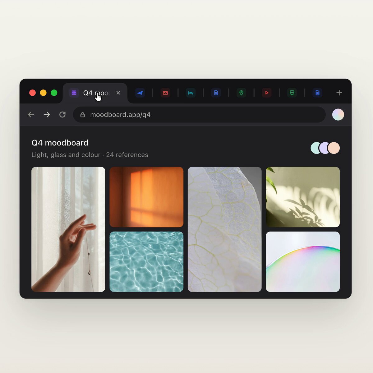
Before building, download the first frame and look at it. If ffmpeg is available, download the clip and extract frames (ffmpeg -i clip.mp4 -vf fps=2 frame-%02d.png), then study the motion frame by frame. Match what you see; the text below describes it, the frames are the truth.

BUILD: Rebuild only an in-app browser-like tab strip with multiselection, group creation and collapsible colored tab groups. Do not build the photo board below it or attempt to control real browser tabs.
DESIGN SYSTEM: Charcoal #202123 strip about 40px high, tabs around 120px wide, small 12px sans-serif labels, 14px placeholder icons, 6px radii and narrow gaps. Selected tabs have blue #4b87ee borders and tinted backgrounds. Groups use a blue or green rounded name badge with a count; a restrained tinted boundary connects expanded members. Small gray contextual bar below the strip reports selected count and Group shortcut.
MOTION: On selection, fade the tinted fill and outline over 120ms with cubic-bezier(0.2,0,0,1). On group creation move selected tabs into contiguous positions after the label using layout transitions about 300ms with cubic-bezier(0.22,1,0.36,1). Clicking the label collapses member widths and opacity into the badge over 260ms; reverse from the same origin when reopening. Keep unrelated tabs sliding smoothly rather than jumping.
SECTIONS: Ungrouped tabs; modifier-selected tabs with selected-count toolbar; named expanded group; collapsed badge with count; multiple differently colored groups. Use neutral placeholder labels and icons.
IMPLEMENTATION: Use React state with stable tab IDs, Motion layout and presence transitions. Support Command or Control plus click for multiselection and Command or Control G to group only while focus is in the widget; also expose a visible Group button. Use actual buttons, visible keyboard focus, arrow-key traversal, aria-expanded on group toggles and accessible selected state. When collapsing a focused member, move focus to its group toggle. Reduced-motion uses immediate reordering and expansion. Keep updates confined to the tab strip, with no expensive photo assets.
ADAPT TO THE PROJECT: Reuse existing design tokens, components and fonts. Map these colors to the nearest project tokens. Never copy logos, brand names, photos or illustrations; use placeholders.
SUCCESS CHECK:
- Interaction works with pointer and keyboard without losing focus.
- Interrupted transitions keep their current visual position and settle correctly.
- Reduced motion removes movement while preserving every state and action.