REFERENCE
- Gallery page: https://magpui.com/en/i/calm-planner-app-landing-with-phone-fan-c1a03f
- First frame (image): https://dnioievkvxejjbxgwvko.supabase.co/storage/v1/object/public/media/calm-planner-app-landing-with-phone-fan-c1a03f/shot.jpg
- Clip (mp4): https://dnioievkvxejjbxgwvko.supabase.co/storage/v1/object/public/media/calm-planner-app-landing-with-phone-fan-c1a03f/clip.mp4
- Original post: https://x.com/Mike_Andreuzza/status/2114698829803200682 by @Mike_Andreuzza
Before building, download the first frame and look at it. If ffmpeg is available, download the clip and extract frames (ffmpeg -i clip.mp4 -vf fps=2 frame-%02d.png), then study the motion frame by frame. Match what you see; the text below describes it, the frames are the truth.

ASSETS
This needs real artwork, not shapes drawn in code. Use the files the user gives you (ask where they are). If you have an image generation tool, generate them with these prompts; otherwise leave clearly marked placeholders.
- Calm app photos: Soft natural lifestyle photos for app cards: a tree-lined park path in bright spring daylight, and a tidy desk by a sunny window with a laptop and plants; airy, slightly desaturated, no people facing camera, 4:3 aspect ratio.

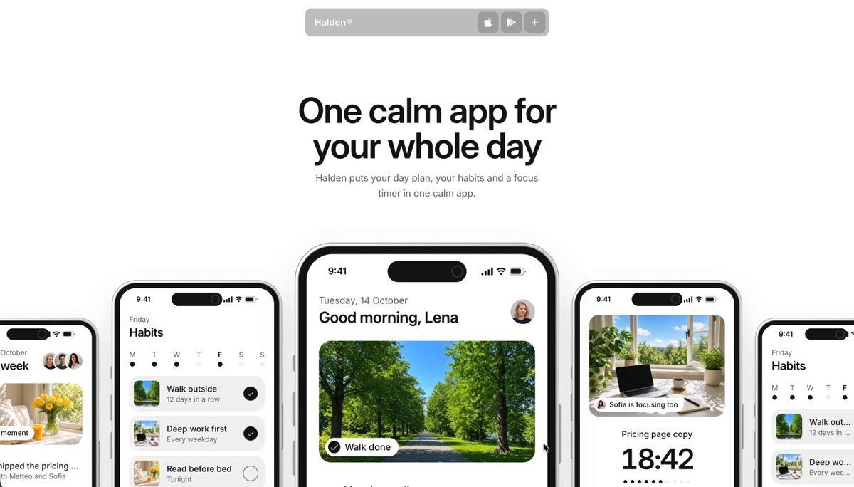
BUILD: Build a calm, light landing page for an iOS app that combines a daily plan, habit tracking and a focus timer. The hero is a big centered headline above a horizontal fan of five iPhone mockups showing different app screens. Below, three feature sections each pair a short headline with a sticky phone whose screen changes to the matching feature, plus a column of small feature notes. It should feel quiet, tidy and premium, with the app screens doing the selling.

DESIGN SYSTEM: Background #ffffff, feature panels #f2f2f2 with radius 24px. Text near-black #111111, secondary gray #8a8a8a. Font: clean neo-grotesk sans (Inter or similar). Hero headline centered, about clamp(44px, 5.5vw, 76px), weight 600, letter-spacing -0.03em, line-height 1.05, two lines; subline 17px gray, max-width 420px, centered. Feature headlines 40px weight 600, letter-spacing -0.02em; feature notes as 15px bold title plus 13px gray body, stacked with 28px gaps. Phone mockups: rounded iPhone frame with dynamic island, thin dark bezel, soft shadow 0 30px 60px rgba(0,0,0,0.12). App screens use white cards, black check circles, small photo thumbnails, a large 48px monospaced-feeling timer (18:42) with a dotted progress row, and a black pill button. Floating navigation: a small translucent gray pill bar (about 290x34px, radius 10px, backdrop blur) centered at the top with the wordmark left and three small square icon buttons right (App Store, Play Store, plus).

MOTION: Hero: the headline and subline fade and rise 16px over 600ms, cubic-bezier(0.22,1,0.36,1). The five phones enter from below with a 80ms stagger, the center phone largest and front, the outer phones smaller and partly cropped by the viewport edges, then the whole fan drifts slowly sideways as you scroll (parallax, outer phones move faster than the center). Feature sections: as each section enters, its headline and notes fade up (500ms, 60ms stagger); the phone stays pinned (position sticky) while the section scrolls, and its screen crossfades with a slight 8px vertical slide (400ms ease-out) to the next feature screen. A second phone can slide in beside the first in the habits section. The nav pill stays fixed and gains a slightly stronger blur after 40px of scroll.

SECTIONS: Floating nav pill. Hero: two-line headline (e.g. 'One calm app for your whole day'), one-line subline, fan of five phones (week view, habits list, today screen with a big photo card and 'Walk done' chip, focus timer, habits again). Feature 1 'Your whole day on one timeline.': gray panel, text left, phone center showing the today timeline, notes right (tasks and events together, an inbox for loose ends, repeats that fit your week). Feature 2 'Habits that survive a bad day.': headline bottom left, habits phone center, notes right (a rest day in every streak, reminders at your time, your week at a glance). Feature 3 'Fifty quiet minutes at a time.': focus timer phone with a photo of a desk and a 'focusing too' chip, notes on sessions, breaks and time logged to the task. Then a dark footer band with a final phone and App Store call to action.

IMPLEMENTATION: Next.js + Tailwind + Motion (useScroll / useTransform for the fan parallax, whileInView for reveals). Phone mockups as one reusable component with an aspect-ratio frame and a slot for the screen; build the app screens in real HTML/CSS rather than images so they stay crisp. Sticky phone with CSS position: sticky inside each section and AnimatePresence for screen swaps. Placeholder photos for the nature and desk cards. Mobile: the fan becomes a horizontal snap carousel, and feature phones move above their text. Respect prefers-reduced-motion (no parallax, instant screen swaps, simple fades). Good contrast and visible focus on the nav buttons.

ADAPT TO THE PROJECT: Reuse the project's existing design tokens, components and fonts; map colors to the closest existing tokens; never copy logos, brand names, photos or illustrations from the original; use a placeholder app name, copy and photos.

SUCCESS CHECK:
- The hero shows a centered headline over a fan of five phones that drift apart with scroll.
- In each feature section the phone stays pinned while its screen swaps to the matching feature.
- On mobile the fan is a swipeable carousel and nothing overflows; reduced motion removes parallax.