REFERENCE
- Gallery page: https://magpui.com/en/i/photo-carousel-with-ink-blot-reveal-ef54bd
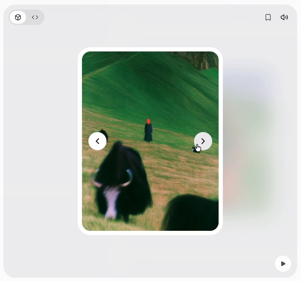
- First frame (image): https://dnioievkvxejjbxgwvko.supabase.co/storage/v1/object/public/media/photo-carousel-with-ink-blot-reveal-ef54bd/shot.jpg
- Clip (mp4): https://dnioievkvxejjbxgwvko.supabase.co/storage/v1/object/public/media/photo-carousel-with-ink-blot-reveal-ef54bd/clip.mp4
- Original post: https://x.com/Lumosous/status/2114610123297665271 by @Lumosous
Before building, download the first frame and look at it. If ffmpeg is available, download the clip and extract frames (ffmpeg -i clip.mp4 -vf fps=2 frame-%02d.png), then study the motion frame by frame. Match what you see; the text below describes it, the frames are the truth.

BUILD: A single-image photo carousel where the transition is the star. A portrait card sits centered on a soft light-grey stage, with a round previous button on its left edge and a round next button on its right edge. A blurred, faded copy of the next card peeks out behind it on the right. When you press next or previous, the new photo does not slide in: it grows out of the click point through an organic, irregular blob mask with jagged, torn-paper edges, swallowing the old photo in about 700ms. Mid-transition both photos are visible at once, like a collage. It should feel artful, tactile and smooth, closer to an ink spill than a wipe.

DESIGN SYSTEM: Stage background #ECECEE, full-bleed panel with radius 16px. Card about 160x210px at this scale (use 320x420px in a real layout), radius 14px, 4px white border #FFFFFF, soft shadow 0 12px 30px rgba(0,0,0,0.12). Photos cover the card (object-fit: cover). Nav buttons 28px white circles #FFFFFF with a 1.5px dark chevron #1C1C1C, shadow 0 2px 6px rgba(0,0,0,0.15), placed half over the card edges at vertical center. Behind-card preview: same size, offset 40px right, filter blur(14px), opacity 0.5. Optional small toolbar: 3D/code toggle pill top left, bookmark and sound icons top right, play button bottom right, all 12px grey #6B6B6B.

MOTION: Trigger: click on next/prev (or arrow keys). The incoming image is drawn on top, clipped by a blob mask centered at the pressed button. The mask is a noisy circle: radius from 0 to the card diagonal over 700ms, cubic-bezier(0.65,0,0.35,1); its outline is displaced by 2D noise (amplitude about 18% of radius, 6 to 9 lobes) that also drifts in time, so edges look torn and irregular, with 2 or 3 small satellite blobs that merge into the main one. The outgoing image scales 1 to 1.04 and darkens 10% during the reveal. Buttons press to scale 0.92 for 120ms. The blurred preview behind crossfades to the following image over 400ms after the reveal ends. Block new clicks until the reveal finishes, or queue one.

SECTIONS: Stage; blurred next-card preview; main card with current image and incoming image layer; prev and next buttons; optional toolbar icons. States: idle, revealing (both images visible), done.

IMPLEMENTATION: Best done with a small WebGL fragment shader (OGL or a raw canvas) that mixes two textures with a noise-displaced radial mask, uniforms for progress, origin and time. A lighter alternative is an SVG clipPath whose path is regenerated each frame from a noisy polar shape. Preload neighbour images. prefers-reduced-motion: plain 200ms crossfade. Buttons are real buttons with aria-labels, visible focus ring, and left/right arrow keys work. Keep the canvas sized to the card and cap DPR at 2.

ADAPT TO THE PROJECT: Reuse the project's button, radius and shadow tokens and map colors to existing tokens. Do not copy the original photos or artwork; use placeholder images from the project or neutral stock placeholders.

SUCCESS CHECK:
- Next and previous reveal the new image through an irregular, torn-edged blob that starts at the pressed side.
- Mid-transition both images are visible and the reveal finishes in under a second without jank.
- Keyboard arrows work and reduced motion falls back to a crossfade.