REFERENCE
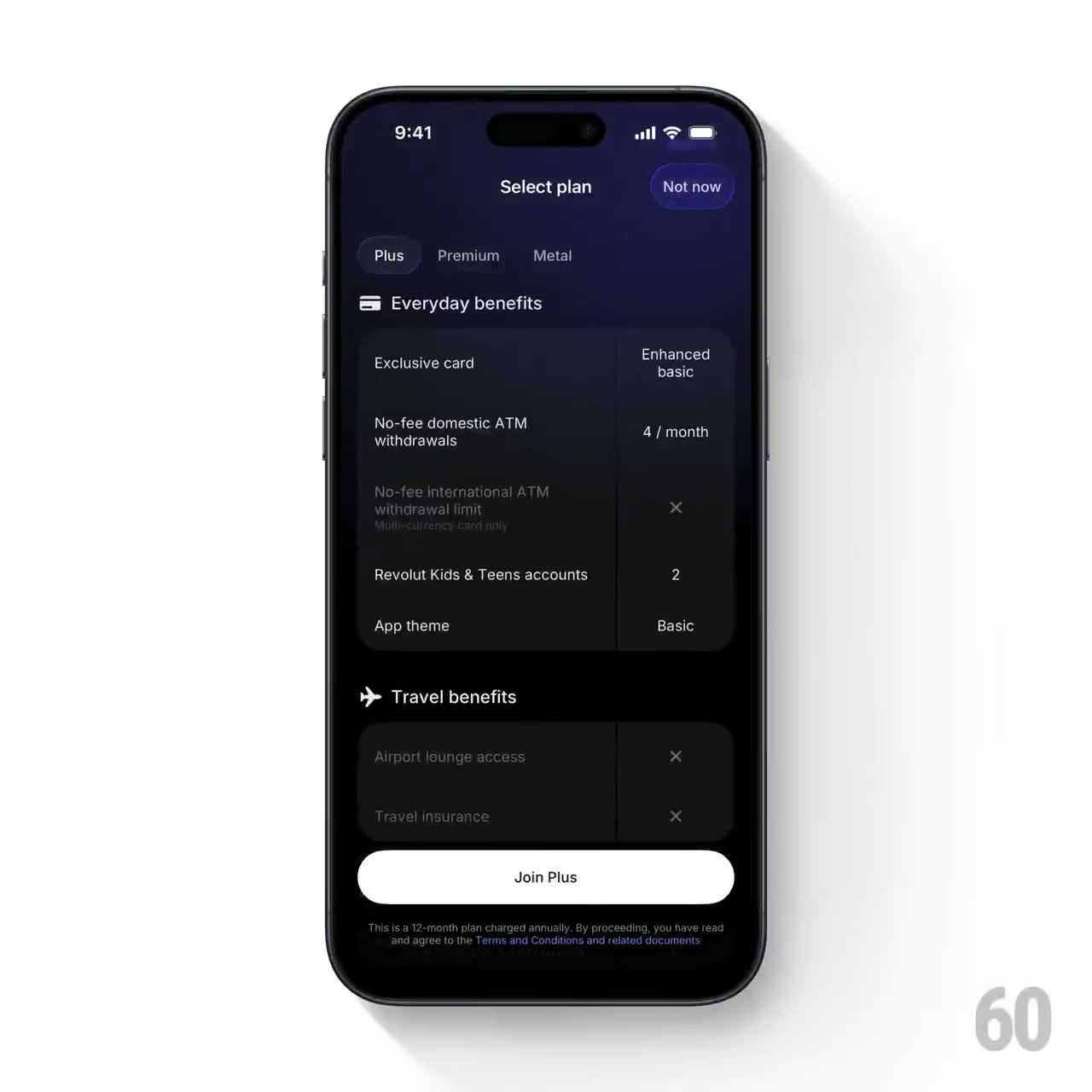
- Gallery page: https://magpui.com/en/i/plan-tabs-with-ambient-transitions-c5cca3
- First frame (image): https://dnioievkvxejjbxgwvko.supabase.co/storage/v1/object/public/media/plan-tabs-with-ambient-transitions-c5cca3/shot.jpg
- Clip (mp4): https://dnioievkvxejjbxgwvko.supabase.co/storage/v1/object/public/media/plan-tabs-with-ambient-transitions-c5cca3/clip.mp4
- Original post: https://60fps.design/shots/revolut-select-plan-tab-scroll-interaction by Revolut
Before building, download the first frame and look at it. If ffmpeg is available, download the clip and extract frames (ffmpeg -i clip.mp4 -vf fps=2 frame-%02d.png), then study the motion frame by frame. Match what you see; the text below describes it, the frames are the truth.

BUILD: Build a compact mobile subscription-plan selector, not an entire banking app. A row of plan tabs controls the price, a small decorative card silhouette, benefit rows and a restrained ambient background. Keep the conversion action anchored below the scrolling details.
DESIGN SYSTEM: Use a 390px-wide mobile layout that expands fluidly, near-black #080808 background, white #f6f6f6 text, muted #949494 secondary text and dark #181818 rounded benefit panels. Header spacing is approximately 20px. Use a neutral sans-serif at 13px for tabs, 22px for the plan title and 14px for benefits. Active tabs have a subtle translucent pill. Ambient purple #252047 shifts to desaturated green #3b4b3b between the observed plans. Use 16px panel radii and a white pill-shaped primary action about 46px high.
MOTION: On tab selection, crossfade background layers over 350ms with cubic-bezier(0.22,1,0.36,1). Move the small decorative card horizontally by 24px and fade it over 280ms. Replace title, price and benefit content together with a restrained 12px translation and 200ms opacity transition. Move the active-tab pill over 220ms. Scrolling only moves detail content; the header and bottom actions remain stable. Durations are rebuild targets rather than measured source timings.
SECTIONS: Header; plan tablist; selected plan summary with simple CSS card artwork; short benefit rows; expandable or scrollable full-benefit list; secondary benefits action and persistent primary subscription action. Include idle, selected, focused and expanded-details states.
IMPLEMENTATION: Use React and Motion for shared-layout tab selection and keyed content transitions; CSS gradients and transforms suffice for decoration, with no WebGL. Use accessible tablist semantics and arrow-key selection. Ensure the sticky action does not obscure content or safe-area padding. For prefers-reduced-motion switch content immediately and keep decoration static. Animate transform and opacity only, using two background layers for the crossfade.
ADAPT TO THE PROJECT: Reuse the project design tokens, components and fonts, mapping colors to the closest existing tokens. Do not copy logos, brand names, photos, illustrations or proprietary card artwork; use neutral plan names and a simple CSS placeholder.
SUCCESS CHECK:
- Selecting a plan updates the tab, price, benefits and ambient surface coherently.
- The primary action stays visible without hiding the last benefit row.
- Keyboard navigation and reduced-motion mode both preserve clear selected states.