REFERENCE
- Gallery page: https://magpui.com/en/i/hold-to-upgrade-with-a-fiery-power-up-bd655a
- First frame (image): https://dnioievkvxejjbxgwvko.supabase.co/storage/v1/object/public/media/hold-to-upgrade-with-a-fiery-power-up-bd655a/shot.jpg
- Clip (mp4): https://dnioievkvxejjbxgwvko.supabase.co/storage/v1/object/public/media/hold-to-upgrade-with-a-fiery-power-up-bd655a/clip.mp4
- Original post: https://x.com/endisaliaj/status/2119549850941640840 by @endisaliaj
Before building, download the first frame and look at it. If ffmpeg is available, download the clip and extract frames (ffmpeg -i clip.mp4 -vf fps=2 frame-%02d.png), then study the motion frame by frame. Match what you see; the text below describes it, the frames are the truth.

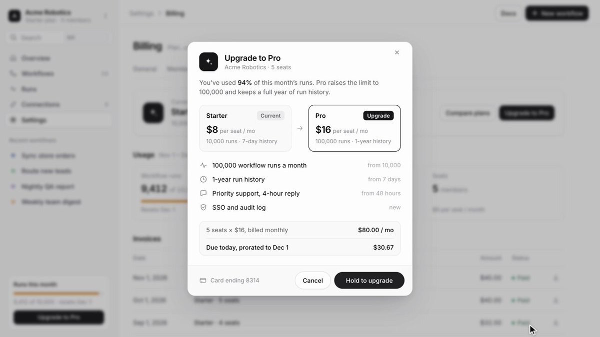
BUILD: An 'Upgrade to Pro' modal whose confirm button is a press-and-hold control that charges up like a power-up. While held, golden flames build around the button; at full charge a burst of fire and a huge expanding ring of light sweep across the screen, then the modal settles into a warm gold 'You're on Pro' success state. The rest of the UI stays calm and minimal so the power-up reads as a reward.

DESIGN SYSTEM: Page behind is a light SaaS billing screen dimmed with a rgba(0,0,0,0.25) overlay and 4px backdrop blur. Modal: 380px wide, white #ffffff, radius 16px, padding 20px, shadow 0 24px 60px rgba(0,0,0,0.18). Header: 36px dark rounded-square icon (#111) with a sparkle glyph, title 16px semibold #111, sub line 12px #737373. Body copy 13px #404040 with key figures in semibold. Plan comparison: two cards side by side with an arrow between; current plan on #f5f5f5, target plan with a 1px #111 border, radius 12px, price 22px semibold plus a small 'per seat / mo'. Feature list: 13px rows with 16px line icons and right-aligned muted 'from …' values. Summary box on #fafafa radius 10px with totals right-aligned. Footer: card on file at left in 12px #737373, 'Cancel' text button and a black pill button 'Hold to upgrade' (height 36px, radius 999px). Success palette: gold #f5c542 to #e8b923 gradient, pale gold surfaces #fff8e1, gold border #f0d68a.

MOTION: Hold: on pointerdown a fill sweeps inside the button from left to right over 1200ms linear, the button scales to 0.97 and small flame tongues rise from its edges, growing in height and brightness with progress. Release before full: fill and flames drain back over 300ms, cubic-bezier(0.4, 0, 0.2, 1). Full charge: a burst of flames from the button (particles rising 80 to 160px, 600ms, ease-out), a bright ring expanding from the button to beyond the viewport (scale 0 to 25, 900ms, cubic-bezier(0.16, 1, 0.3, 1), thin gold stroke with bloom), a short white flash on the modal (opacity 0 to 0.6 to 0, 250ms) and a sparkle trail arcing across the dialog. Then the success state crossfades in over 400ms: icon tile turns gold, title becomes 'You're on Pro', plan badges swap to 'Previous' and 'Current' with the Pro card gaining a gold border and tint, feature icons become gold check discs staggered 60ms, and the button becomes a gold pill 'Pro unlocked' with a check. After closing, the billing page shows the new plan card and a small dark toast 'You're on Pro' slides up from the bottom (250ms).

SECTIONS: Parts: overlay, modal header, plan comparison, feature list, summary box, footer with hold button, fire/particle canvas layer, success state, toast. States: idle, hover (button lifts 1px), holding (charging fill plus growing flames), cancelled (drain), charged (burst), success, closed with toast.

IMPLEMENTATION: React + Motion for layout, crossfades and the hold progress; a full-screen pointer-events-none canvas on top for the fire, using Three.js (or a small WebGL shader) with additive blending, a noise-driven flame shader around the button rect and a particle system for embers, plus a ring mesh with a glow for the shockwave. Keep the canvas sized to the viewport with devicePixelRatio capped at 2 and stop the render loop when idle. Keyboard: Space or Enter held on the focused button does the same as pointer hold; also offer a plain click fallback after a long-press hint for assistive tech. Announce the result with aria-live. prefers-reduced-motion: no flames or ring, the button fills and the modal switches to the gold success state with a simple 200ms fade.

ADAPT TO THE PROJECT: Reuse the project's existing modal, buttons, typography and tokens; map the gold to the closest accent token if one exists. Do not copy logos, company names or prices from the original; use placeholder plan names and numbers.

SUCCESS CHECK:
- Releasing the button early cancels cleanly with no upgrade; holding to the end always triggers exactly one burst.
- The flames and ring render above the modal without blocking clicks and the canvas idles after the effect.
- Keyboard hold works and reduced motion shows the success state without the fire effect.