REFERENCE
- Gallery page: https://magpui.com/en/i/editorial-portfolio-that-follows-the-clock-b256e4
- First frame (image): https://dnioievkvxejjbxgwvko.supabase.co/storage/v1/object/public/media/editorial-portfolio-that-follows-the-clock-b256e4/shot.jpg
- Clip (mp4): https://dnioievkvxejjbxgwvko.supabase.co/storage/v1/object/public/media/editorial-portfolio-that-follows-the-clock-b256e4/clip.mp4
- Original post: https://x.com/codrops/status/2117997292724584927 by @codrops
Before building, download the first frame and look at it. If ffmpeg is available, download the clip and extract frames (ffmpeg -i clip.mp4 -vf fps=2 frame-%02d.png), then study the motion frame by frame. Match what you see; the text below describes it, the frames are the truth.

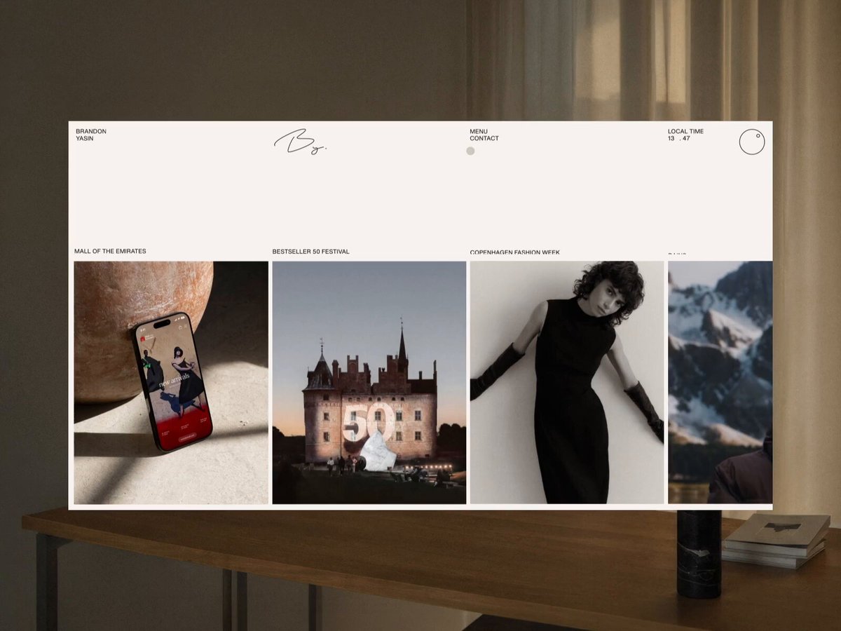
BUILD: A multi-page editorial portfolio for a brand and digital designer that feels like a quiet printed magazine brought to life by motion. Three ideas carry it. 1) The whole color theme follows the visitor's local time of day (cream paper in daylight, golden at sunset, olive and charcoal at night), shown by a small LOCAL TIME readout with a circular clock dial in the header; clicking the dial opens a full-screen TIME TRAVEL mode where dragging a knob around the dial scrubs the hour and the palette crossfades live. 2) Pages are cards: the site is a book, every page is a card, and navigating zooms the current page out into a row of live page cards side by side, then zooms the chosen one back in to full screen. 3) Layouts stay calm and typographic, with big photos, generous margins and short confident copy, so the motion does what paper cannot. Desktop first, fully responsive.

DESIGN SYSTEM: 12-column grid, 24px outer margin desktop / 16px mobile, 16-24px gutters. Typography: a neutral grotesk sans for everything; display headlines 56-72px desktop (32-40px mobile), weight 400, line-height 1.05, letter-spacing -0.02em, set in left-aligned blocks of 2-3 lines; small caps-like labels 11px uppercase, letter-spacing 0.04em; body 13-15px, line-height 1.5. A hand-drawn signature monogram sits centered in the header; header has tiny text links (Work, Menu, Contact) and the local time on the right with a 28px outlined circle dial. Theme tokens (CSS custom properties) per time slot: day bg #F3F0E8 / ink #1A1A18; sunset bg #E9DFC9 / ink #2A2116 / accent #C9A15A; dusk bg #8E9278 olive / ink #F3F0E8; night bg #23241F charcoal / ink #EDEAE2 / muted #6F7064; accent card terracotta #B5775A, sage #8FA08A. Surfaces are flat paper: no radii on page cards (0-2px), hairline rules 1px at 15% ink, no shadows except a very soft 0 30px 60px rgba(0,0,0,0.25) under cards when zoomed out. Photography full-bleed inside image frames with object-fit cover.

MOTION: Theme change: all color tokens tween together over 1200ms cubic-bezier(0.65,0,0.35,1) when the hour changes or while dragging in Time Travel (throttle to rAF). Time Travel: overlay fades in 400ms, dial knob follows the pointer angle with inertia (Draggable + Inertia), hour readout ticks in monospace digits, closing with the X fades out 300ms. Page-as-card transition: on menu open or link click, the current page scales from 1 to ~0.42 and its clip-path insets from 0 to a card shape while neighbour pages slide in from left and right to form a horizontal row with 24px gaps (900ms, single custom ease approximating cubic-bezier(0.76,0,0.24,1)); the row can be dragged horizontally with inertia; choosing a card zooms it back to full screen (800ms, same ease) while the others fly out to fixed off-screen positions so every exit travels the same visual speed. Back navigation reverses the same timeline. Text reveals: headlines split into lines, each line slides up 100% from an overflow-hidden mask, 700ms, stagger 80ms, cubic-bezier(0.22,1,0.36,1). Core values section: three numbered columns (01 Empathy, 02 Freedom, 03 Growth); hovering one expands it into a filled terracotta or photo panel with its paragraph fading in (500ms), the others narrow. Case study: images scale from 1.08 to 1 and unmask from the bottom as they enter (900ms), a hero image docks into the layout with a Flip animation. Smooth scroll with Lenis driven by the same ticker as GSAP.

SECTIONS: 1) Home: header, row of featured case thumbnails (phone mockup, architecture, portrait, landscape) with tiny captions above, plus Cases and Archive entry cards. 2) About: large statement headline (about building refined brands and experiences across digital and physical spaces), small portrait bottom left, About Me paragraph bottom right. 3) Approach / core values: dark band headline about a signature approach guided by core values, three value columns with hover expand. 4) Case study page: big title bottom left over a cream sheet, one hero product photo on the right, a short paragraph about the role and clients, then a dense grid of 12-16 project photos. 5) Contact: olive sheet with a numbered list of channels and a simple form, success state 'thank you' with a hand-drawn mark. 6) Menu: horizontal row of live page cards. 7) Time Travel overlay.

IMPLEMENTATION: Nuxt or Next.js with GSAP (ScrollTrigger, SplitText, CustomEase, Flip, Draggable, InertiaPlugin, Observer) and Lenis, one gsap.ticker driving Lenis and all tweens. Build each page card as the real page DOM with a clip-path bound to a CSS variable (--inset) that GSAP tweens together with scale and translate; keep menu cards as lightweight live previews (pause videos, reduce images to thumbnails). Theme via CSS variables on :root, computed from Intl local time on load. gsap.matchMedia for per-breakpoint motion (on mobile cards stack vertically and swipe). prefers-reduced-motion: no zoom, cards and pages crossfade in 200ms, theme switches instantly, Time Travel becomes a range input. Keyboard: menu cards are focusable links with arrow-key navigation, Escape closes Time Travel and menu, visible 2px focus rings in the current ink color, dial is a slider with aria-valuetext of the hour. Keep 60fps: animate only transform, opacity and clip-path, lazy-load images.

ADAPT TO THE PROJECT: Reuse the project's existing design tokens, fonts and components; map the time-of-day palette to the closest existing color tokens or add them as theme tokens. Never copy logos, signatures, names, client brands, photos or copy from the original: use placeholder text, a placeholder monogram and placeholder images.

SUCCESS CHECK:
- Changing the system clock (or dragging the Time Travel dial) recolors the whole site smoothly between at least four time-of-day palettes.
- Opening the menu zooms the current page into a draggable row of live page cards, and picking another card zooms it to full screen with no layout jump.
- With prefers-reduced-motion on, every transition becomes a short crossfade and the site stays fully usable by keyboard.