REFERENCE
- Gallery page: https://magpui.com/en/i/dark-product-landing-for-a-desk-timer-0eb346
- First frame (image): https://dnioievkvxejjbxgwvko.supabase.co/storage/v1/object/public/media/dark-product-landing-for-a-desk-timer-0eb346/shot.jpg
- Clip (mp4): https://dnioievkvxejjbxgwvko.supabase.co/storage/v1/object/public/media/dark-product-landing-for-a-desk-timer-0eb346/clip.mp4
- Original post: https://x.com/kaznachej_v/status/2116225564822372691 by @kaznachej_v
Before building, download the first frame and look at it. If ffmpeg is available, download the clip and extract frames (ffmpeg -i clip.mp4 -vf fps=2 frame-%02d.png), then study the motion frame by frame. Match what you see; the text below describes it, the frames are the truth.

ASSETS
This needs real artwork, not shapes drawn in code. Use the files the user gives you (ask where they are). If you have an image generation tool, generate them with these prompts; otherwise leave clearly marked placeholders.
- Product close-up photos: Studio product photo of a minimalist graphite desk timer with a small rounded-square black OLED screen showing an orange countdown ring and a large knurled black metal dial, dramatic soft top light, dark charcoal background, shallow depth of field, 4:5 aspect ratio

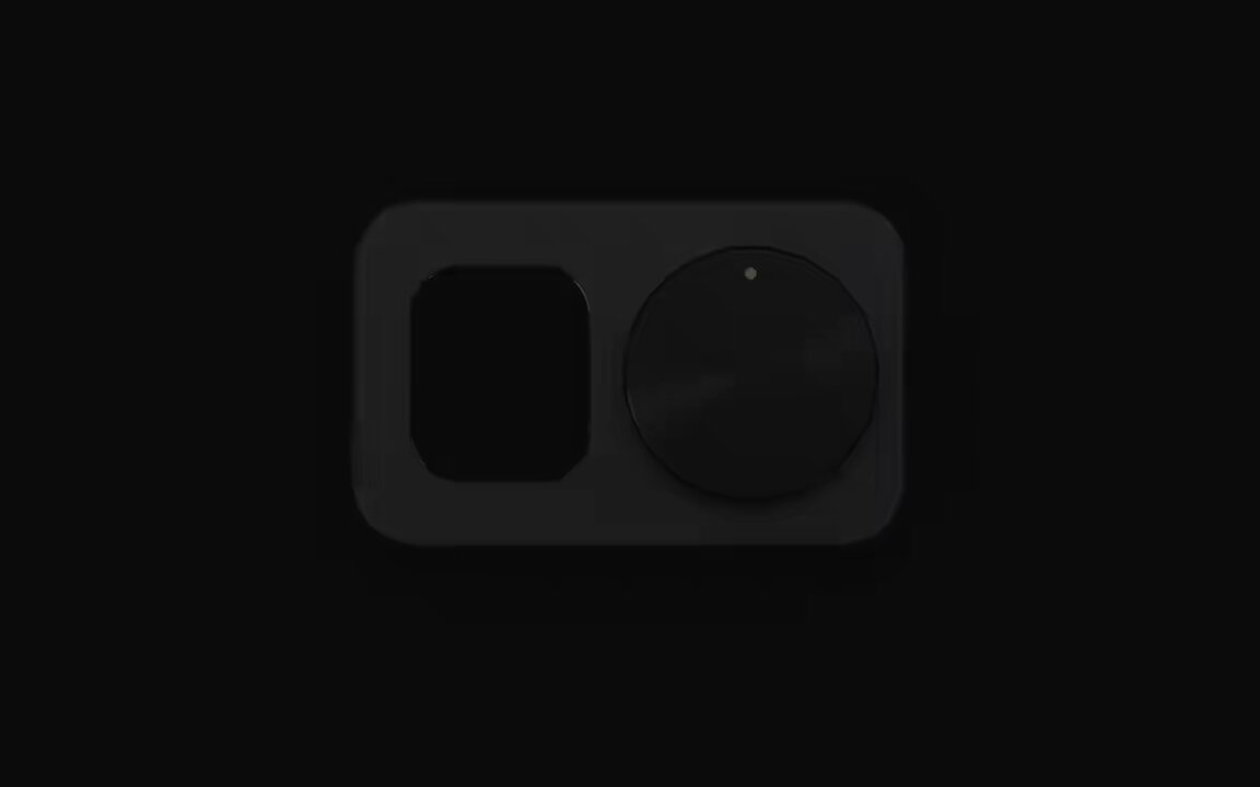
BUILD: Build a dark, premium single-product landing page for a small desk focus timer: a graphite slab with a rounded-square OLED screen on the left and a large knurled metal dial on the right. The device is rendered in the page and is interactive: turning the dial sets the minutes, pressing it starts a countdown ring on the screen. Below the hero, a bento grid of small working components explains the product. It should feel like an expensive hardware launch page: calm, tactile, precise, with one orange accent.

DESIGN SYSTEM: Background #0b0b0c, cards #141416 with 1px borders rgba(255,255,255,0.06) and 16-20px radius. Device body: graphite #4a4a4d to #2e2e30 gradient, 28px radius, soft shadow 0 40px 80px rgba(0,0,0,0.6). Screen: #050505 with a rounded 22px corner, countdown ring 10px stroke in orange #ff7a1a over a dim track #3a2414, time in a tall clean sans at about 40px white, tiny uppercase labels (FOCUS in orange, clock time in gray). Dial: near-black #151517 with a conic-gradient brushed-metal sheen and a small glowing orange-cream indicator dot. Typography: a neo-grotesk sans for headlines (about 64-72px, tight -0.03em tracking, second line in 45% white, e.g. 'Turn. Press. / Disappear.'), small monospace uppercase micro labels (10-11px, letter-spacing 0.08em, 50% white) for card corners like 'DIAL', '60 DETENTS', 'DISPLAY'. Accent: #ff6a00 for buttons, active toggles and the highlighted bar. Top nav: wordmark left, small mono links centered, orange pill 'Pre-order' button right. One light card (#e9e8e3 with black type) breaks the dark grid.

MOTION: (1) Hero intro: device fades and rises 24px over 900ms cubic-bezier(0.22,1,0.36,1); a circular burst behind it (thin white ring about 1.6x device width plus 120 short orange radial streaks at 20-60% opacity) expands from scale 0.6 to 1 and fades over 1400ms while the screen counts 00:00 up to 18:00. (2) Dial drag: pointer rotation maps to minutes with 60 detents; each detent snaps with a 120ms spring (stiffness 500, damping 30), the tick marks around the dial light up in orange up to the current value, and the big number updates. (3) Countdown: the ring stroke-dashoffset decreases linearly each second; color swaps between FOCUS (orange) and BREAK (white) modes with a 300ms crossfade. (4) Scroll: the device scales from 1 to 0.85 and tilts into a 3/4 perspective (rotateX 50deg) as the hero leaves, then a 'Three moves' section shows three image cards (Turn, Press, Disappear) that reveal with 80ms stagger, opacity and 16px rise, 600ms. (5) Bento: toggles slide their knob 18px in 200ms cubic-bezier(0.4,0,0.2,1); the bar chart bars grow from 0 height with 60ms stagger, 700ms, cubic-bezier(0.16,1,0.3,1); the add-to-bag button morphs into an orange dot then a check 'Added to bag' pill over 450ms; a spec ticker ('60 detents · Bluetooth 5.3 · USB-C · 3 weeks on a charge') scrolls horizontally at about 40px/s.

SECTIONS: Nav; hero (device, burst, headline, short paragraph, orange Pre-order button with price $169); scroll tilt of the device with a large '16' stat and caption; 'Three moves between you and an hour of deep work' with three photo cards; 'One press. Every app goes quiet.' close-up of the screen; components bento: light intro card 'Small parts. One ritual.', dial card with minutes readout, display card with FOCUS / BREAK / DEEP tabs, 'Works with' list (Slack, macOS Focus, Teams, Calendar) with toggles, checkout card with price and add-to-bag, weekly deep-work bar chart with total '12h 36m', spec ticker; FAQ; footer. Component states: dial idle, dragging, snapped; timer idle, running, paused, done; toggles on/off; checkout idle, adding, added.

IMPLEMENTATION: React + Tailwind + Motion (useMotionValue for dial angle, springs for detents, useScroll + useTransform for the hero tilt). Draw the device with CSS and SVG (conic gradients for the brushed dial, SVG circle for the ring); the burst on a canvas with about 120 particles. The dial is a role='slider' with aria-valuenow in minutes, arrow keys step one detent, Page Up/Down step five, Enter starts or pauses. Visible 2px orange focus rings on all controls. prefers-reduced-motion: no burst, no tilt, instant value changes, ticker stops. Keep the page at 60fps: transform and opacity only, pause the canvas when off screen.

ADAPT TO THE PROJECT: Reuse the project's existing design tokens, components and fonts; map the orange, graphite and off-white to the closest existing tokens; never copy logos, the product name, photos or copy from the original; use placeholder product photos and your own product name.

SUCCESS CHECK:
- Dragging the dial or using arrow keys changes the minutes in 60 snapped steps and the tick marks and number stay in sync.
- Pressing the dial starts a countdown whose ring empties over the set time and can be paused.
- On scroll the device tilts away smoothly and the bento components (toggles, chart, add to bag) all respond to input.