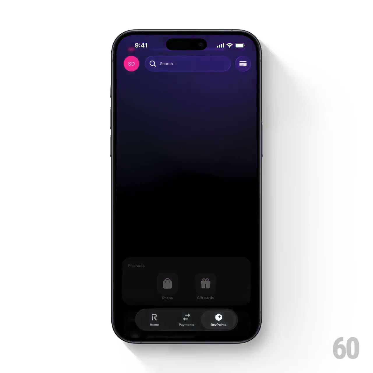
REFERENCE
- Gallery page: https://magpui.com/en/i/coachmarks-with-quiet-focus-rings-a53df6
- First frame (image): https://dnioievkvxejjbxgwvko.supabase.co/storage/v1/object/public/media/coachmarks-with-quiet-focus-rings-a53df6/shot.jpg
- Clip (mp4): https://dnioievkvxejjbxgwvko.supabase.co/storage/v1/object/public/media/coachmarks-with-quiet-focus-rings-a53df6/clip.mp4
- Original post: https://60fps.design/shots/revolut-revpoints-feature-coachmark-border-pulse-interaction by Revolut
Before building, download the first frame and look at it. If ffmpeg is available, download the clip and extract frames (ffmpeg -i clip.mp4 -vf fps=2 frame-%02d.png), then study the motion frame by frame. Match what you see; the text below describes it, the frames are the truth.

BUILD: Build a three-step contextual coachmark overlay around a row of existing circular action buttons. Dim the surrounding dashboard, preserve the current target and label, and pair each target with one large short instruction above it. A restrained ring pulses around the selected button. End by dissolving the scrim to restore the existing screen; do not rebuild a banking app or phone frame.
DESIGN SYSTEM: Use a roughly 360px-wide demonstration area with a dark purple #35216D upper surface and near-black #09090C content. Apply a black scrim at approximately 75 percent opacity, with the target lifted above it. Place three or four 44px round action buttons in a horizontal row with 18px gaps, 11px captions and a 1px white ring on the active target. Center the instructional heading in 24px regular sans with a maximum width of 270px. Keep the rest of the interface recognizable but low contrast.
MOTION: On guide entry fade in the scrim over 200ms, cubic-bezier(0.2,0,0,1). With each explicit Next action crossfade the heading and target emphasis over 180ms. Pulse the active ring from scale 1 to 1.12 and opacity 0.7 to 0 over 850ms, cubic-bezier(0.2,0,0,1), at most twice per step. On completion fade the entire overlay out over 240ms without zooming the dashboard. No glow storm or automatic progression.
SECTIONS: Existing action row; step instruction; active circular ring; Next and Skip controls; completed state restoring the dashboard. Preserve the original action labels but use neutral placeholder wording in the demo.
IMPLEMENTATION: Use React portals and Motion for the overlay, text crossfades and ring transforms. Measure target positions with ResizeObserver and update on resize or scroll rather than assuming fixed offsets. Treat the guide as an accessible modal with labelled instructions, contained keyboard focus, Escape and Skip support, and focus restoration when dismissed. Targets should not execute real actions merely to advance onboarding. Under prefers-reduced-motion use a static solid ring and instant text changes. Animate only opacity and transforms, never continuous layout measurement.
ADAPT TO THE PROJECT: Reuse the project's existing design tokens, components and fonts. Map the estimated colors to existing tokens. Never copy logos, brand names, photos or illustrations from the original; use placeholders. All durations and dimensions here are reconstruction targets inferred from the reference, not measured source constants.
SUCCESS CHECK:
- Each step highlights the correct action after resize and the instruction stays legible.
- Skip, Escape and completion remove the scrim and restore focus.
- Reduced-motion users receive the same guidance with no pulsing.