REFERENCE
- Gallery page: https://magpui.com/en/i/coachmarks-with-pulsing-action-borders-f8124a
- First frame (image): https://dnioievkvxejjbxgwvko.supabase.co/storage/v1/object/public/media/coachmarks-with-pulsing-action-borders-f8124a/shot.jpg
- Clip (mp4): https://dnioievkvxejjbxgwvko.supabase.co/storage/v1/object/public/media/coachmarks-with-pulsing-action-borders-f8124a/clip.mp4
- Original post: https://60fps.design/shots/revolut-feature-buttons-coachmark-border-pulse-interaction by Revolut
Before building, download the first frame and look at it. If ffmpeg is available, download the clip and extract frames (ffmpeg -i clip.mp4 -vf fps=2 frame-%02d.png), then study the motion frame by frame. Match what you see; the text below describes it, the frames are the truth.

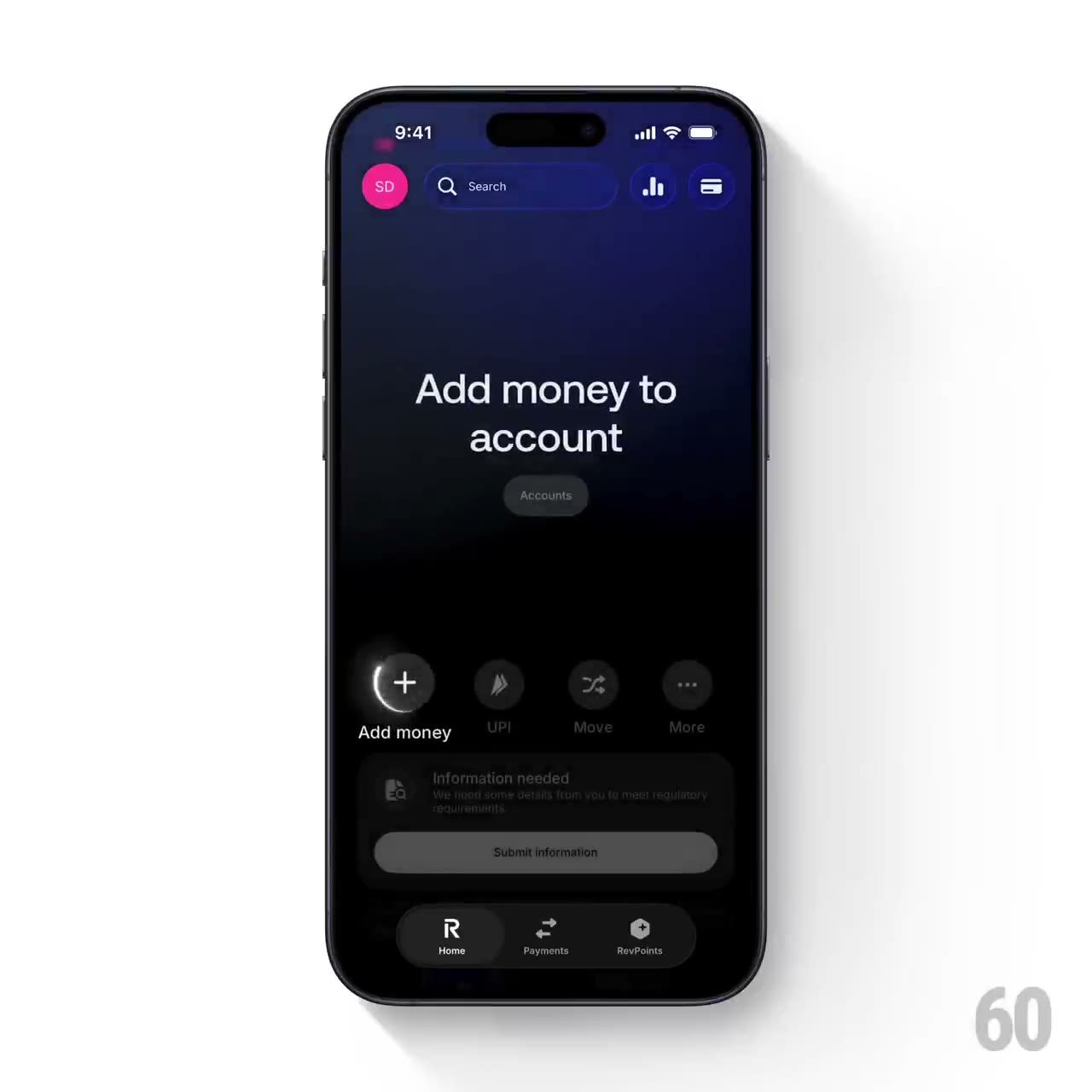
BUILD: Build a compact guided-tour overlay for a row of four quick-action buttons. Dim the underlying dashboard and spotlight one action at a time with a restrained bright border pulse; pair it with a centered two-line instruction. Rebuild only the guidance interaction, not a banking app.
DESIGN SYSTEM: Use a 360px-wide responsive container, near-black #08090C backdrop with subtle #20245B top glow, neutral sans-serif instructions at 24px/28px, white #F5F5F7 text. Arrange four 44px circular actions in an evenly spaced row with 12px captions. Place a small muted pill beneath the instruction. Inactive icons remain charcoal #25262A.
MOTION: On opening, fade the scrim in over 180ms. On step change, fade the instruction out/in over 140ms/180ms with 6px vertical movement. Draw a 1px white perimeter around the active circular action and expand a soft halo from scale 1 to 1.25 while opacity falls from .5 to 0 over 800ms. Use cubic-bezier(0.22,1,0.36,1); keep the other actions still. Suggested timings are rebuild targets, not source measurements.
SECTIONS: Instruction; small context pill; four labeled actions; dimmed surrounding content. States: closed, active step, advancing, completed. Allow Next, Previous and dismissal without invoking the underlying action.
IMPLEMENTATION: Use React and Motion for step crossfades and transform/opacity pulses; use CSS border or SVG circle for the perimeter. Animate only the active button. Trap focus in the tour if modal; label controls and restore focus on dismissal. For prefers-reduced-motion use a static outline with instant text changes.
ADAPT TO THE PROJECT: Reuse existing design tokens, components and fonts. Map estimated colors to the nearest project tokens. Never copy logos, brand names, photos or illustrations; use generic labels and CSS-generated surfaces.
SUCCESS CHECK:
- All states work without changing the surrounding layout.
- Keyboard and reduced-motion modes preserve the same information.
- Animation stays within its component and produces no layout shift.