REFERENCE
- Gallery page: https://magpui.com/en/i/web-search-with-expandable-sources-f3fb23
- First frame (image): https://dnioievkvxejjbxgwvko.supabase.co/storage/v1/object/public/media/web-search-with-expandable-sources-f3fb23/shot.jpg
- Clip (mp4): https://dnioievkvxejjbxgwvko.supabase.co/storage/v1/object/public/media/web-search-with-expandable-sources-f3fb23/clip.mp4
- Original post: https://www.rareui.com/components/websearch by Rare UI
Before building, download the first frame and look at it. If ffmpeg is available, download the clip and extract frames (ffmpeg -i clip.mp4 -vf fps=2 frame-%02d.png), then study the motion frame by frame. Match what you see; the text below describes it, the frames are the truth.

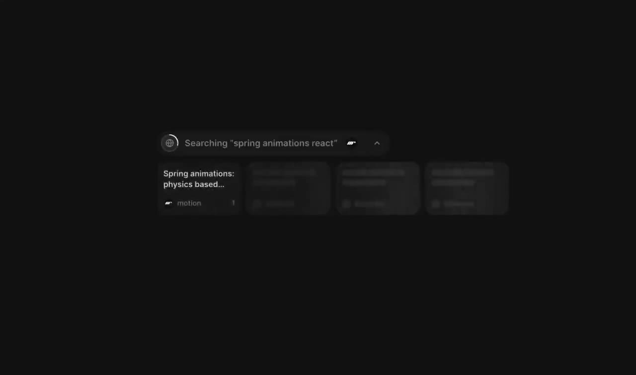
BUILD: Build only a compact animated web-search response component: a status capsule above a row of source cards and an answer beneath. The source row can expand into a small grid and collapse back. Keep the presentation quiet and dense.
DESIGN SYSTEM: Use a roughly 480px maximum width with responsive wrapping. Near-black background #111111, cards #1b1b1b, subtle borders #292929, white text #ededed and muted labels #929292. Use the existing sans-serif at 13px for card titles and answer text, 11px for metadata. Cards approximately 104 by 66px, 8px gaps, 8px corner radii; 16px between sources and answer. A narrow rounded status capsule contains a search/spinner glyph, status label and overlapping circular source marks.
MOTION: Suggested rebuild timings, not measured: on search start rotate the small status glyph on a 900ms linear loop. Reveal source cards with opacity 0 to 1 and translateY 6px to 0 over 240ms, stagger 70ms, cubic-bezier(0.22,1,0.36,1). On completion replace the status with a searched-sites count. Reveal answer text in short groups at 40ms intervals. Clicking the extra-sources card expands the row into a two-row grid over 280ms using layout animation, cubic-bezier(0.22,1,0.36,1); collapse with the same timing.
SECTIONS: Searching status with placeholder cards; completed status; three visible source cards and an extra-sources card with overlapping circular marks; expanded source grid; answer paragraph with small inline source references. Support idle, loading, completed, expanded and collapsed states.
IMPLEMENTATION: Use React and Motion for source entrances, presence and layout changes; keep answer text real selectable text. Use supplied local fixture data, not a fake network integration. Make source cards links and the expand control a button with aria-expanded, keyboard activation and visible focus. Announce completion once in a polite live region. Respect prefers-reduced-motion with static state changes and an immediate answer. Limit the grid to six sources and avoid animation-driven React rerenders per frame.
ADAPT TO THE PROJECT: Reuse the project's existing design tokens, components and fonts. Map colors to the closest existing tokens. Never copy logos, brand names, photos or illustrations from the original; use placeholder source marks and sample content.
SUCCESS CHECK:
- Search status, source cards and answer appear in that order.
- Expanding and collapsing preserves card identity and produces no horizontal overflow at 320px.
- All links and controls work by keyboard and reduced-motion mode removes progressive movement.