REFERENCE
- Gallery page: https://magpui.com/en/i/service-list-with-tilting-hover-preview-359995
- First frame (image): https://dnioievkvxejjbxgwvko.supabase.co/storage/v1/object/public/media/service-list-with-tilting-hover-preview-359995/shot.jpg
- Clip (mp4): https://dnioievkvxejjbxgwvko.supabase.co/storage/v1/object/public/media/service-list-with-tilting-hover-preview-359995/clip.mp4
- Original post: https://x.com/lorenzodossi/status/2117636983128461772 by @lorenzodossi
Before building, download the first frame and look at it. If ffmpeg is available, download the clip and extract frames (ffmpeg -i clip.mp4 -vf fps=2 frame-%02d.png), then study the motion frame by frame. Match what you see; the text below describes it, the frames are the truth.

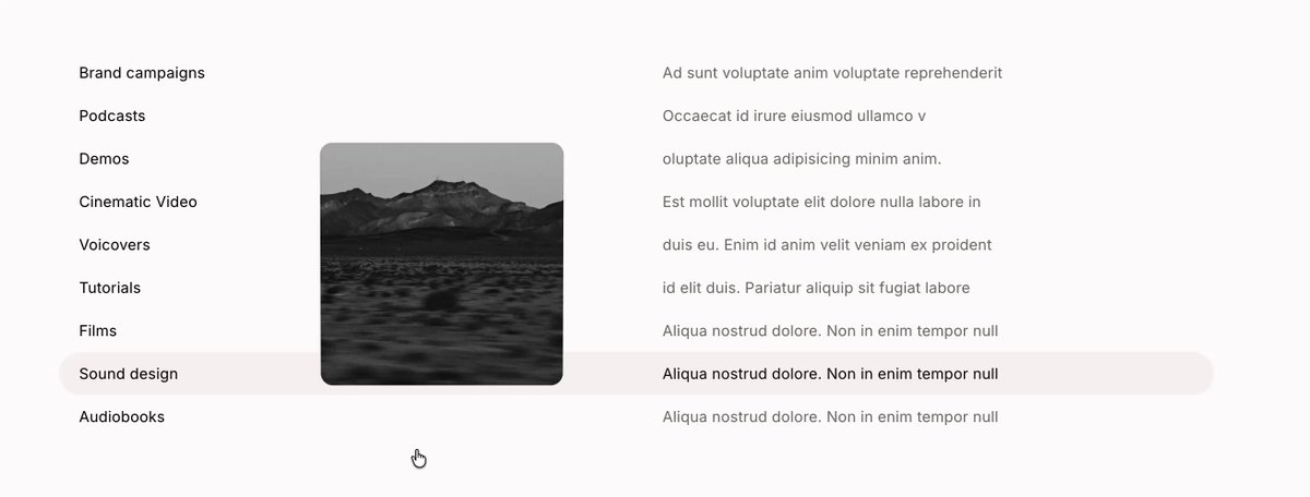
BUILD: An index list of services (for example Brand campaigns, Podcasts, Demos, Cinematic video, Voiceovers, Tutorials, Films, Sound design, Audiobooks). Each row has a short label on the left and a one-line description in a second column. On desktop, hovering a row tints it with a soft gray band and a small rounded photo card appears next to the pointer, vertically centered on the hovered row; moving between rows makes the card glide to the new row and crossfade to that row's image. The card feels physical: the photo is slightly zoomed inside it and drifts against the card's movement (parallax), the card scales up a touch while the image is counter-scaled so it stays put, and it tilts in 3D according to how fast the mouse moves vertically. On touch devices there is no hover: the row closest to the vertical middle of the viewport becomes active while scrolling, and the card sits at the right edge of that row. Calm, precise, almost invisible polish.

DESIGN SYSTEM: Background #FFFFFF (mobile #FCFBFB). Desktop rows about 22px tall, full width, two columns: labels at x 0 (about 14% width), descriptions starting near 50%. Typography: a neutral grotesk sans; labels 12-13px weight 500 #111111, descriptions 12-13px weight 400 #8A8A8A. Active row: background #F2F2F2, radius 6px, label and description turn #111111. Preview card: about 130x150px on desktop (about 74x74px on mobile), radius 8px, no border, very soft shadow 0 8px 24px rgba(0,0,0,0.10); grayscale or muted photos, object-fit cover, image scaled 1.12 inside the card. Mobile: single column, label 13px weight 500 above a 12px gray description, rows about 58px tall with 10px gaps, card pinned to the right edge with 12px inset.

MOTION: Card follow: position eases toward the pointer y (snapped to the hovered row center) and pointer x plus 40px, using a spring (stiffness 220, damping 26) or a lerp of 0.15 per frame. Row tint: background opacity 0 to 1 over 160ms cubic-bezier(0.2, 0, 0, 1). Image swap: crossfade 220ms cubic-bezier(0.4, 0, 0.2, 1) with the new image starting at scale 1.18 and settling to 1.12. Parallax: image translate equals minus 15% of the card's velocity, clamped to 8px. Hover scale: card scale 1 to 1.04 over 240ms, image scale divided by the same factor so it does not grow. Tilt: rotateX equals vertical pointer velocity times 0.08 deg, clamped to plus or minus 10deg, perspective 800px, decaying back to 0 with the same spring when the mouse stops. Enter and leave: card opacity and scale 0.9 to 1 over 200ms; on leaving the list it fades out over 160ms. Mobile scroll activation: the active row changes when its center crosses the viewport middle, the card moves to it with a 260ms spring and crossfades the image.

SECTIONS: Parts: list container, rows (label, description), active band, floating preview card with an inner image layer. States: idle (no card), hover row (band plus card), moving between rows (card gliding and tilting), leaving (card fades), touch scroll-active row, focus-visible row (2px ring #111111 at 25% opacity, card shown like on hover), reduced motion.

IMPLEMENTATION: React with Motion: useMotionValue for pointer position, useVelocity on y to drive rotateX, useSpring for follow and tilt, and AnimatePresence or two stacked img layers for the crossfade. Detect hover-capable pointers with the CSS media query (hover: hover) and (pointer: fine); only those get the pointer-follow card, so taps never leave a sticky hover state. On coarse pointers use an IntersectionObserver with rootMargin '-50% 0px -50% 0px' to pick the active row while scrolling. Rows are links or buttons so Tab focus shows the same preview. prefers-reduced-motion: no tilt or parallax, card snaps to the row and the image cross-fades only. Animate only transform and opacity, preload the row images, and keep a single card element in the DOM.

ADAPT TO THE PROJECT: Reuse the project's existing design tokens, components and fonts, and map the grays above to the closest existing tokens. Never copy logos, brand names, photos or illustrations from the original; use placeholder images.

SUCCESS CHECK:
- On desktop, moving the mouse down the list makes the card glide row to row, swap images with a crossfade and tilt with mouse speed, then settle flat when the mouse stops.
- On a touch device, scrolling the list activates the row in the middle of the screen and no row stays highlighted after a tap.
- With prefers-reduced-motion on, there is no tilt or parallax and the list remains fully usable by keyboard.