REFERENCE
- Gallery page: https://magpui.com/en/i/segment-tabs-with-stacked-photo-deck-480c6d
- First frame (image): https://dnioievkvxejjbxgwvko.supabase.co/storage/v1/object/public/media/segment-tabs-with-stacked-photo-deck-480c6d/shot.jpg
- Clip (mp4): https://dnioievkvxejjbxgwvko.supabase.co/storage/v1/object/public/media/segment-tabs-with-stacked-photo-deck-480c6d/clip.mp4
- Original post: https://x.com/lorenzodossi/status/2117648124693090656 by @lorenzodossi
Before building, download the first frame and look at it. If ffmpeg is available, download the clip and extract frames (ffmpeg -i clip.mp4 -vf fps=2 frame-%02d.png), then study the motion frame by frame. Match what you see; the text below describes it, the frames are the truth.

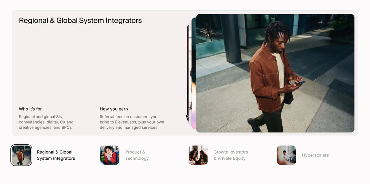
BUILD: A wide audience-selector component: a large rounded card on top and a row of four thumbnail tabs underneath. The active tab sets the card content: a title at the top-left, two short columns at the bottom-left ("Who it's for" and "How you earn"), and a big photo on the right half. Behind the photo sits a deck of the other photos, visible only as thin slivers on its left edge, like cards fanned slightly backward. Switching tabs feels calm and physical: the current photo slides back into the deck while the next one comes forward, and the text cross-fades.

DESIGN SYSTEM: Page background #FAF8F7. Card: full content width (about 960px), height about 340px, radius 18px, fill #F4F0EE, 1px border rgba(0,0,0,0.04), no heavy shadow. Two-column grid inside: left 50% for text, right 50% for the photo deck with 10px inner padding. Title: neutral grotesk sans, 20px/1.2, weight 500, #111. Column labels 13px weight 500 #111; column text 12.5px/1.45 #6B6B6B, max width about 200px, two columns 24px apart, anchored to the bottom of the card with 24px padding. Photo: radius 12px, object-fit cover. Deck slivers: 2-3 cards behind, each offset 6-8px to the left, scaled 0.96 and 0.92, slightly darker (brightness 0.85). Tab row: four items, each a 56px square thumbnail with radius 10px plus a two-line label 13px; inactive labels #9A9A9A, active label #111, active thumbnail gets a 1.5px dark ring with 2px offset.

MOTION: Tab change (click or keyboard): outgoing photo moves to the deck: translateX -24px, scale 0.94, opacity to 0.6, 420ms cubic-bezier(0.32, 0.72, 0, 1); incoming photo comes from the deck: starts at translateX -24px, scale 0.94, blur 8px, then animates to translateX 0, scale 1, blur 0 over 520ms with the same easing, starting 60ms later. Slivers re-stack to match the new order with 40ms stagger. Title and both text columns cross-fade: out 160ms (opacity 0, y -4px), in 240ms (opacity 1, y 4px to 0), cubic-bezier(0.22, 1, 0.36, 1). Tab ring and label color transition 200ms ease-out. Optional autoplay every 5s, paused on hover or focus.

SECTIONS: Parts: card, title, two copy columns, photo deck (active photo + slivers), tab row of thumbnails and labels. States: idle, tab hover (label darkens to #444, thumbnail scale 1.03), tab focused (visible focus ring), active tab, transitioning (inputs still accepted; rapid clicks retarget the animation instead of queuing).

IMPLEMENTATION: React with Motion: keep the deck as an ordered array, render each photo as an absolutely positioned motion.img whose x, scale, filter and zIndex come from its index in the deck, so a tab change just reorders the array and Motion springs every card to its new slot. Text uses AnimatePresence with mode "popLayout". Use a real tablist (role tablist / tab / tabpanel, arrow keys to move, Enter or Space to select). prefers-reduced-motion: no slide or blur, plain 150ms cross-fade. Preload the images, keep blur only during the transition, animate only transform, opacity and filter. On mobile stack the photo above the text and turn the tab row into a horizontal scroll snap.

ADAPT TO THE PROJECT: Reuse the project's existing design tokens, fonts and components; map the colors to the closest existing tokens. Never copy logos, brand names, photos or illustrations from the original; use placeholder copy and placeholder photos.

SUCCESS CHECK:
- Clicking each of the four tabs swaps title, both text columns and the photo, with the old photo visibly sliding back into the deck and the new one coming forward.
- Thin slivers of the other photos stay visible on the left edge of the active photo at all times and reorder after each change.
- Arrow keys move between tabs with a visible focus ring, and with reduced motion only a simple cross-fade remains.