REFERENCE
- Gallery page: https://magpui.com/en/i/playful-sticker-pack-landing-page-d62a63
- First frame (image): https://dnioievkvxejjbxgwvko.supabase.co/storage/v1/object/public/media/playful-sticker-pack-landing-page-d62a63/shot.jpg
- Clip (mp4): https://dnioievkvxejjbxgwvko.supabase.co/storage/v1/object/public/media/playful-sticker-pack-landing-page-d62a63/clip.mp4
- Original post: https://x.com/samirande_/status/2117933715527729166 by @samirande_
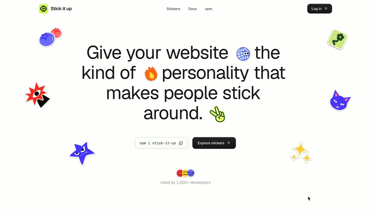
Before building, download the first frame and look at it. If ffmpeg is available, download the clip and extract frames (ffmpeg -i clip.mp4 -vf fps=2 frame-%02d.png), then study the motion frame by frame. Match what you see; the text below describes it, the frames are the truth.

BUILD: A one-page landing for a library of decorative UI stickers. A minimal white page where chunky, brightly colored stickers (a violet star, a red spiky badge, a purple cat face, a lime blob, a yellow sparkle, a peace-sign hand) float around a large centered headline, and small emoji-like stickers are set inline inside the headline itself. Below, pastel bento cards show the stickers applied to landing pages, mobile apps and developer UIs, then a simple call to action and a footer with an enormous cropped wordmark on a sky-blue gradient. It should feel friendly, fun and still tidy.

DESIGN SYSTEM: Max width 1120px, centered, 24px gutters. Navbar 56px: small round logo + name left, three 13px links center, a black pill "Log in" button right (#111, white text, 999px radius, 28px tall). Typography: a neutral grotesk sans; hero headline 64px/1.1, weight 500, letter-spacing -0.02em, #111, three lines centered; section titles 28px weight 500; body 14px #6B6B6B. Inline stickers in the headline are about 0.8em, sitting on the baseline. Colors: page #FFFFFF, text #111111, muted #8A8A8A; sticker accents violet #5B3DF5, red #E8423A, purple #7B3FE4, lime #B7E34B, yellow #F6D23A; bento surfaces pastel yellow #F7E57A, pink #F49AA8, mint #BDEB9A, periwinkle #C9D3F7, light gray #EEEEEE. Cards 20px radius, no borders, soft shadow 0 10px 30px rgba(0,0,0,0.06). Hero actions: a light gray copy-to-clipboard command chip ("npm i sticker-pack", monospace 12px, 8px radius, copy icon) next to a black "Explore stickers" button, 36px tall; a tiny avatar stack + "Loved by 1000+ developers" caption under them. Footer: two-line tagline left ("Stick it on. / Ship it fun" style), two link columns right, then a full-width wordmark at about 22vw, weight 700, white, cropped by the bottom edge, on a gradient from #FFFFFF to #6FB6F2 to #3A8EF0.

MOTION: Hero stickers: each floats on its own loop, translateY ±6px and rotate ±4deg over 3000-4600ms, ease cubic-bezier(0.45, 0, 0.55, 1), offset start times so they never sync. Sticker hover: scale 1.12 and rotate 8deg in 200ms cubic-bezier(0.34, 1.56, 0.64, 1); stickers can be dragged and spring back (stiffness 300, damping 18). Hero entry: headline lines fade up 16px with 80ms stagger over 600ms cubic-bezier(0.22, 1, 0.36, 1), then stickers pop in from scale 0.4 with a 60ms stagger. On scroll, bento cards fade up 24px when 20% visible, 500ms, 70ms stagger; stickers inside the cards rotate in from -15deg. Copy chip: click swaps the icon to a check for 1500ms. Footer wordmark slides up 40px as it enters.

SECTIONS: 1) Navbar. 2) Hero: three-line headline with inline stickers, command chip + primary button, social proof, floating stickers around the edges. 3) "See your brand, stickered." title with two large gray cards showing sticker-decorated mockups labelled "Landing pages" and "Mobile apps". 4) "Everything you need to stick around." bento: a yellow "What's in the pack" card with a checklist and a phone mockup, a pink "Stick it anywhere" card with sticker-decorated device frames, a mint "Light to ship. Fun to touch." card, and a periwinkle "Designed for developers" card with stacked notification toasts and the install chip. 5) CTA: "Ready to give your UI some personality?" with the same two actions and a few floating stickers. 6) Footer with tagline, links and the giant cropped wordmark.

IMPLEMENTATION: React + Motion (motion/react) for entry, scroll reveals, hover and drag; stickers are inline SVG components so colors come from tokens. Floating loops can be CSS keyframes to keep the main thread free. prefers-reduced-motion: no floating or drag springs, stickers static, reveals become 200ms opacity fades. All buttons and the copy chip are real buttons with visible focus rings; decorative stickers are aria-hidden. Keep at most 12 animated stickers on screen and animate only transform and opacity.

ADAPT TO THE PROJECT: Reuse the project's existing design tokens, components and fonts, map colors to the closest existing tokens, and never copy logos, brand names, photos or illustrations from the original; draw your own simple sticker shapes or use placeholders.

SUCCESS CHECK:
- The hero headline reads on three centered lines with small stickers inline and larger stickers gently floating around it without overlapping the text.
- The bento section shows four pastel cards that reveal with a stagger on scroll, and hovering any sticker gives a springy tilt.
- The footer wordmark spans the full width, is cropped at the bottom, and all motion stops under prefers-reduced-motion.