REFERENCE
- Gallery page: https://magpui.com/en/i/pill-navigation-with-rising-menu-b7d86f
- First frame (image): https://dnioievkvxejjbxgwvko.supabase.co/storage/v1/object/public/media/pill-navigation-with-rising-menu-b7d86f/shot.jpg
- Clip (mp4): https://dnioievkvxejjbxgwvko.supabase.co/storage/v1/object/public/media/pill-navigation-with-rising-menu-b7d86f/clip.mp4
- Original post: https://x.com/noman_huge/status/2109576698924843195 by @noman_huge
Before building, download the first frame and look at it. If ffmpeg is available, download the clip and extract frames (ffmpeg -i clip.mp4 -vf fps=2 frame-%02d.png), then study the motion frame by frame. Match what you see; the text below describes it, the frames are the truth.

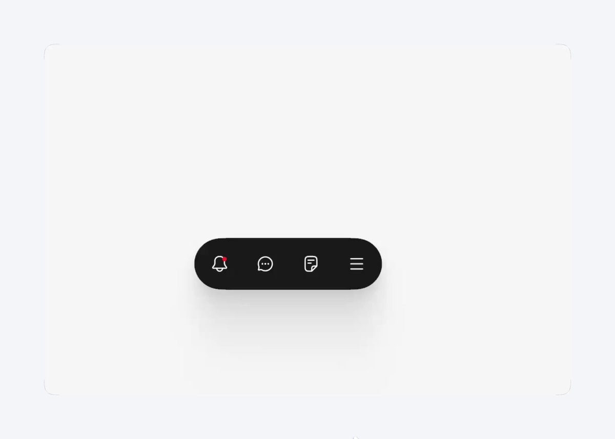
BUILD: Build a compact dark floating pill navigation with four outline icon buttons. The final menu button opens a rounded three-row panel above the right edge and can show a contextual settings icon.
DESIGN SYSTEM: Estimated dimensions: bar 200 by 48px, 24px radius, 6px padding, 20px outline icons. Use #191919 for the bar, #292929 for the panel, #555555 for the active circular trigger and #eeeeee for labels. Panel about 180 by 138px, 20px radius; three 40px rows, 14px sans-serif labels. Use a diffuse shadow below the bar and a white surrounding surface.
MOTION: Suggested timings: opening translates the panel from 18px below and scales it from .9 to 1 with opacity 0 to 1 and blur 8px to 0 over 300ms, cubic-bezier(.2,.8,.2,1). Close reverses over 180ms. Animate trigger icon replacement and active background over 180ms with the same easing. Hover rows fade their lighter background in 120ms. Keep the bar anchored during transitions.
SECTIONS: Idle icon bar; hovered menu trigger; open panel with account, settings and guide actions; highlighted row; contextual trigger; closed state. Panel aligns above the last button with a 10px gap.
IMPLEMENTATION: Use Motion for transform, opacity and blur transitions with an anchored popover. Implement real buttons, accessible names, aria-expanded, Escape dismissal, outside click and keyboard navigation; restore trigger focus on close. Reduced motion removes blur and translation. Animate only this small panel, not page layout.
ADAPT TO THE PROJECT: Reuse existing design tokens, components and fonts. Map colors to closest existing tokens. Never copy logos, brand names, photos or illustrations; use neutral icons and labels.
SUCCESS CHECK:
- Opening never shifts the pill position.
- The panel opens and closes with keyboard and pointer.
- Reduced motion retains all menu functionality.