REFERENCE
- Gallery page: https://magpui.com/en/i/perspective-cards-open-into-editorial-profiles-6e3d33
- First frame (image): https://dnioievkvxejjbxgwvko.supabase.co/storage/v1/object/public/media/perspective-cards-open-into-editorial-profiles-6e3d33/shot.jpg
- Clip (mp4): https://dnioievkvxejjbxgwvko.supabase.co/storage/v1/object/public/media/perspective-cards-open-into-editorial-profiles-6e3d33/clip.mp4
- Original post: https://x.com/evilrabbit_/status/2117459591508427009 by @evilrabbit_
Before building, download the first frame and look at it. If ffmpeg is available, download the clip and extract frames (ffmpeg -i clip.mp4 -vf fps=2 frame-%02d.png), then study the motion frame by frame. Match what you see; the text below describes it, the frames are the truth.

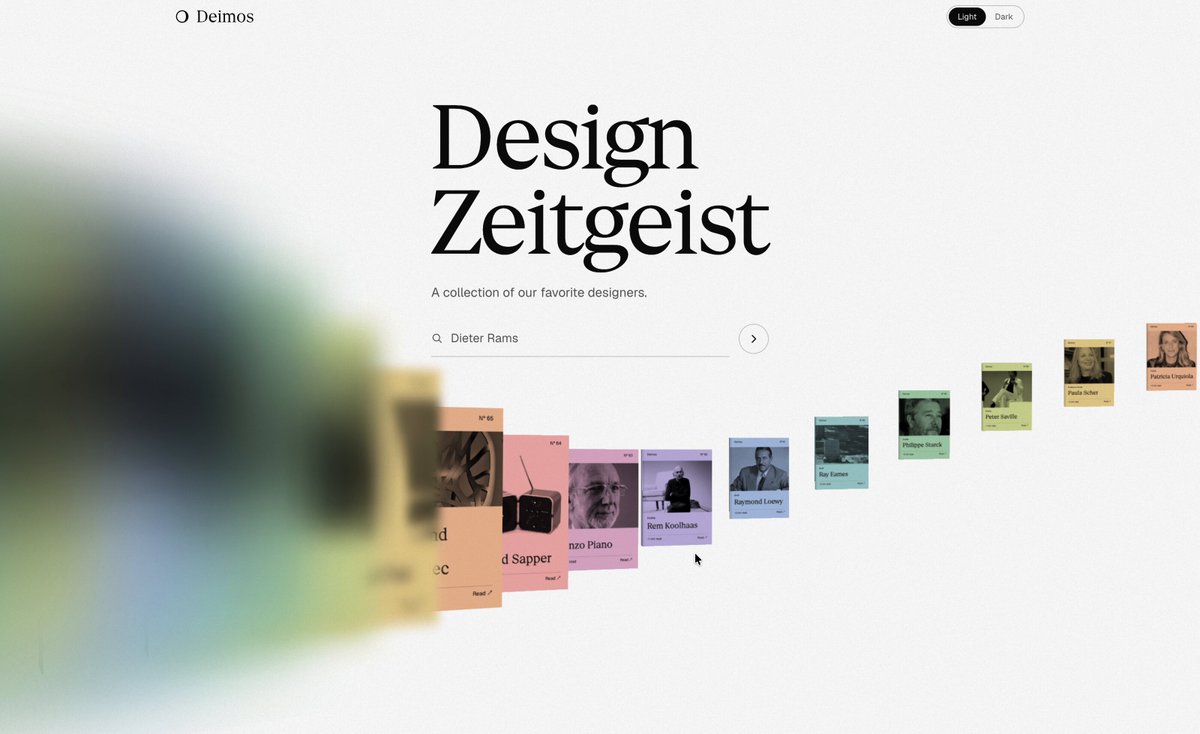
BUILD: Build a perspective card gallery that opens an editorial detail view. Arrange compact colored cards along a receding diagonal ribbon, with oversized blurred cards at the left edge and smaller sharp cards toward the right. Selecting a card brings it forward and expands its color into the reading surface.
DESIGN SYSTEM: Use an off-white #F7F7F5 background, black #171717 text and muted card colors including pink #DD9A9D, lavender #B9AFCC and green #AAC3A0. Place a two-line serif heading above the central ribbon, approximately 64px on desktop. Use small sans-serif metadata around 12px. Cards have square corners and portrait proportions around 3:4. Keep ample whitespace. The reading view uses a large serif title, narrow left contents column, central prose column and right image/metadata column.
MOTION: Suggested timings: on gallery navigation translate cards along the depth axis with perspective and scale, 650ms cubic-bezier(0.22,1,0.36,1); apply increasing blur up to 24px only to the nearest foreground cards. On selection animate the selected card forward and expand its colored surface to cover the content area over 800ms cubic-bezier(0.76,0,0.24,1), revealing editorial content after a 350ms delay with a 250ms opacity transition. These are implementation targets rather than measured source timings.
SECTIONS: Gallery state contains heading, small search control and receding card ribbon. Selected state contains the expanding colored card. Detail state contains title, contents navigation, prose sections, portrait placeholder and concise metadata. Retain a visible return control.
IMPLEMENTATION: Use CSS perspective and Motion for card transforms and shared-layout expansion; no WebGL is required. Render only a bounded set of cards, animate transform and opacity, and avoid large full-screen animated filters. Make cards real buttons, support arrow-key navigation and Enter selection, restore focus on return and provide visible focus rings. With prefers-reduced-motion replace perspective movement and expansion with an immediate view switch and short fade.
ADAPT TO THE PROJECT: Reuse existing project design tokens, components and fonts. Map colors to the closest existing tokens. Never copy logos, brand names, photos or illustrations from the original; use placeholders and original sample profile text.
SUCCESS CHECK:
- The ribbon visibly recedes in depth, with blurred foreground cards and legible smaller cards.
- A selected card visually connects to the matching colored editorial surface without an abrupt background jump.
- Gallery selection and return work with keyboard and reduced motion enabled.