REFERENCE
- Gallery page: https://magpui.com/en/i/live-agent-run-monitor-card-69888f
- First frame (image): https://dnioievkvxejjbxgwvko.supabase.co/storage/v1/object/public/media/live-agent-run-monitor-card-69888f/shot.jpg
- Clip (mp4): https://dnioievkvxejjbxgwvko.supabase.co/storage/v1/object/public/media/live-agent-run-monitor-card-69888f/clip.mp4
- Original post: https://x.com/flohoeller/status/2116105105762328633 by @flohoeller
Before building, download the first frame and look at it. If ffmpeg is available, download the clip and extract frames (ffmpeg -i clip.mp4 -vf fps=2 frame-%02d.png), then study the motion frame by frame. Match what you see; the text below describes it, the frames are the truth.

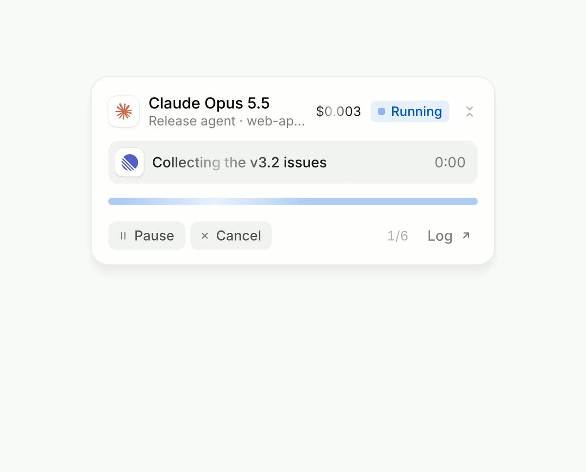
BUILD: A compact monitor card for a running AI agent. It shows the model name, the agent's job, a live cost counter and a status badge. The current step sits in a highlighted row with a source icon and its own timer, a segmented progress bar fills step by step, finished steps stack below with their durations, and when the agent needs permission the card turns warm and asks for Allow or Decline. When idle it collapses into a single slim pill. It should feel calm, precise and alive, like a good developer tool.

DESIGN SYSTEM: Card about 360px wide, white #FFFFFF on a page of #F5F5F5, radius 12px, 1px border #ECECEC, soft shadow 0 2px 8px rgba(0,0,0,0.05). Padding 12px. Header row: 20px brand-mark slot, title in a neutral sans 13px/600 #111111, subtitle 11px #8A8A8A truncated with ellipsis, cost in monospace-ish tabular numbers 12px #555555, status badge pill 11px with a 6px dot (Running: bg #EAF1FE, text #2F6FE4; Needs you: bg #FDF1E3, text #C46A12). Current step row: bg #F4F4F5, radius 8px, height 32px, 16px source icon, label 12px #222222, timer right aligned 11px tabular #8A8A8A. Progress bar: 6 segments, 4px tall, 4px gaps, radius 2px, empty #E7E7EA, done #9E9E9E, active #9DBEF5 filling to #2F6FE4. Completed step list rows 28px, icon 14px, text 12px #666666, duration 11px #A0A0A0 at right. Footer: ghost buttons Pause and Cancel (11px, bg #F4F4F5, radius 6px, 24px tall), step counter 11px #A0A0A0 like 2/6, Log link with an arrow. Approval state: step row bg #FDF1E3 with a monospace command chip, Decline text button with an Esc key hint, Allow solid button #111111 white text with an Enter key hint.

MOTION: Timers tick every 100ms with tabular numbers so width never jumps. When a step completes, the active row text cross-fades to the next step label (opacity and translateY 4px to 0, 220ms, cubic-bezier(0.22,1,0.36,1)) and the finished step slides into the top of the list (height 0 to 28px, opacity 0 to 1, 260ms, same easing), earlier rows push down. The active progress segment fills its width linearly with the step's elapsed time, then snaps to the done color in 150ms. Hovering a progress segment or step opens a detail popover under it (scale 0.96 to 1, opacity 0 to 1, translateY -4px to 0, 180ms, cubic-bezier(0.16,1,0.3,1)). Status badge color changes with a 200ms background transition; entering the approval state tints the step row in 240ms. Collapse to the pill: card height and width animate together into a 40px tall pill (320ms, cubic-bezier(0.65,0,0.35,1)) while list and footer fade out in the first 120ms; the pill shows the model, a row of tiny icons of tools used and the total time.

SECTIONS: Parts are header, current step row, segmented progress bar, completed steps list, footer actions, hover popover, collapsed pill. Popover: 300px card, title with source icon and source name, a 4-column stats row (Started, Took, Share, State) in 10px labels over 12px values, a short description 12px, and a monospace path chip on #F4F4F5. States: running, hover detail open, needs approval, publishing (last step), done (card turns dark #111111 with total time and cost), collapsed pill.

IMPLEMENTATION: React with Framer Motion (layout animations for the list and the collapse, AnimatePresence for step labels and the popover). Drive the demo from a step array with mocked durations. Use font-variant-numeric: tabular-nums for every number. Popover opens on hover and on keyboard focus of a segment or row, closes on Escape; Allow and Decline are real buttons bound to Enter and Escape when the card has focus. With prefers-reduced-motion, swap all slides and scale for instant changes with 120ms opacity fades and keep timers. Keep re-renders cheap: timers in a ref with requestAnimationFrame, only the timer text updates.

ADAPT TO THE PROJECT: Reuse the project's existing design tokens, components, icons and fonts, map the colors to the closest existing tokens, and never copy logos, product names or brand marks from the original; use placeholder icons and a generic model name.

SUCCESS CHECK:
- Steps advance on their own, timers tick without layout shift and finished steps slide into the list.
- Hover or keyboard focus on a step opens the detail popover, Escape closes it.
- The approval state shows Allow and Decline that work with Enter and Escape, and the card can collapse to the pill and expand back smoothly.