REFERENCE
- Gallery page: https://magpui.com/en/i/liquid-tooltips-and-color-selector-fa58bb
- First frame (image): https://dnioievkvxejjbxgwvko.supabase.co/storage/v1/object/public/media/liquid-tooltips-and-color-selector-fa58bb/shot.jpg
- Clip (mp4): https://dnioievkvxejjbxgwvko.supabase.co/storage/v1/object/public/media/liquid-tooltips-and-color-selector-fa58bb/clip.mp4
- Original post: https://x.com/koppkev/status/2120471771602092136 by @koppkev
Before building, download the first frame and look at it. If ffmpeg is available, download the clip and extract frames (ffmpeg -i clip.mp4 -vf fps=2 frame-%02d.png), then study the motion frame by frame. Match what you see; the text below describes it, the frames are the truth.

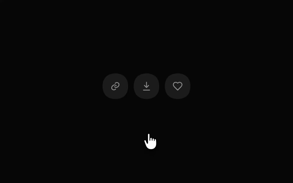
BUILD: Build a compact set of dark liquid controls: three circular icon buttons for link, download and favorite, plus a separate pill-shaped color selector. Tooltips emerge as connected bulges rather than detached rectangular overlays. Keep the interaction quiet and restrained.
DESIGN SYSTEM: Use a near-black #090905 backdrop and charcoal #24241F controls with muted #A6A69E stroke icons. Estimate circular buttons at 44px diameter with 6px gaps. Use a 128px by 34px selector, 17px radius, a 10px blue #4285EF or violet #8851E7 dot, a 12px sans-serif label and a small chevron. Tooltip text is 12px in off-white. No borders or conspicuous shadows.
MOTION: On hover or keyboard focus, grow the tooltip upward from the button using scale, translateY and a deforming connected silhouette over approximately 280ms, cubic-bezier(0.22,1,0.36,1). Reverse in 200ms on exit. On selector activation, enlarge the pill downward into a soft rounded surface over 340ms with the same easing; rotate the chevron and keep the dot and label anchored near the upper-left. Selecting a color updates the dot and label and contracts the surface over 260ms. These timings are implementation targets, not measured source values.
SECTIONS: Idle icon row; hovered or focused link button with Copy link label; idle Blue selector; expanding selector; collapsed Violet selector. Use simple geometric color-choice dots in the expanded state, without adding unrelated panels.
IMPLEMENTATION: Use React and Motion for layout, presence and transform animation, with an SVG connected silhouette or a tightly scoped SVG goo filter for the joining surfaces. Render text and icons outside the filtered layer so they stay sharp. Limit filtering to these small controls, not the viewport. Use real buttons, accessible names, a listbox for colors, Escape to close, arrow-key selection and visible focus rings. With prefers-reduced-motion, switch states without deformation.
ADAPT TO THE PROJECT: Reuse existing tokens, components and fonts; map the palette to the closest project colors. Never copy logos, brand names, photos or illustrations; use placeholders where needed.
SUCCESS CHECK:
- Tooltip appears connected to its button and stays legible throughout the transition.
- Color changes preserve the compact selector alignment without shifting the surrounding layout.
- Keyboard use and reduced-motion mode work without relying on hover.