REFERENCE
- Gallery page: https://magpui.com/en/i/image-lifts-to-reveal-metadata-8e1c30
- First frame (image): https://dnioievkvxejjbxgwvko.supabase.co/storage/v1/object/public/media/image-lifts-to-reveal-metadata-8e1c30/shot.jpg
- Clip (mp4): https://dnioievkvxejjbxgwvko.supabase.co/storage/v1/object/public/media/image-lifts-to-reveal-metadata-8e1c30/clip.mp4
- Original post: https://smoothui.dev/docs/components/image-metadata-preview by Edu Calvo
Before building, download the first frame and look at it. If ffmpeg is available, download the clip and extract frames (ffmpeg -i clip.mp4 -vf fps=2 frame-%02d.png), then study the motion frame by frame. Match what you see; the text below describes it, the frames are the truth.

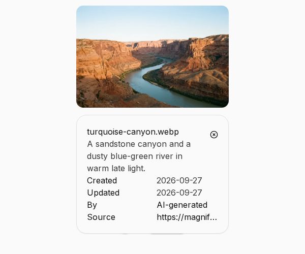
BUILD: Build a compact image card that reveals its metadata beneath the photograph. Keep this to one media component, with a small row of actions in the closed state and a quiet details panel in the expanded state.

DESIGN SYSTEM: Use an approximately 300px-wide landscape image with a 3:2 aspect ratio and 16px rounded corners, on #f8faf8. Below it, center three lightweight actions: share icon, a compact pill action and a chevron disclosure. Use 40px action targets and about 12px spacing. The expanded white panel aligns exactly with the image width, has a fine #e5e7e3 border, 14px corners and 18px padding. Use 14px neutral sans-serif text in #272b27, a filename, a short description and a two-column table of dates, creator and source.

MOTION: When the details action opens, lift the photograph about 70px and animate the metadata panel into the vacated space with opacity 0 to 1, y 12px to 0 and blur 5px to 0 over roughly 320ms, cubic-bezier(0.22,1,0.36,1). Fade the closed action row out over 120ms. Reverse on close over 220ms. Keep the image corners stable and do not add rotation, particles or dramatic overshoot.

SECTIONS: Closed: image and centered actions. Expanded: lifted image with filename, description, semantic metadata rows and close action. Hover and focus: subtle control emphasis. Repeated open and close must preserve image position and keyboard focus.

IMPLEMENTATION: Use the installable component source from the original source link through its shadcn-compatible registry. Use React and Motion for layout and presence transitions, with a semantic table for metadata. Provide a disclosure button with aria-expanded and aria-controls; allow keyboard activation and Escape to close, returning focus to the disclosure. Respect prefers-reduced-motion by switching panels instantly without lift, blur or spring. Keep image dimensions reserved and use a project-owned placeholder image, not the source photograph.

ADAPT TO THE PROJECT: Reuse the existing design tokens, components and fonts. Map colors to the closest existing tokens. Never copy logos, brand names, photographs or illustrations from the source; use project-owned placeholders.

SUCCESS CHECK:
- Closed, active and completed states match the described component without adding a full page.
- Pointer, touch and keyboard interaction work with visible focus and correct accessible state.
- Reduced-motion mode remains usable and no content jumps or clips at mobile widths.