REFERENCE
- Gallery page: https://magpui.com/en/i/health-dashboard-with-body-hotspots-6d6b2a
- First frame (image): https://dnioievkvxejjbxgwvko.supabase.co/storage/v1/object/public/media/health-dashboard-with-body-hotspots-6d6b2a/shot.jpg
- Original post: https://x.com/tobiadonadon_/status/2111119867411869961 by @tobiadonadon_
Before building, download the image and look at it. Match what you see; the text below describes it, the frames are the truth.

ASSETS
This needs real artwork, not shapes drawn in code. Use the files the user gives you (ask where they are). If you have an image generation tool, generate them with these prompts; otherwise leave clearly marked placeholders.
- Neutral side-profile portrait: Photorealistic upper-body side-profile portrait of an adult with short curly hair, neutral expression, soft diffused daylight, warm white plain background, no text or logos, vertical 3:4 composition, lower torso softly fading into white; licensed placeholder aesthetic for a personal wellness dashboard.

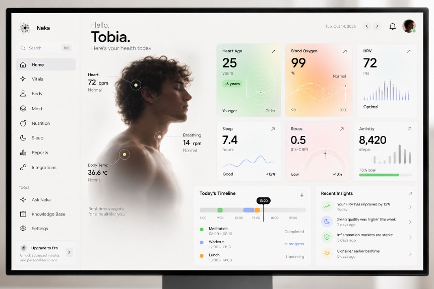
BUILD: Build a desktop personal-health dashboard with a narrow left sidebar, a large portrait with body-metric callouts, and a compact grid of health cards. The reference is a static design; prioritize its calm hierarchy rather than inventing elaborate animations. Use sample data, not medical claims.
DESIGN SYSTEM: Use a warm white #F7F7F4 background, near-black #181A18 text and muted #969992 labels. At 1200px width, use a 180px sidebar, a roughly 330px portrait column and a flexible right panel. Use 12px grid gaps and 16px card padding. Typography is a neutral sans serif: 30px greeting name, 28px metric values, 12px labels and 10px secondary annotations. Cards have subtle 10px corners, almost invisible borders and no heavy shadows. Use pale green #DEF0D8, peach #FFE4CF and blush #F9E7EB washes.
SECTIONS: Sidebar contains a small abstract mark, search field, eight primary navigation rows, a tools group and an upgrade block; selected navigation gets a pale gray rounded background. Main header has a small greeting above a bold name, helper text, date, previous/next controls, notification icon and avatar. Beneath it, place a side-profile upper-body portrait fading into the background at its lower edge. Three small circular markers connect to heart-rate, breathing-rate and temperature labels. Right panel contains a 3-column, 2-row card grid: heart-age number with faint concentric rings, oxygen percentage with crossing curves, variability with narrow vertical bars, sleep with a fine wave chart, stress with a half-circle gauge and activity with bars and a green goal track. Below, place a timeline with colored event segments, a black current-time marker and three event rows beside a recent-insights list with pastel circular icons. Treat these as informational, not clinical guidance.
IMPLEMENTATION: Use semantic HTML and CSS Grid with inline SVG for rings, bars and line charts. Use a single masked portrait image rather than a canvas. Collapse to two card columns on tablets and one on small screens; stack the portrait above metrics. Label charts with textual equivalents, give icon buttons accessible names, and provide visible keyboard focus. Hotspot labels must also be available without hover. Avoid unnecessary motion and respect prefers-reduced-motion for any optional transition.
ADAPT TO THE PROJECT: Reuse the project's existing tokens, components and fonts. Map the estimated colors to the nearest existing tokens. Never copy original logos, brand names, photos or illustrations; use a licensed placeholder portrait and neutral sample content.
SUCCESS CHECK:
- Portrait callouts remain readable without overlapping the face or card grid.
- All six metric cards and both lower panels preserve a clear reading hierarchy.
- Navigation, charts and hotspot information work with keyboard and at mobile widths.