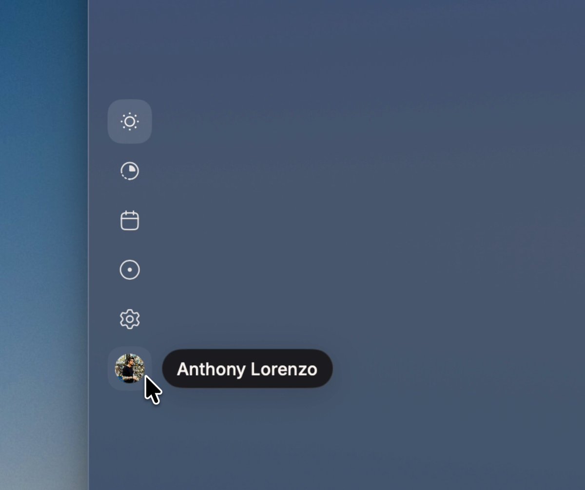
REFERENCE
- Gallery page: https://magpui.com/en/i/fluid-tooltip-across-sidebar-icons-950696
- First frame (image): https://dnioievkvxejjbxgwvko.supabase.co/storage/v1/object/public/media/fluid-tooltip-across-sidebar-icons-950696/shot.jpg
- Clip (mp4): https://dnioievkvxejjbxgwvko.supabase.co/storage/v1/object/public/media/fluid-tooltip-across-sidebar-icons-950696/clip.mp4
- Original post: https://x.com/Anthony99_s/status/2114869597577023821 by @Anthony99_s
Before building, download the first frame and look at it. If ffmpeg is available, download the clip and extract frames (ffmpeg -i clip.mp4 -vf fps=2 frame-%02d.png), then study the motion frame by frame. Match what you see; the text below describes it, the frames are the truth.

BUILD: Build an icon-only vertical sidebar with a single fluid tooltip that moves between hovered icons rather than recreating independent popovers. Scope this to the rail and tooltip.
DESIGN SYSTEM: Slate blue background around #465973. Six small pale outline icons on a vertical rail, 36–40px apart; a circular placeholder avatar at the bottom. Use 16px icons and a 32px rounded highlight for the active top item. Position the black #17191D tooltip 14px to the right. Use a 28px high capsule with 14px side padding, 12px white sans-serif label and a muted keyboard shortcut. Width should follow text, approximately 80–140px. Add only a restrained soft shadow.
MOTION: Pointer entry reveals the capsule in 140ms. Switching items moves the same surface to the next row and changes its width over 280ms with cubic-bezier(0.22,1,0.36,1). Briefly stretch the surface along its direction of travel, then settle. Crossfade labels over 100ms; do not stack visible labels. Exit fades in 120ms after a 100ms grace period. Durations are implementation targets, not measured source timings.
SECTIONS: Icon rail, active icon surface, bottom avatar, shared tooltip capsule, label and optional shortcut. Include idle, hover, focus and hidden states. Example labels: Today, Tasks, Calendar, Focus, Settings, Profile.
IMPLEMENTATION: Use Motion shared layout or one persistent absolutely positioned element with motion values for y and width. Use a subtle SVG contour only if needed for the fluid stretch; avoid expensive full-screen blur filters. Keyboard focus reveals the same tooltip; Escape dismisses it. Buttons need accessible names independent of tooltip text. Respect prefers-reduced-motion with immediate positioning and an opacity-only transition. Keep rail hit targets at least 40px and prevent edge clipping.
ADAPT TO THE PROJECT: Reuse the project's tokens, components and fonts, mapping colors to the closest existing tokens. Never copy logos, brand names, photos or illustrations; use a placeholder avatar.
SUCCESS CHECK:
- Rapid movement across icons retargets one continuous capsule without duplicate bubbles.
- Labels and shortcuts remain readable after each transition.
- Keyboard navigation, Escape and reduced-motion behavior work without hover.