REFERENCE
- Gallery page: https://magpui.com/en/i/3d-cover-flow-carousel-collection-448c9d
- First frame (image): https://dnioievkvxejjbxgwvko.supabase.co/storage/v1/object/public/media/3d-cover-flow-carousel-collection-448c9d/shot.jpg
- Clip (mp4): https://dnioievkvxejjbxgwvko.supabase.co/storage/v1/object/public/media/3d-cover-flow-carousel-collection-448c9d/clip.mp4
- Original post: https://x.com/alibey_10/status/2117241062443946158 by @alibey_10
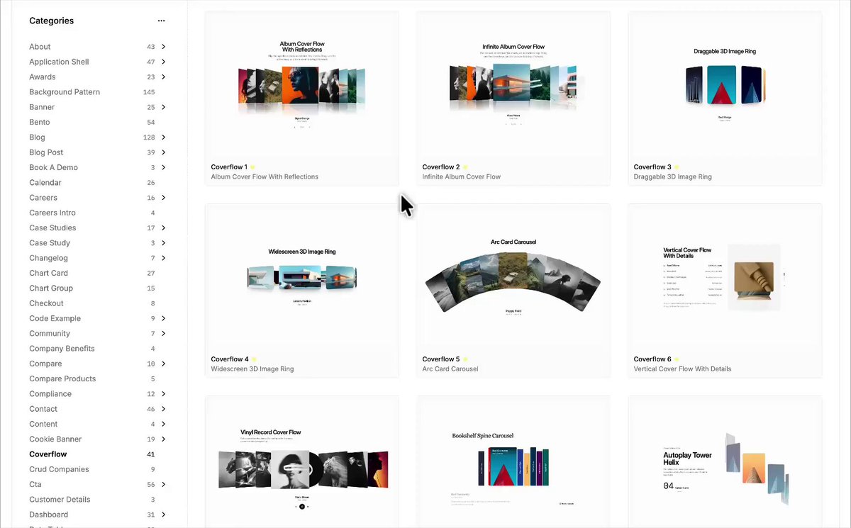
Before building, download the first frame and look at it. If ffmpeg is available, download the clip and extract frames (ffmpeg -i clip.mp4 -vf fps=2 frame-%02d.png), then study the motion frame by frame. Match what you see; the text below describes it, the frames are the truth.

BUILD: A cover flow carousel for a clean white page, inspired by the collection of carousel components shared by Ali Bey (@alibey_10); keep a small credit to the original author in the project's notes or footer. One large image card sits in the centre, standing straight and fully sharp; the cards on each side are pushed back, rotated away around the vertical axis and overlap behind each other like a fanned deck of prints. Clicking a side card, pressing the arrows or dragging slides the whole row so the chosen card swings to the centre. Under the stage sit two small pagination dots and a centred caption (title in 14px semibold, location or category in 12px gray) that cross-fades with the active card. Offer a second variant, a drum: product cards arranged on a vertical cylinder that turns step by step while a spec panel on the left (name, code, three label/value rows) updates for the active card.

DESIGN SYSTEM: Page background #FFFFFF with a very faint gray grid or none. Stage 1100px wide, about 520px tall, perspective 1200px, perspective-origin 50% 50%. Centre card 280x360px, radius 14px, 1px #E5E5E5 border, soft shadow 0 24px 48px rgba(0,0,0,0.14). Side cards 220x300px (about 80% scale), radius 14px, 8px apart in depth steps, dimmed to 60-70% opacity and gently desaturated. Caption: 14px Inter-like grotesque, #111 title, #6B7280 subtitle. Dots 6px, #D4D4D4 idle, #111 active. Spec panel (drum variant): 40px light grotesque headline, 11px uppercase gray labels, 13px #111 values, thin #E5E5E5 dividers.

MOTION: Slide to a new card: each card animates translateX, translateZ, rotateY and scale to its slot over 600ms with cubic-bezier(0.22, 1, 0.36, 1); card at offset n gets rotateY = n * -38deg (clamped to +-62deg), translateZ = -|n| * 90px, translateX = n * 150px, opacity = 1 - 0.18 * |n|; stagger neighbours 30ms outward from the centre. Drag: follow the pointer 1:1, on release snap to the nearest card with a spring (stiffness 220, damping 26). Caption: 200ms fade out, 300ms fade in. Hover on a side card: lift 8px and straighten 6deg over 250ms. Drum variant: cards rotateX by 24deg per step around a cylinder of radius 360px, the active card scales to 1.08 and its panel text slides up 12px while fading in over 350ms.

SECTIONS: Stage (the row of 5 to 7 visible cards), caption, pagination dots, optional prev/next arrow buttons (36px circles, 1px #E5E5E5 border, appearing on hover), optional spec panel for the drum variant. States: idle (centre card still), hover (side card lifts), dragging (cards follow the pointer, no caption), settling (spring to slot), keyboard focus (2px #111 outline on the centre card).

IMPLEMENTATION: React with Motion (Framer Motion) animating transforms only, with a 3D preserve-3d wrapper and one motion value for the active index driving every card's transform with useTransform, so drag and click share the same path. Use CSS transform and opacity only, will-change: transform on cards, next/image or plain img with explicit sizes. Left and right arrow keys move the carousel, cards are buttons with aria-label 'Show slide n of N', the active slide is announced with aria-live polite. With prefers-reduced-motion, drop the rotation and depth and cross-fade between cards in 200ms. Keep to 7 mounted cards at a time for performance.

ADAPT TO THE PROJECT: Reuse the project's existing design tokens, components and fonts, map the grays and the black to the closest existing tokens, and never copy logos, brand names, photos or illustrations from the original; use neutral placeholder images.

SUCCESS CHECK:
- The centre card is always the sharpest and tallest, and neighbours rotate away in a smooth, symmetric fan.
- Click, arrow keys and drag all land on the same card with a springy 600ms settle and no jumps.
- With prefers-reduced-motion on, the row cross-fades without any 3D rotation and still works by keyboard.