REFERENCE
- Gallery page: https://magpui.com/en/i/studio-landing-with-pixel-dissolve-slider-9815cf
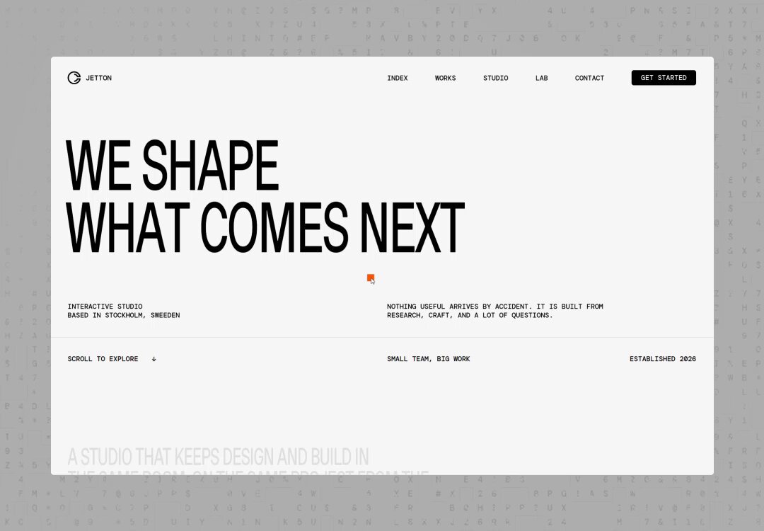
- First frame (image): https://dnioievkvxejjbxgwvko.supabase.co/storage/v1/object/public/media/studio-landing-with-pixel-dissolve-slider-9815cf/shot.jpg
- Clip (mp4): https://dnioievkvxejjbxgwvko.supabase.co/storage/v1/object/public/media/studio-landing-with-pixel-dissolve-slider-9815cf/clip.mp4
- Original post: https://x.com/clapatdesign/status/2118041187030360263 by @clapatdesign
Before building, download the first frame and look at it. If ffmpeg is available, download the clip and extract frames (ffmpeg -i clip.mp4 -vf fps=2 frame-%02d.png), then study the motion frame by frame. Match what you see; the text below describes it, the frames are the truth.

BUILD: A landing page for a small design and build studio. After a typographic intro, a pinned full-screen slider shows one project per slide (big photo, large uppercase project name centered). Moving between slides plays a blocky pixel dissolve: a grid of square cells fills from the bottom edge upward in a ragged, random front, covering the current photo in black, then clears to reveal the next one, while the title letters swap in a staggered snap. After the slider, an 'expanding list' section with huge condensed uppercase lines that stretch and separate as you scroll. It should feel bold, graphic and a bit playful, like a print studio with a digital edge.

DESIGN SYSTEM: Page background #F4F4F2, text #111111, single accent orange #F0561E used for tiny dots and highlights. Top nav 56px: small logo mark left, tiny uppercase links (Index, Works, Studio, Lab, Contact) 11px letter-spacing 0.08em, a black pill 'Get started' button 28px tall with white 10px uppercase text on the right. Intro: two uppercase grotesk lines at 64px/0.95 left aligned, small mono-like uppercase meta labels 10px in a 4-column row. Slides: 100vw x 100vh photos, object-fit cover, project name in a condensed uppercase grotesk at 7vw, white #FFFFFF, centered; bottom corners hold 10px uppercase labels (category, year). Pixel cells: 24px squares on desktop (16px mobile), black #0A0A0A, no gaps. Expanding list: centered lines of condensed uppercase type at 9vw, line-height 0.9, black on white, words pushed to the edges of a 12-column grid with wide gaps. Small paragraph blocks 12px, max 280px, a 'Read more' link with a small arrow. Final section: a big 'DE.' wordmark fragment with an orange square dot. No radii except the pill button, no shadows.

MOTION: Slide change (trigger: scroll step, wheel, swipe or arrow keys, snapping): total 900ms. 0-450ms: cells appear from the bottom: each cell's delay = (1 - row/rows) * 300ms + random 0-150ms, so the front is ragged; each cell pops from opacity 0 to 1 instantly (steps(1)) or scale 0 to 1 over 80ms. At 450ms swap the photo underneath. 450-900ms: cells disappear from the top down with the same ragged randomness. Title: letters of the old name drop out one by one (random order, 20ms stagger, opacity to 0), new letters appear in random order with 25ms stagger; occasionally show a letter as a single black cell first. Intro headline: words reveal with a 500ms clip from bottom, cubic-bezier(0.22, 1, 0.36, 1), 60ms stagger. Expanding list (scroll-scrubbed): each line starts with words close together and letter-spacing -0.02em, and as it crosses the viewport center words move apart toward the grid edges (translateX up to 18vw) and the line scales vertically from 0.6 to 1; lines above leave by sliding up and clipping at the top. Small accent orange square blinks 2 times on section entry (150ms on, 150ms off).

SECTIONS: 1) Nav bar. 2) Intro: big two-line statement, meta row, 'Scroll to explore' hint. 3) Statement block: uppercase lines with a small inline photo strip below. 4) Pinned project slider, 5-6 slides, each with full-bleed photo, centered project name, bottom labels (case study, category, year), a centered small 'See all works' button with a counter. 5) Expanding list: 'Creating branding experiences and online presence that last' split into stretched lines with two side paragraphs. 6) Closing: large fragment wordmark, contact email, social links and a black bottom bar.

IMPLEMENTATION: GSAP with ScrollTrigger (pin + snap for the slider, scrub for the expanding list). Pixel dissolve: draw the cell grid on a 2D canvas overlaid on the slide (cheap and crisp, recompute grid on resize), driven by a GSAP timeline progress 0-1 where each cell has a precomputed threshold from its row plus random jitter; alternatively a WebGL fragment shader with a floor(uv * grid) cell id, a hash for jitter and a step against progress. Keep titles as real text split into letter spans. prefers-reduced-motion: replace the dissolve with a 200ms crossfade and show the list without stretch. Keyboard: arrow keys and Page Up/Down step slides, focus outline on nav and buttons. Cap the cell grid at ~4,000 cells, pause the canvas when the slider is off-screen, preload the next slide image.

ADAPT TO THE PROJECT: Reuse the project's existing design tokens, fonts, buttons and layout components; map the colors above to the closest existing tokens. Never copy logos, brand names, photos or project names from the original; use placeholder images and copy.

SUCCESS CHECK:
- Changing slides covers the photo with black square cells rising from the bottom in a ragged front, swaps the image, then clears top-down within about 900ms while the title letters swap in random order.
- In the expanding list, words spread toward the edges and lines grow taller as they cross the viewport center while scrolling.
- With prefers-reduced-motion on, slides crossfade and all text stays readable; arrow keys navigate the slider.