REFERENCE
- Gallery page: https://magpui.com/en/i/shader-reveal-content-transitions-4ff402
- First frame (image): https://dnioievkvxejjbxgwvko.supabase.co/storage/v1/object/public/media/shader-reveal-content-transitions-4ff402/shot.jpg
- Clip (mp4): https://dnioievkvxejjbxgwvko.supabase.co/storage/v1/object/public/media/shader-reveal-content-transitions-4ff402/clip.mp4
- Original post: https://x.com/educalvolpz/status/2117171381058130124 by @educalvolpz
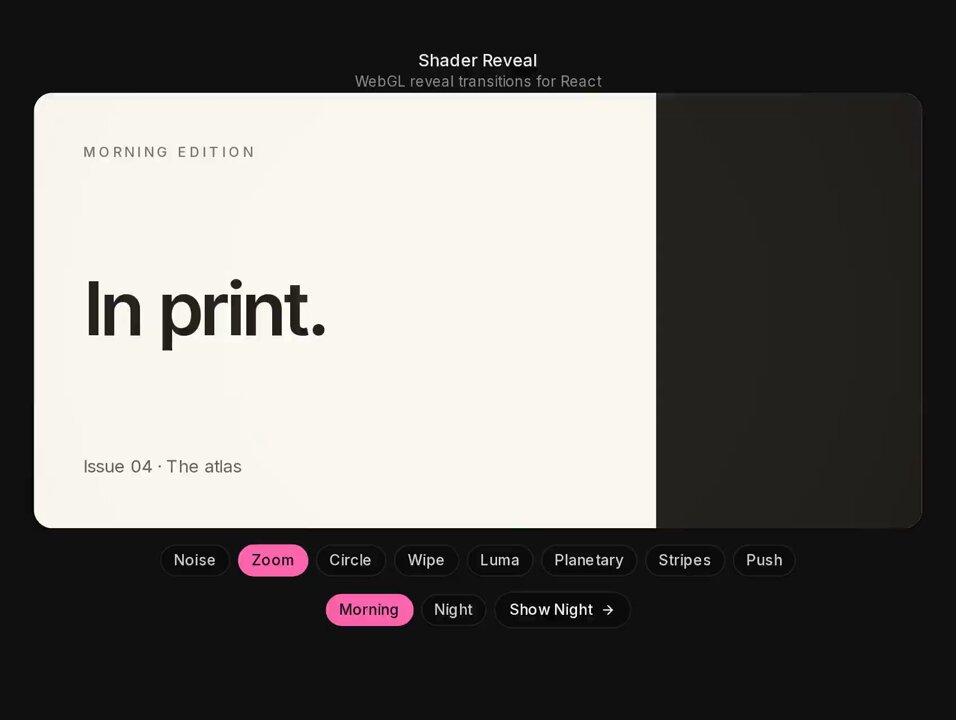
Before building, download the first frame and look at it. If ffmpeg is available, download the clip and extract frames (ffmpeg -i clip.mp4 -vf fps=2 frame-%02d.png), then study the motion frame by frame. Match what you see; the text below describes it, the frames are the truth.

BUILD
A React component that transitions between two content states (example: a "Morning edition" card and a "Night edition" card) with a WebGL shader reveal that covers the whole card. The content is normal React markup; the shader only animates a snapshot overlay and the real content swaps at the midpoint of the transition. Include a pill row to pick one of eight variants (Noise, Zoom, Circle, Wipe, Luma, Planetary, Stripes, Push) and a second row to pick the target state plus a "Show Night ->" button. It should feel smooth, editorial and a little magical.

DESIGN SYSTEM
- Page: near-black #121212, centered column, small title "Shader Reveal" 13px white with a 11px gray #7A7A7A subtitle.
- Card: about 640x300px, radius 14px, overflow hidden. Morning state: background #EFEDE6, text #151515. Night state: background #151515 with a hot pink #FF5FA2 block on the right third, text #F2F2F2.
- Card content: uppercase kicker 10px letter-spacing .2em ("MORNING EDITION"), headline 44px semibold tight tracking ("In print." / "After dark."), small caption 12px at bottom left ("Issue 04 - The atlas").
- Controls: pills 12px, padding 4px 10px, radius 999px, inactive text #BDBDBD on transparent, active #FF5FA2 background with dark text; 6px gaps.

MOTION
- Every variant runs 900ms with cubic-bezier(.65,0,.35,1) on a uniform progress 0 -> 1; the content swaps at progress .5.
- Noise: dissolve thresholded by fbm noise with a soft 0.08 edge.
- Zoom: outgoing texture scales 1 -> 1.3 with radial blur while the new one scales .9 -> 1.
- Circle: radial mask expanding from the clicked control's direction with a 2% feathered edge.
- Wipe: horizontal wipe with a smeared, streaked edge (vertical noise offsets the edge per row) in a mint tint #BFE5D6.
- Luma: reveal ordered by the luminance of the incoming image.
- Planetary: polar-coordinate swirl that twists both textures into pink #FF6FB0 and mint #9FE0C5 bands before resolving.
- Stripes: 12 vertical bands reveal with 30ms stagger.
- Push: old content slides out left as new pushes in, with slight chromatic edge.
- Pills: active state background crossfades 150ms ease-out.

SECTIONS
Parts: title block, card (content layer + canvas overlay), variant pill row, state row (two state pills + action button). States: idle, transitioning (controls disabled, aria-busy), done.

IMPLEMENTATION
WebGL via a tiny wrapper (OGL or raw WebGL2; Three.js is fine if already in the project). Before a transition, rasterize the current and next content into textures (render the next state offscreen, capture both with html-to-image or draw them via a matching canvas layout), place a canvas exactly over the card, run the selected fragment shader with uniforms uProgress, uFrom, uTo, uResolution, uTime, then remove the canvas. Only the overlay is WebGL; the card stays accessible DOM. prefers-reduced-motion: plain 200ms crossfade. Controls are real buttons with aria-pressed and focus-visible rings. Limit DPR to 2 and destroy the GL context when idle.

ADAPT TO THE PROJECT
Reuse the project's existing typography, color tokens and radius scale; map pink and mint to the nearest accent tokens. Use placeholder copy. Do not copy logos, brand names, photos or illustrations from the original.

SUCCESS CHECK
- Each of the eight variants produces a visibly different full-card transition and ends on the correct state.
- The real React content swaps at the midpoint and is selectable and readable after the transition.
- With reduced motion enabled the switch is a simple crossfade.