REFERENCE
- Gallery page: https://magpui.com/en/i/scroll-tour-of-an-ai-site-builder-50ecfc
- First frame (image): https://dnioievkvxejjbxgwvko.supabase.co/storage/v1/object/public/media/scroll-tour-of-an-ai-site-builder-50ecfc/shot.jpg
- Clip (mp4): https://dnioievkvxejjbxgwvko.supabase.co/storage/v1/object/public/media/scroll-tour-of-an-ai-site-builder-50ecfc/clip.mp4
- Original post: https://x.com/LexnLin/status/2116847889511272918 by @LexnLin
Before building, download the first frame and look at it. If ffmpeg is available, download the clip and extract frames (ffmpeg -i clip.mp4 -vf fps=2 frame-%02d.png), then study the motion frame by frame. Match what you see; the text below describes it, the frames are the truth.

BUILD
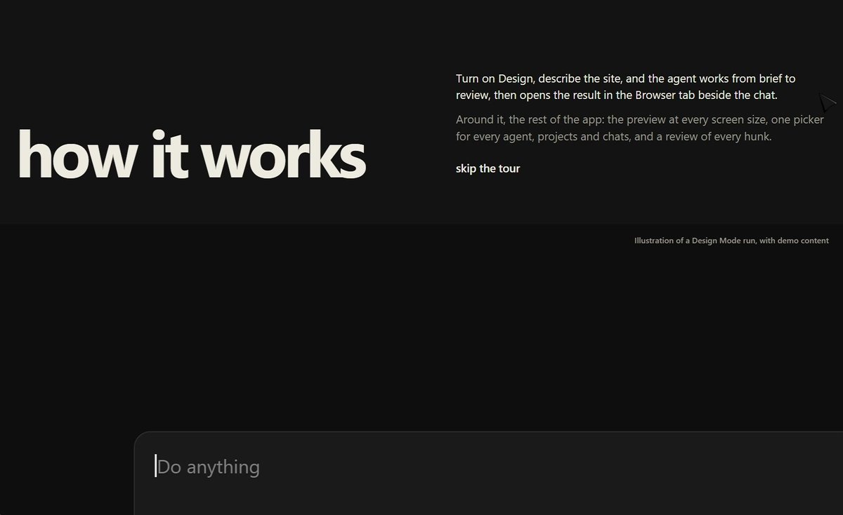
A scroll-driven 'how it works' product tour for an AI app builder. The section is pinned while the user scrolls through five beats: (1) a large 'how it works' heading with a short intro and a 'skip the tour' link sits next to an empty chat composer; (2) the composer slides to the center and grows, and a prompt types itself into it character by character; (3) the prompt is sent: it moves up as a user bubble and an assistant reply streams a checklist of build steps (understanding the request, planning the page, building, reviewing) that tick off one by one, ending with a 'files edited' summary row; (4) a browser-style preview of the generated landing page scales up from the right until it fills the viewport, showing a big centered headline over a dotted halftone wave; (5) the preview shrinks back into a framed app window on the right while a vertical list of features appears on the left (live preview beside the chat, every screen size, any agent one picker, projects and chats, review every hunk); the active item is bright with a 2px left bar and the preview swaps state for each item (desktop to mobile frame, model picker menu open, sidebar of projects, diff view). Calm, precise, very developer-tool.

DESIGN SYSTEM
- Canvas #0B0B0C, panels #141416 with 1px border rgba(255,255,255,.08), radius 14px for the composer and 10px for app windows, shadow 0 30px 80px rgba(0,0,0,.6).
- Type: neutral grotesk sans. Section heading 72-96px weight 600 tracking -0.03em #F2F2F2; preview headline 64px weight 700, two lines, tight leading 0.95; body 14px #8A8A8F; feature list items 18px, inactive at 35% opacity, active 100% with a 13px description below.
- Composer: 560px wide, placeholder 'Do anything', bottom row with a '+' button, two pill toggles (one orange text #F26B3A 'Full access', one neutral 'Design'), a model selector on the right and a round white send button 28px. On focus a faint multicolor glow (pink #FF5CA8 to violet #7B5CFF to green #4BE38A) blurs 24px around the border.
- Halftone wave: rows of white dots 1.5-3px, sizes driven by a sine field, fading to transparent at the top.
- Small grey caption top right 11px: 'Illustration of the product with demo content'.

MOTION
- Pin the section for about 500vh; map scroll progress 0-1 to a single timeline (scrub 0.6).
- Beat 1 to 2: composer translate to center and scale 1 to 1.35, 0-0.12, cubic-bezier(.22,1,.36,1); heading fades and moves -40px.
- Typing: reveal prompt characters across 0.12-0.22 of progress (stepwise, caret blinking 500ms when idle).
- Send: bubble moves up 120px and fades into the thread, 0.22-0.26; checklist rows appear with 60ms stagger, each check icon scales 0.6 to 1 cubic-bezier(.34,1.56,.64,1) over 240ms.
- Preview zoom: clip-path inset from 30% to 0 and scale 0.55 to 1, 0.36-0.5, cubic-bezier(.65,0,.35,1); halftone dots animate continuously (wave phase +0.6 rad/s).
- Shrink to window: scale 1 to 0.62 and translateX 18vw, 0.5-0.58; feature list slides in from -24px with 80ms stagger.
- Feature steps: each item owns 8% of progress; active bar moves with a 300ms ease, preview content crossfades 250ms (opacity and 8px y).

SECTIONS
- Intro: heading, intro paragraph, skip link, idle composer.
- Prompt typing and send.
- Agent build log with ticking steps and summary row (edited files count, green +lines, red -lines, Undo and Review buttons).
- Full-screen generated landing preview (nav with logo and GitHub link, headline, subcopy, primary 'Download' and secondary 'View on GitHub' buttons, halftone wave, 'Scroll to build mode' pill).
- Split view: feature list left, framed app window right with chat and live preview.

IMPLEMENTATION
- GSAP ScrollTrigger with one pinned timeline is the best fit for many scrubbed beats; Motion's useScroll + useTransform also works in React. Draw the halftone wave on a single canvas (requestAnimationFrame, devicePixelRatio aware, paused when offscreen).
- Make the feature list real buttons: clicking an item scrolls to its step; arrow keys move between items; visible focus ring 2px white at 40%.
- prefers-reduced-motion: no pinning, show the five beats as static stacked panels with final states, no typing.
- Keep everything transform and opacity based; avoid animating width/height; target 60fps on a mid laptop.

ADAPT TO THE PROJECT
Reuse the project's existing design tokens, fonts and components (buttons, inputs, window chrome), mapping the colors above to the closest tokens. Do not copy any logos, brand names or product screenshots from the original; use placeholder product name, placeholder prompt text and mock UI.

SUCCESS CHECK
- Scrolling down plays all five beats in order and scrolling up reverses them cleanly with no jumps.
- Each feature item swaps the preview state and is reachable by keyboard.
- With reduced motion enabled the section is a static, readable sequence with no pinning.