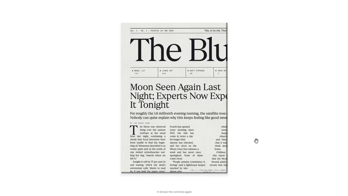
REFERENCE
- Gallery page: https://magpui.com/en/i/newspaper-where-text-reflows-around-art-587c03
- First frame (image): https://dnioievkvxejjbxgwvko.supabase.co/storage/v1/object/public/media/newspaper-where-text-reflows-around-art-587c03/shot.jpg
- Clip (mp4): https://dnioievkvxejjbxgwvko.supabase.co/storage/v1/object/public/media/newspaper-where-text-reflows-around-art-587c03/clip.mp4
- Original post: https://x.com/kshvbgde/status/2116270360417243293 by @kshvbgde
Before building, download the first frame and look at it. If ffmpeg is available, download the clip and extract frames (ffmpeg -i clip.mp4 -vf fps=2 frame-%02d.png), then study the motion frame by frame. Match what you see; the text below describes it, the frames are the truth.

Inspired by "The Blue Hour", an original piece by keshav (@kshvbgde) on X: https://x.com/kshvbgde/status/2116270360417243293 . Credit him in a small caption or the page footer.

BUILD: Build a playful broadsheet newspaper page called "The Blue Hour" whose stories are gentle absurd news (a moon sighting, a bath duck finishing a lap of the Pacific, a balloon from a 1994 birthday still rising). The star of the piece: cobalt-blue, pixel-dithered illustrations (a moon, a cluster of balloons, a rubber duck, a round star chart, moon phases) appear inside the text columns, and the justified body text reflows in real time around each illustration's exact silhouette, not its bounding box. It should feel like printed paper that is quietly alive.

DESIGN SYSTEM: Paper background #efede6 with a very faint grain; ink #141414; one accent cobalt #2b35c9 (dither dots range #1e2aa8 to #8f97e8). Masthead: a high-contrast display serif at about 88px, centered, with the "o" of "Hour" replaced by a small dithered moon; thin double rules (1px + 3px, 4px apart) above and below with tiny uppercase metadata (volume, date, price) at 10px letter-spaced 0.08em. Headlines in the same serif at 28-34px, line-height 1.05; decks at 13px italic; body text a readable text serif at 11-12px, justified with hyphenation, line-height 1.35, drop caps 3 lines tall. Grid: 12 columns, 16px gutters, max width 1200px, stories span 3-6 columns separated by 1px hairline column rules #c9c6bc. Sections: "The Week in Moons" row of 7 dithered moon phases, "How to Look Up: A Beginner's Guide", "Classifieds", "A Letter from the Printer".

MOTION: (1) Load: masthead and rules fade in 400ms cubic-bezier(0.22,1,0.36,1), then columns fill top to bottom with lines staggered 8ms. (2) Illustration reveal: each illustration starts as a few large blue pixels that resolve into finer dither over 900ms (step the dither cell size 16 > 8 > 4 > 2px), while its scale grows from 0.6 to 1 with cubic-bezier(0.34,1.56,0.64,1); on every frame the text around it is re-laid out so lines shorten and wrap around the shape. (3) Idle: balloons bob 6px on a 3s sine, the duck drifts 10px left and right over 6s, the star chart rotates 1 turn per 90s; text keeps reflowing smoothly with them. (4) Hover on an illustration: it grows 8% over 300ms and the text makes room. (5) Scroll: new sections reveal with the same pixel-resolve as they enter the viewport (IntersectionObserver, threshold 0.3).

SECTIONS: Masthead with metadata rules; lead story spread with two headlines and columns; illustrated story columns (moon, balloons, duck, star chart); "A Letter from the Printer" and balloon story; "The Week in Moons" phase strip; "How to Look Up" guide with a large star chart; Classifieds column; footer rule with credits.

IMPLEMENTATION: Use the pretext text-measurement approach (the open-source pretext library by @_chenglou, or your own canvas measureText line breaker) to lay out each column line by line: for each line, compute the free horizontal span(s) left after subtracting the illustration silhouette at that y, then fill words into those spans; render lines as absolutely positioned DOM spans so text stays selectable and accessible. Silhouettes come from each illustration's alpha mask sampled per line height. Illustrations are drawn on small canvases with an ordered Bayer dither in the accent blue. Re-layout only the columns whose obstacles moved, throttle to 60fps, cache word widths. prefers-reduced-motion: show illustrations fully resolved, no bobbing, layout computed once. Keep the article text in semantic article/h2/p in the DOM order for screen readers.

ADAPT TO THE PROJECT: Reuse the project's existing design tokens, components and fonts (map ink, paper and accent to the closest tokens), keep your own headlines and copy, never copy logos, brand names or illustrations from the original; draw your own dithered placeholder shapes.

SUCCESS CHECK:
- When an illustration grows or bobs, adjacent lines visibly change length and wrap around its real outline, with no overlap and no layout jump.
- Illustrations resolve from coarse pixels to fine dither on load and when scrolled into view.
- Text stays selectable, readable by screen readers, and the page holds 60fps on a laptop.