REFERENCE
- Gallery page: https://magpui.com/en/i/mac-planner-landing-with-fuzzy-mascot-855852
- First frame (image): https://dnioievkvxejjbxgwvko.supabase.co/storage/v1/object/public/media/mac-planner-landing-with-fuzzy-mascot-855852/shot.jpg
- Clip (mp4): https://dnioievkvxejjbxgwvko.supabase.co/storage/v1/object/public/media/mac-planner-landing-with-fuzzy-mascot-855852/clip.mp4
- Original post: https://x.com/soltwagner/status/2117225530345013494 by @soltwagner
Before building, download the first frame and look at it. If ffmpeg is available, download the clip and extract frames (ffmpeg -i clip.mp4 -vf fps=2 frame-%02d.png), then study the motion frame by frame. Match what you see; the text below describes it, the frames are the truth.

ASSETS
This needs real artwork, not shapes drawn in code. Use the files the user gives you (ask where they are). If you have an image generation tool, generate them with these prompts; otherwise leave clearly marked placeholders.
- Fuzzy red plush mascot: A round fuzzy plush creature made of long soft red fur (#E3241B), two simple white oval eyes, two small rounded ears on top, no mouth, soft studio lighting with gentle shadows inside the fur, 3D render, centered, front view and a version peeking with only the top half visible, transparent background, 1:1

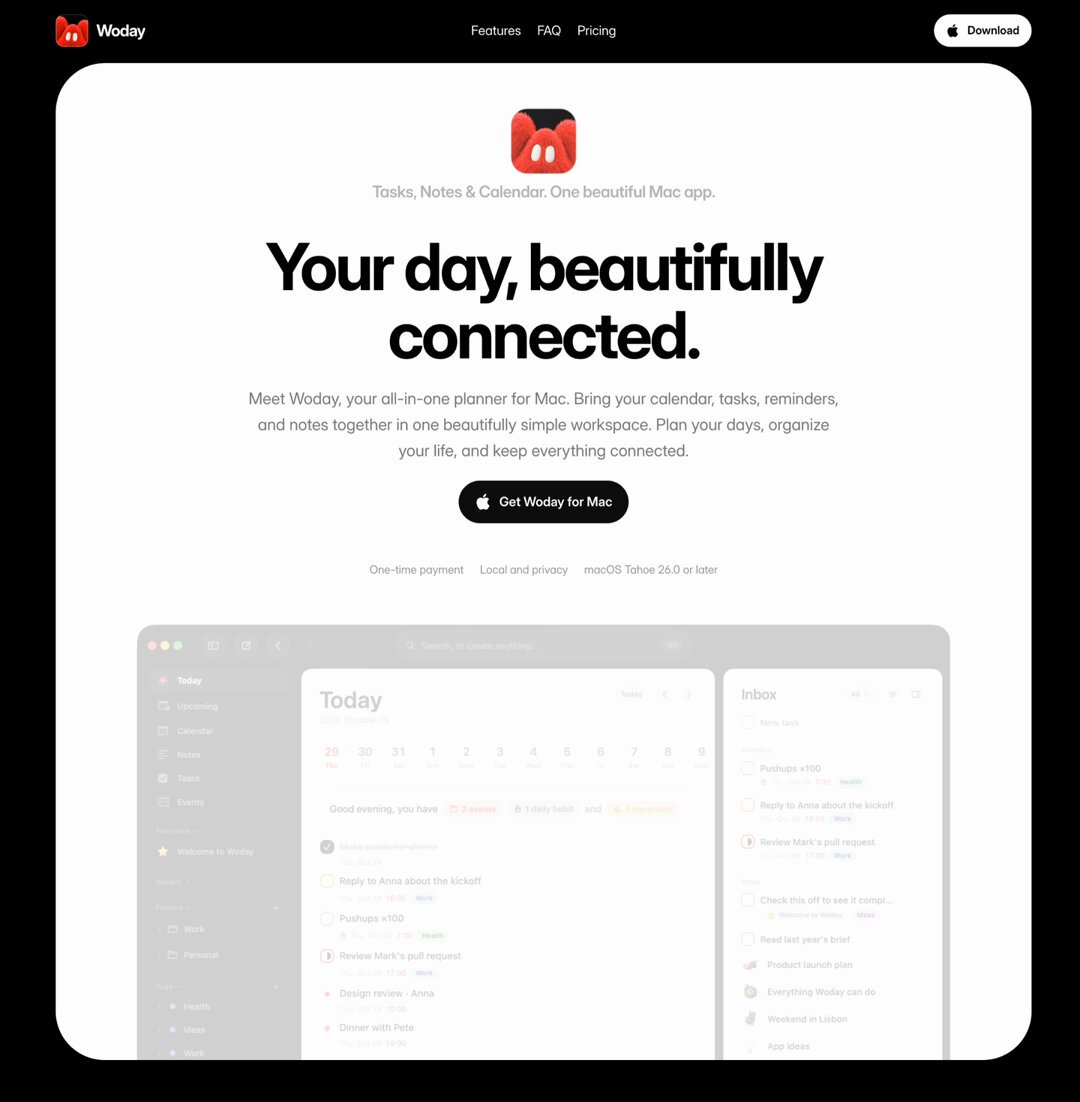
BUILD: A complete landing page for a desktop planner app (calendar, tasks and notes in one). The page body is pure black and every section is a large rounded white panel, inset from the viewport edges, so the site reads like a stack of bright cards floating on black. Real product screenshots of the app windows (macOS-style window chrome with traffic lights, sidebar, Today/Upcoming/Calendar/Tasks/Notes views) carry the story, and a fuzzy red plush mascot (a round furry creature with two white oval eyes, ears or tufts on top) peeks over the top edge of the screenshots and sits next to feature headings, adding warmth to an otherwise calm, Apple-like page.

DESIGN SYSTEM: Page background #000000. Panels #FFFFFF (some #F5F5F7), radius 40px on desktop (24px on mobile), side inset 48px from the viewport (16px mobile), 16-24px vertical gap between panels, no shadows. Max content width inside panels 1040px. Type: a neo-grotesk sans (SF Pro / Inter-like). Hero headline 72-84px, weight 700, letter-spacing -0.035em, line-height 1.02, #0A0A0A, centered on two lines. Section headings 44-52px weight 700, left-aligned, two lines. Eyebrow above headings 13px weight 500 #8E8E93. Body 17-19px #6E6E73 line-height 1.5, max-width 560px. Feature chips: 13px text, #F2F2F4 fill, radius 999px, padding 6px 12px, 8px gap, wrapping rows. Primary button: #0A0A0A pill, white 15px weight 600 label with an apple glyph, height 44px, padding 0 20px. Header: sits on the black outside the first panel, 64px tall, small red app icon plus white wordmark left, centered links (Features, FAQ, Pricing) 14px white, a white pill Download button right. Accent red #E3241B (mascot, today marker, small status dots); tag colors in screenshots: green #34C759, orange #FF9F0A, purple #AF52DE at low opacity.

MOTION: Hero: app icon, tagline, headline, body, button and meta line rise 16px and fade in with 80ms stagger, 700ms cubic-bezier(0.16, 1, 0.3, 1). Hero screenshot: starts at opacity 0.35 and translateY 40px, scales from 0.96 to 1 and reaches full opacity as it scrolls into the middle of the viewport (scroll-linked, from 'top bottom' to 'center center'). Section panels: each panel's content fades up 24px over 600ms cubic-bezier(0.22, 1, 0.36, 1) when 20% visible; screenshots inside follow 120ms later. Mascot: idles with a gentle bob (translateY 0 to -6px, 2.4s ease-in-out, infinite) and a 3 degree tilt toward the pointer; when its section enters, it pops up from behind the screenshot edge (translateY 60% to 0, 700ms cubic-bezier(0.34, 1.56, 0.64, 1)). FAQ rows expand with height auto animation 300ms cubic-bezier(0.4, 0, 0.2, 1) and a rotating plus icon. Header stays fixed, no background change.

SECTIONS: 1) Fixed header on black. 2) Hero panel: small red app icon 64px radius 14px, grey tagline, two-line headline, body paragraph, black pill CTA, a row of three small grey meta items (one-time payment, local and private, OS version), then a wide app screenshot (Today view with week strip, greeting line with colored count chips, task list and an Inbox column) cropped by the panel bottom. 3) Black band with a centered white 26px weight 600 statement paragraph. 4) 'Everything you need, together' panel: centered heading, short body, a row of chips, then an Upcoming + Inbox screenshot. 5) Calendar panel: text left (eyebrow, heading, body, chips) and a calendar week screenshot right, mascot in the lower left corner. 6) Tasks panel: same split, mascot peeking over the screenshot's top edge. 7) Notes panel: heading left, a note-document screenshot with a cover photo on the right. 8) Quick launcher panel: a dark command palette screenshot with a search field and results. 9) Pricing panel: 'One price' heading and a centered single price card (big price, struck-through old price, short feature checklist, black CTA), mascot sitting on top of the card. 10) FAQ on black: heading and question left, white rounded question rows right. 11) Footer on black: app icon, tagline, Download button, three link columns (Menu, Navigation, More products), and a large cropped mascot rising from the bottom edge.

IMPLEMENTATION: Plain HTML/CSS or the project's framework with Motion (or GSAP ScrollTrigger) for the reveals and the scroll-linked hero screenshot; use IntersectionObserver for one-shot reveals. Screenshots are responsive images (AVIF/WebP, 2x) with loading='lazy' below the fold. prefers-reduced-motion: show everything at its final state, keep only opacity fades of 200ms, stop the mascot bob. All buttons and FAQ rows are real buttons with visible 2px focus rings (#0A66FF, offset 2px) and aria-expanded on FAQ rows. Keep animations on transform and opacity only.

ADAPT TO THE PROJECT: Reuse the project's existing design tokens, typography, buttons and accordion components; map the colors to the closest existing tokens. Never copy the original logo, brand name, mascot artwork or screenshots: use your own product screenshots or neutral placeholders and a generated mascot.

SUCCESS CHECK:
- Every section is a rounded white panel inset on a black page, with the header and footer living on the black.
- The hero screenshot grows from 0.96 to 1 scale and full opacity as it scrolls into view, and section contents fade up once.
- The mascot peeks over at least three screenshots and pops up when its section enters, with no motion under prefers-reduced-motion.