REFERENCE
- Gallery page: https://magpui.com/en/i/jelly-square-loading-indicator-60e6a4
- First frame (image): https://dnioievkvxejjbxgwvko.supabase.co/storage/v1/object/public/media/jelly-square-loading-indicator-60e6a4/shot.jpg
- Clip (mp4): https://dnioievkvxejjbxgwvko.supabase.co/storage/v1/object/public/media/jelly-square-loading-indicator-60e6a4/clip.mp4
- Original post: https://x.com/sashabirukoff/status/2114012286469992743 by @sashabirukoff
Before building, download the first frame and look at it. If ffmpeg is available, download the clip and extract frames (ffmpeg -i clip.mp4 -vf fps=2 frame-%02d.png), then study the motion frame by frame. Match what you see; the text below describes it, the frames are the truth.

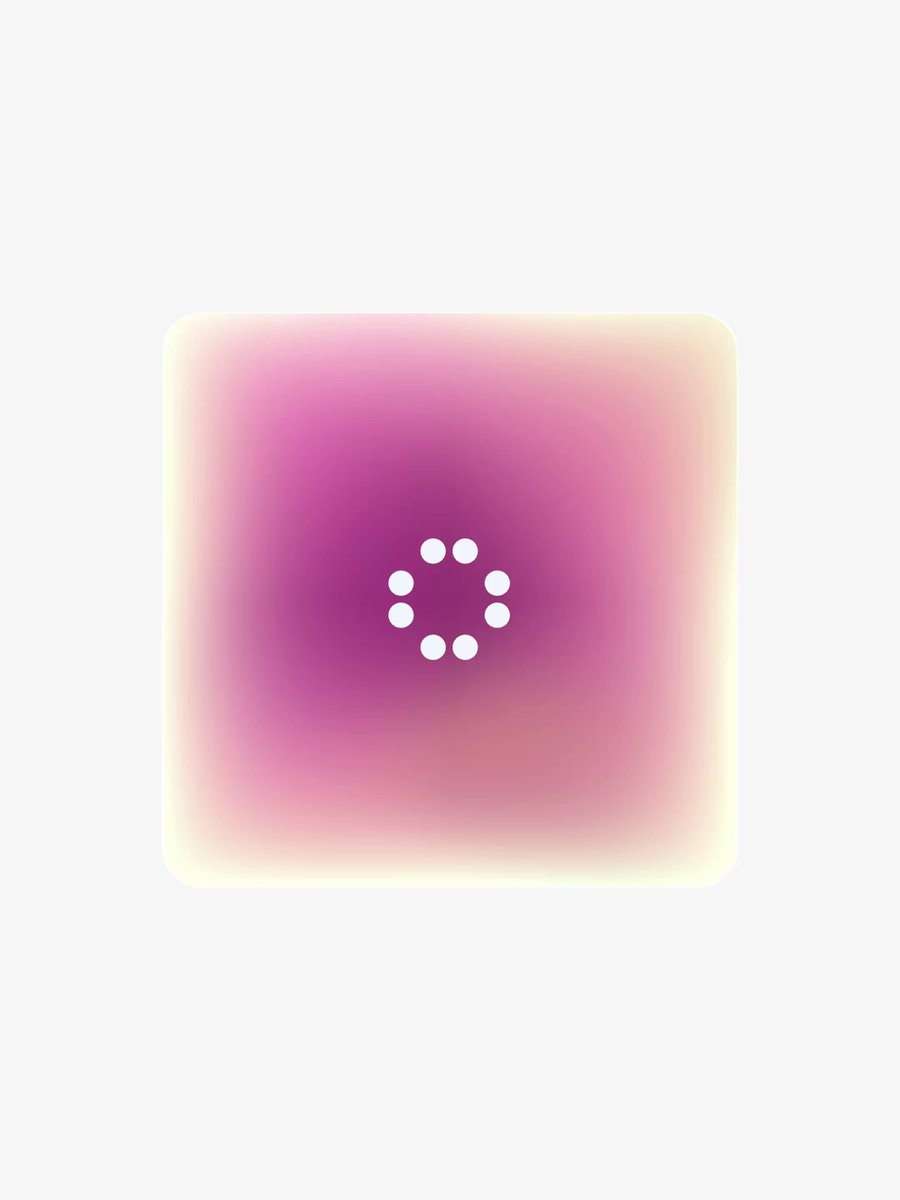
BUILD: Build an isolated loading indicator: a white dotted spinner centered inside a soft pink and cream jelly square on a nearly white canvas. No page chrome.
DESIGN SYSTEM: Estimate a 220px square with 22px softened corners; use layered radial gradients from #973287 at center through #df91b7 to #fff5ce at the edges, with 12px blur. Canvas #fafafa. Center a 40px ring of ten white 7px dots. No text.
MOTION: On loading, rotate the dot ring over 1000ms linearly using cubic-bezier(0,0,1,1). Gently deform the outer square with scaleX 0.97–1.03, scaleY 1.03–0.97 and rotation -2 to 2 degrees over a proposed 1800ms alternating loop, cubic-bezier(0.45,0,0.55,1); these timings are implementation estimates. Keep dots crisp and independent of the blur.
SECTIONS: Loading surface, diffuse colored core, pale border glow, centered dotted spinner; hide the whole indicator when loading ends.
IMPLEMENTATION: Use CSS gradients and Motion transforms for the soft wobble; avoid full-screen filters. No interactive focus target; expose role=status with an accessible loading label. With prefers-reduced-motion show the static dotted ring.
ADAPT TO THE PROJECT: Reuse existing project tokens, components and fonts; map these estimated colors to the closest tokens. Never copy logos, brand names, photos or illustrations; use placeholders.
SUCCESS CHECK:
- Component remains usable at 320px viewport width.
- Motion matches the described states without layout shifts.
- Reduced-motion and keyboard paths work.