REFERENCE
- Gallery page: https://magpui.com/en/i/isometric-macro-pad-hero-7c5eee
- First frame (image): https://dnioievkvxejjbxgwvko.supabase.co/storage/v1/object/public/media/isometric-macro-pad-hero-7c5eee/shot.jpg
- Clip (mp4): https://dnioievkvxejjbxgwvko.supabase.co/storage/v1/object/public/media/isometric-macro-pad-hero-7c5eee/clip.mp4
- Original post: https://x.com/DilaneKombou/status/2117904533523488803 by @DilaneKombou
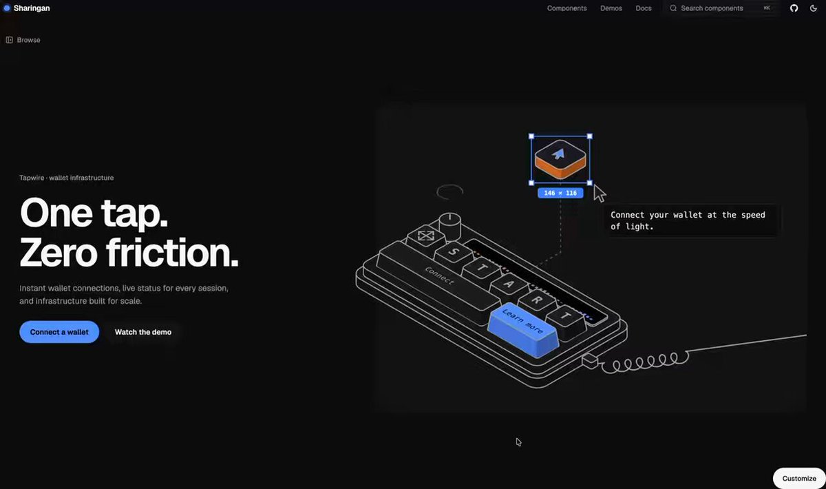
Before building, download the first frame and look at it. If ffmpeg is available, download the clip and extract frames (ffmpeg -i clip.mp4 -vf fps=2 frame-%02d.png), then study the motion frame by frame. Match what you see; the text below describes it, the frames are the truth.

BUILD: A landing hero with a split layout: a bold two-line headline, short subline and two buttons on the left, and on the right an interactive isometric line-art macro pad that is the product metaphor. The pad has a row of keycaps spelling a word (S T A R T), a wide "Connect" bar key, a small knob and an icon key, a thin LED strip, a coiled cable trailing off to the right edge and one big accent key labelled "Learn more" that is a real link. Above it floats a single orange-and-white tile with an arrow glyph, tethered to the pad by a dashed line. A fake design-tool cursor flies in, selects the floating tile with a blue selection box and handles and a size badge (e.g. "146 x 116"), and a mono tooltip types a one-line tagline next to it. Visitors can hover keys to press them and type the word on their keyboard to "connect" the deck. It should feel crafted, calm and a bit nerdy, like a technical drawing that comes alive.

DESIGN SYSTEM: Two columns on desktop (text about 40%, illustration about 60%, vertically centered), 24px page gutters. The illustration sits in a softly rounded panel (radius 16px) a shade lighter than the page: dark theme page #0B0B0C, panel #161618; light theme page #FFFFFF, panel #EFEFEF. Headline in a heavy grotesk sans, about 64px, line-height 1.0, tracking -0.03em, white (#FFFFFF) on dark or near-black (#0D0D0D) on light; small eyebrow above it at 12px muted (#8A8A8E); subline 15px muted, max 44ch. Primary button: pill, 40px tall, #3B6CF6 fill, white 14px medium label; secondary: same size, ghost on dark, light gray fill #E6E6E6 on light. Illustration: SVG in true isometric projection (30 degrees), 1.25px strokes in #D9D9D9 on dark or #1A1A1A on light; keycap tops filled #1E1E20 (dark) or #F7F7F7 (light) with a darker side face; keycap letters in a monospace 13px; accent key filled #3B6CF6 with a lighter top #5B86FF; floating tile top #F2F2F2 with #E8692C sides. Selection box 1px #3B6CF6 with 6px white square handles, badge 11px mono white on #3B6CF6, radius 3px. Tooltip: #111 panel with 1px #2A2A2A border, 12px mono text.

MOTION: Intro (on mount, after 300ms): the pad draws in with stroke-dashoffset from 0 to full over 900ms cubic-bezier(0.65,0,0.35,1), faces fade in 300ms after their strokes complete, stagger 40ms per key. The floating tile bobs up and down 6px on a 3.2s loop cubic-bezier(0.37,0,0.63,1). The fake cursor travels in on a curved path over 700ms cubic-bezier(0.22,1,0.36,1), pauses 200ms, then the selection box scales from 0.9 to 1 with opacity 0 to 1 in 180ms and the size badge pops in under it; the tooltip types its tagline at 28ms per character with a blinking caret. Key press on hover or keydown: keycap top translates 3px down along the isometric vertical in 90ms cubic-bezier(0.3,0,0.2,1), side face shrinks to match, release springs back in 220ms with a tiny 1px overshoot; the matching LED segment lights blue. When the full word is typed in order, the keys flash in sequence (60ms stagger), the LED strip sweeps left to right in 500ms, the tooltip text swaps to a connected label with a small check, and a loading ring above the pad spins once and resolves into a dot. Theme switch cross-fades colors in 250ms.

SECTIONS: Left column: eyebrow, headline (two lines), subline, primary and secondary buttons. Right panel: macro pad with keys (idle, hover-pressed, typed-correct, typed-wrong with a 120ms 2px shake), accent link key (hover lifts 2px, focus ring), floating tile with tether and selection box, typed tooltip, coiled cable running to the panel edge, small loading ring. States for the deck: idle, intro, interacting, connected.

IMPLEMENTATION: DOM plus inline SVG with CSS 3D-free isometric math (precompute each key's top and side polygons from a grid so press depth is just a translate along the iso axis); animate with Motion (or plain CSS transitions) and drive the stroke draw-in with pathLength. Keep the headline, tagline and key labels as real text. Listen for keydown on the document only while the hero is in view; ignore inputs inside form fields. Accent key is an <a> with a visible focus ring; pressed keys are aria-hidden decorations, with an aria-live region announcing the connected state. prefers-reduced-motion: render the final state (pad drawn, selection visible, tagline complete), no bobbing, presses become instant color changes. Expose props for eyebrow, headline, subline, ctas, keyCta, the word to spell, tagline and connected label; support a ?motion=final style flag for a still frame.

ADAPT TO THE PROJECT: Reuse the project's existing design tokens, fonts and button components, map the blue and orange accents to the closest existing tokens, support the project's dark and light themes, and never copy logos, brand names or product copy from the original; use placeholder text.

SUCCESS CHECK:
- On load the pad draws in, the cursor selects the floating tile and the tagline types out, all within about 3 seconds.
- Hovering or typing the letters presses the matching keys, and typing the full word triggers the connected state with an aria-live announcement.
- With prefers-reduced-motion the hero shows the finished still frame and every key and link stays usable by keyboard.