REFERENCE
- Gallery page: https://magpui.com/en/i/exposure-dial-with-sliding-ticks-f4f9a7
- First frame (image): https://dnioievkvxejjbxgwvko.supabase.co/storage/v1/object/public/media/exposure-dial-with-sliding-ticks-f4f9a7/shot.jpg
- Clip (mp4): https://dnioievkvxejjbxgwvko.supabase.co/storage/v1/object/public/media/exposure-dial-with-sliding-ticks-f4f9a7/clip.mp4
- Original post: https://smoothui.dev/docs/components/exposure-slider by Edu Calvo
Before building, download the first frame and look at it. If ffmpeg is available, download the clip and extract frames (ffmpeg -i clip.mp4 -vf fps=2 frame-%02d.png), then study the motion frame by frame. Match what you see; the text below describes it, the frames are the truth.

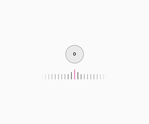
BUILD: Build a compact exposure adjustment control: a horizontal draggable ruler beneath a circular signed-number readout. Keep the center needle fixed while the ruler moves behind it; the surface should feel quiet and precise.

DESIGN SYSTEM: Use a roughly 260px-wide control on an off-white #f8faf8 surface. Place a 72px circular readout above a 40px-tall ruler with 12px spacing. Use a neutral sans-serif, 16px medium numerals, gray #a5aaa5 ticks, a 2px pink #ed70b1 center needle and a fine matching arc around the circle. Fade the outer 35px of each ruler edge with a mask. Increase tick height toward the active center.

MOTION: On pointer drag, translate the ruler horizontally with direct pointer tracking and update the signed readout, including a neutral 0 state. Animate tick height and opacity by distance from the center over approximately 120ms, cubic-bezier(0.2,0.8,0.2,1). On release, snap to the closest step over 260ms, cubic-bezier(0.22,1,0.36,1). Smooth the circular progress arc over 180ms without delaying the accessible numeric value.

SECTIONS: Neutral: centered zero and gray ring. Adjusting: sliding tick strip, pink signed number and ring arc. Released: aligned step. Focused: visible focus outline without shifting layout.

IMPLEMENTATION: Use the installable component source from the original source link through its shadcn-compatible registry, keeping the project in control of the code. Use React, Motion motion values and transforms for the ruler; SVG for the ring. Keep updates off the React render path during dragging. Implement role slider with a configurable signed range and step; support Arrow keys, Home and End. Use pointer capture. Under prefers-reduced-motion, remove spring smoothing and snap immediately. No WebGL is needed.

ADAPT TO THE PROJECT: Reuse the existing design tokens, components and fonts. Map colors to the closest existing tokens. Never copy logos, brand names, photographs or illustrations from the source; use project-owned placeholders.

SUCCESS CHECK:
- Closed, active and completed states match the described component without adding a full page.
- Pointer, touch and keyboard interaction work with visible focus and correct accessible state.
- Reduced-motion mode remains usable and no content jumps or clips at mobile widths.