REFERENCE
- Gallery page: https://magpui.com/en/i/dot-matrix-download-progress-card-3db5d8
- First frame (image): https://dnioievkvxejjbxgwvko.supabase.co/storage/v1/object/public/media/dot-matrix-download-progress-card-3db5d8/shot.jpg
- Clip (mp4): https://dnioievkvxejjbxgwvko.supabase.co/storage/v1/object/public/media/dot-matrix-download-progress-card-3db5d8/clip.mp4
- Original post: https://x.com/RaminNasibov/status/2115540373762150529 by @RaminNasibov
Before building, download the first frame and look at it. If ffmpeg is available, download the clip and extract frames (ffmpeg -i clip.mp4 -vf fps=2 frame-%02d.png), then study the motion frame by frame. Match what you see; the text below describes it, the frames are the truth.

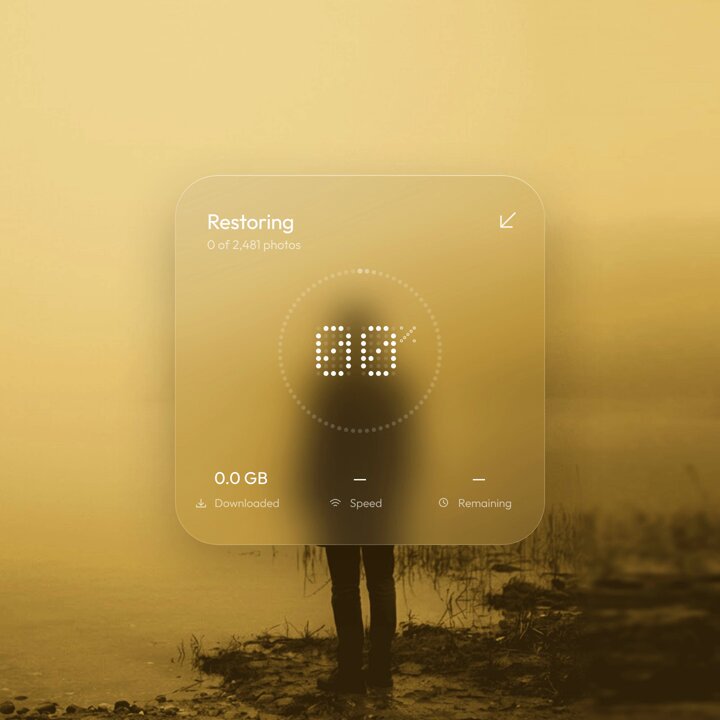
BUILD: A photo restore/download progress card. A square frosted glass card floats over a full-bleed warm photo. Top left: a title "Restoring" and a small subline "312 of 1,240 photos"; top right a small diagonal arrow icon button to collapse. In the center a large percentage made of dot-matrix digits (each digit drawn from a 5x7 grid of round dots) with a small % sign, surrounded by a ring of tiny dots that lights up clockwise as progress grows, with a brighter glowing head dot at the leading edge. Bottom row: three stats with small icons and labels: downloaded size, speed and time remaining. When it reaches 100% the title becomes "Restored", the digits dissolve and the dots regroup into a dotted check mark, speed reads "Idle" and remaining reads "Done". It should feel calm, tactile and precise, like a premium camera app.

DESIGN SYSTEM: Card 320x320px, radius 28px, background rgba(255,245,215,0.18) with backdrop-filter blur(24px) saturate(140%), 1px border rgba(255,255,255,0.35), soft shadow 0 20px 60px rgba(80,50,0,0.25). Padding 22px. Title 15px medium sans #FFFFFF, subline 11px rgba(255,255,255,0.6). Digits: dot size 4px, gap 2px, color #FFFFFF at 95%, inactive grid dots at 12% white, digit height about 44px. Ring: 64 dots of 3px on a 150px circle, inactive rgba(255,255,255,0.18), active #FFFFFF, head dot 5px with glow 0 0 8px #FFF. Stats: value 13px #FFFFFF tabular numbers, label 10px rgba(255,255,255,0.55) with 10px line icons. Background photo warm mustard tones around #D9B45A to #6B4E1F.

MOTION: Progress updates every 120ms in demo mode. Ring: each newly active dot fades from 18% to 100% opacity over 160ms ease-out, the head dot moves with a 1.15 scale pulse. Digits: when a digit changes, its dots switch individually with a 12ms stagger from top to bottom, each dot scaling 0.6 to 1 over 140ms cubic-bezier(0.22,1,0.36,1). Stats count with tabular numbers, no jumps in width. Completion: digit dots fly to check-mark positions over 520ms cubic-bezier(0.65,0,0.35,1) with 8ms stagger, ring finishes and glows once (opacity pulse 300ms), title crossfades over 200ms.

SECTIONS: Header (title, subline, collapse button); dot-matrix percentage; dotted progress ring; stats row (downloaded, speed, remaining). States: idle 0%, in progress, paused (ring head stops pulsing), done (check mark), error (ring dots turn soft red).

IMPLEMENTATION: React with Motion for the dot transitions, the dot grid as SVG circles from a digit bitmap map (0-9, %, check). Ring as SVG circles positioned with trig. Expose a progress prop 0-1 and status. Use role="progressbar" with aria-valuenow and an aria-live polite label for done. prefers-reduced-motion: switch digits instantly and fill the ring without stagger. Keep under 300 SVG nodes and animate only opacity and transform.

ADAPT TO THE PROJECT: Reuse the project's existing design tokens, components, icons and fonts, map colors to the closest existing tokens, and never copy logos, brand names or photos from the original; use a placeholder photo.

SUCCESS CHECK:
- The percentage is drawn with dot-matrix digits and changes dot by dot as progress grows.
- The dotted ring fills clockwise with a glowing head dot in sync with the number.
- At 100% the digits morph into a dotted check mark and the stats read Idle and Done.