REFERENCE
- Gallery page: https://magpui.com/en/i/candy-pack-widget-store-999e35
- First frame (image): https://dnioievkvxejjbxgwvko.supabase.co/storage/v1/object/public/media/candy-pack-widget-store-999e35/shot.jpg
- Clip (mp4): https://dnioievkvxejjbxgwvko.supabase.co/storage/v1/object/public/media/candy-pack-widget-store-999e35/clip.mp4
- Original post: https://x.com/24QWapp/status/2112507370496741468 by @24QWapp
Before building, download the first frame and look at it. If ffmpeg is available, download the clip and extract frames (ffmpeg -i clip.mp4 -vf fps=2 frame-%02d.png), then study the motion frame by frame. Match what you see; the text below describes it, the frames are the truth.

ASSETS
This needs real artwork, not shapes drawn in code. Use the files the user gives you (ask where they are). If you have an image generation tool, generate them with these prompts; otherwise leave clearly marked placeholders.
- Original candy-packet artwork: Front-facing candy pouch illustration for a playful mobile widget store, shiny magenta and violet wrapper with crimped horizontal seams, original smiling star-shaped candy creature surrounded by abstract sparkles, bright white highlights and rounded decorative shapes, no logos or existing characters, leave a quiet area for a short product label, soft studio lighting, crisp kawaii collectible packaging, portrait 4:5 aspect ratio, transparent or plain background, isolated object.

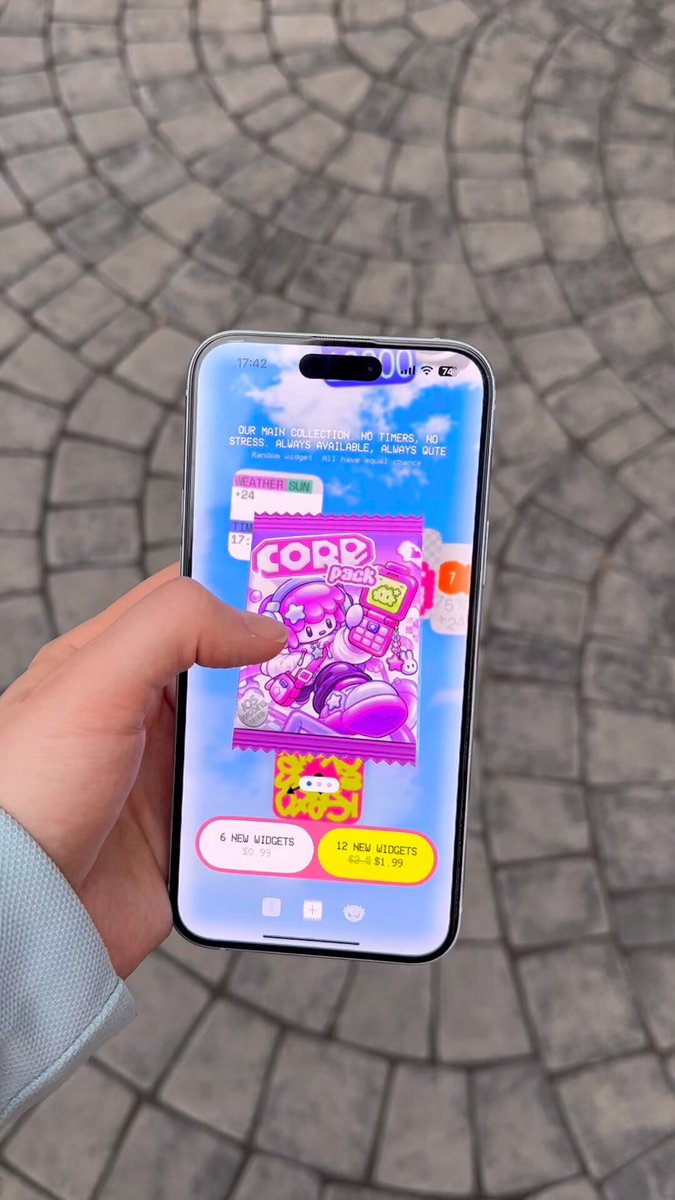
BUILD: Build a mobile widget-store component with a collectible candy-packet presentation. A tall magenta packet sits in the foreground over a sky-blue field of floating, rounded widget previews. Keep it tactile, colorful and deliberately playful. Rebuild only the app component, not the filmed hand, phone hardware or pavement.
DESIGN SYSTEM: Target a 390px-wide mobile viewport with 20px side gutters. Use a blue-to-pale-lilac background, approximately #55BCFF to #CED5FF, with small white cloud-like accents. Center a roughly 235 by 290px product packet with crimped top and bottom edges, hot pink #F236DB and violet #9B3BFF artwork, white chunky rounded display lettering around 30px, and a soft violet shadow, 0 14px 26px #6F48A63D. Behind it, position square and rectangular preview tiles, 64-100px across, with 18px radii; use coral, purple, yellow and blue faces with oversized numerals. Beneath the packet, show two compact pill actions, one pale pink with dark text and one yellow #FFF23D, around 42px high. Keep small navigation icons along the bottom and a generous safe-area inset. Use rounded sans-serif UI labels at 12-14px and bold condensed numerals in previews. All measurements and colors are rebuild estimates.
MOTION: The visible background previews shift position around the central packet. Recreate this as a gentle 8-14px vertical drift with slight 2deg rotation, 2800-4000ms alternating loops, 180ms phase offsets, cubic-bezier(0.45,0,0.55,1). Keep the packet visually dominant and largely stable. Suggested interaction feedback: action press scales to 0.97 over 100ms, cubic-bezier(0.2,0,0,1), then returns over 180ms. These timings are implementation targets rather than measured source timings.
SECTIONS: A full-height blue store stage; decorative widget preview layer; foreground packet illustration with a short generic bundle label; two pill actions; a minimal bottom navigation row. Idle shows the complete composition. Pressed controls retain readable labels. Keyboard focus uses a clear dark outline. Do not invent an unseen checkout flow; wire the primary action to the existing project purchase handler.
IMPLEMENTATION: Use semantic HTML and CSS for layout and Motion for the independent transform loops and press feedback. Use a single optimized transparent packet illustration rather than trying to draw the character with CSS. Keep floating previews aria-hidden, limit them to 6-8 elements, animate only transform, and pause loops offscreen. With prefers-reduced-motion, freeze the tiles and remove scale feedback. Make buttons at least 44px tap targets with accessible labels.
ADAPT TO THE PROJECT: Reuse the project's existing design tokens, components and fonts. Map these colors to the closest existing tokens. Never copy logos, brand names, photos or illustrations from the original; use original placeholder art and generic widget content.
SUCCESS CHECK:
- At 390px width the packet, both actions and bottom navigation fit without horizontal overflow.
- Background previews visibly drift behind, never in front of, the main product label.
- Keyboard focus, touch actions and reduced-motion mode work without any decorative layer blocking input.