REFERENCE
- Gallery page: https://magpui.com/en/i/blueprint-billing-feature-grid-15a6a8
- First frame (image): https://dnioievkvxejjbxgwvko.supabase.co/storage/v1/object/public/media/blueprint-billing-feature-grid-15a6a8/shot.jpg
- Clip (mp4): https://dnioievkvxejjbxgwvko.supabase.co/storage/v1/object/public/media/blueprint-billing-feature-grid-15a6a8/clip.mp4
- Original post: https://x.com/polar_sh/status/2112520117435195565 by @polar_sh
Before building, download the first frame and look at it. If ffmpeg is available, download the clip and extract frames (ffmpeg -i clip.mp4 -vf fps=2 frame-%02d.png), then study the motion frame by frame. Match what you see; the text below describes it, the frames are the truth.

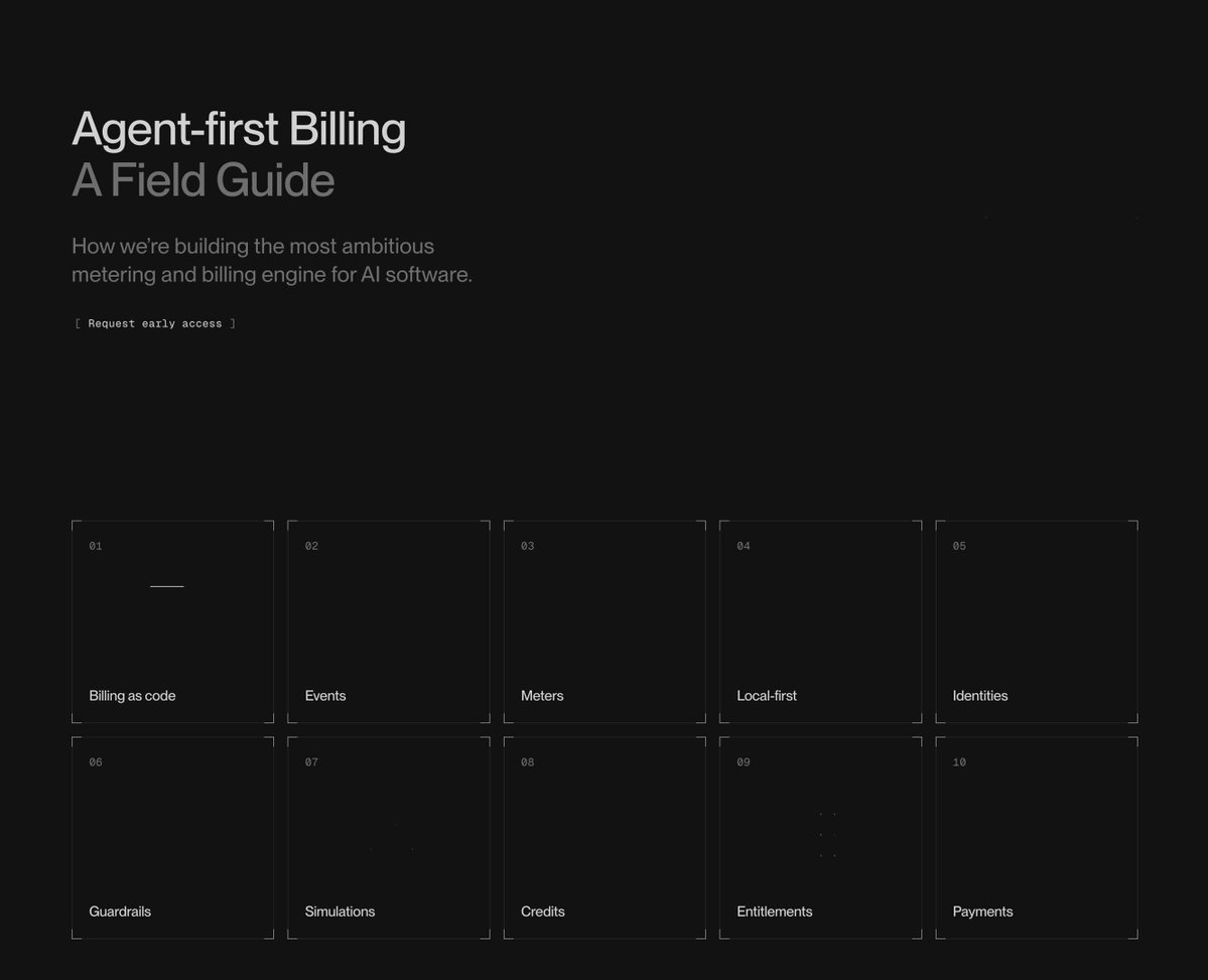
BUILD: Rebuild the visible desktop landing-page composition: a restrained dark technical hero above a ten-cell feature diagram grid. Pair a short two-line heading and small description on the left with an abstract line-and-solid geometric animation on the right. Make the page feel like an engineering drawing, with almost invisible construction guides, not a glossy dashboard.

DESIGN SYSTEM: Use a near-black #121212 background, #E5E5E5 primary text, #797979 secondary text and #292929 hairline construction marks. At a 1200px viewport use 64px side padding, a roughly 1080px content width and generous 70-90px vertical breathing room. The hero uses two balanced columns. Set its heading in a neutral sans-serif around 42px, tight tracking and 1.05 line-height, with the second line gray. Place a 14px two-line description below and a tiny 11px outlined pill link below that. On the right reserve about 320x240px for an abstract diagram: rays, a vertical bar, curved segments and a large circular guide, all on transparent background. Use original geometry rather than reproducing the source mark. Below the hero use five equal columns and two rows. Each cell is about 200x150px with faint corner registration marks, a small centered line diagram and a left-aligned 11px label near its lower edge. Avoid raised cards, rounded panels and gradients. Add sparse tiny coordinate-like annotations as decoration, not a field of illegible text.

MOTION: The visible sequence starts with thin geometric outlines, then bright segments fill in; small diagrams also change between frames. Use these approximate implementation timings: on entering the viewport reveal hero segment strokes from dashoffset 1 to 0 over 700ms, stagger 70ms, cubic-bezier(.22,1,.36,1). Fade matching solid ray and arc segments from 0 to 1 over 350ms after a 250ms delay, cubic-bezier(.2,0,0,1). Keep the circular construction guide dim and stationary. For grid diagrams animate only one or two small elements per cell: a dot traversing a path, a square filling or a short graph revealing. Use 1400-2200ms cycles and 80ms cell offsets, cubic-bezier(.45,0,.55,1), with a 900ms pause between cycles. Keep text and grid bounds still; do not add parallax or camera motion.

SECTIONS: 1. Hero with two-tone heading, short support copy, small outlined link, and original abstract geometric animation. 2. Five-by-two feature grid with simple diagrams representing a document, event stream, metering, grouped blocks, a node hierarchy, a stepped signal, a plotted curve, a zigzag, connected squares and a stepped payment flow. Use short generic feature labels. Recreate only these visible sections, not an invented navigation, pricing block or footer. Provide hover and keyboard-focus states for actual links; decorative diagrams are not buttons.

IMPLEMENTATION: Use responsive CSS Grid, inline SVG for construction marks and diagrams, and GSAP for a coordinated stroke/fill reveal and lightweight diagram loops. Use vector primitives, not canvas or WebGL: the shapes are flat and sparse. Scope the timeline to the component and dispose it on unmount. Prefer transforms and opacity, keep animated paths under 40 and pause offscreen or while the document is hidden. Under prefers-reduced-motion show the completed geometry and static diagrams. Use actual heading hierarchy, readable text contrast and visible focus rings; aria-hide decorative SVG annotations. At tablet widths use three grid columns, at mobile two, and stack the hero text above the diagram without shrinking the body text.

ADAPT TO THE PROJECT: Reuse existing design tokens, layout primitives, fonts and link components; map approximate colors to the nearest current tokens. Never copy logos, brand names, photos or illustrations from the original. Draw an original geometric placeholder and use generic text.

SUCCESS CHECK:
- At desktop widths the visible grid has ten aligned cells in five columns beneath a two-column hero.
- Outline-to-solid animation preserves the construction guides and does not move any text or cause layout shift.
- Small screens have no horizontal overflow, all links are keyboard accessible and reduced-motion shows complete static diagrams.