REFERENCE
- Gallery page: https://magpui.com/en/i/a-lamp-reveals-the-light-theme-3ca18f
- First frame (image): https://dnioievkvxejjbxgwvko.supabase.co/storage/v1/object/public/media/a-lamp-reveals-the-light-theme-3ca18f/shot.jpg
- Clip (mp4): https://dnioievkvxejjbxgwvko.supabase.co/storage/v1/object/public/media/a-lamp-reveals-the-light-theme-3ca18f/clip.mp4
- Original post: https://60fps.design/shots/platen-typewriter-intro-how-to-interaction by Platen
Before building, download the first frame and look at it. If ffmpeg is available, download the clip and extract frames (ffmpeg -i clip.mp4 -vf fps=2 frame-%02d.png), then study the motion frame by frame. Match what you see; the text below describes it, the frames are the truth.

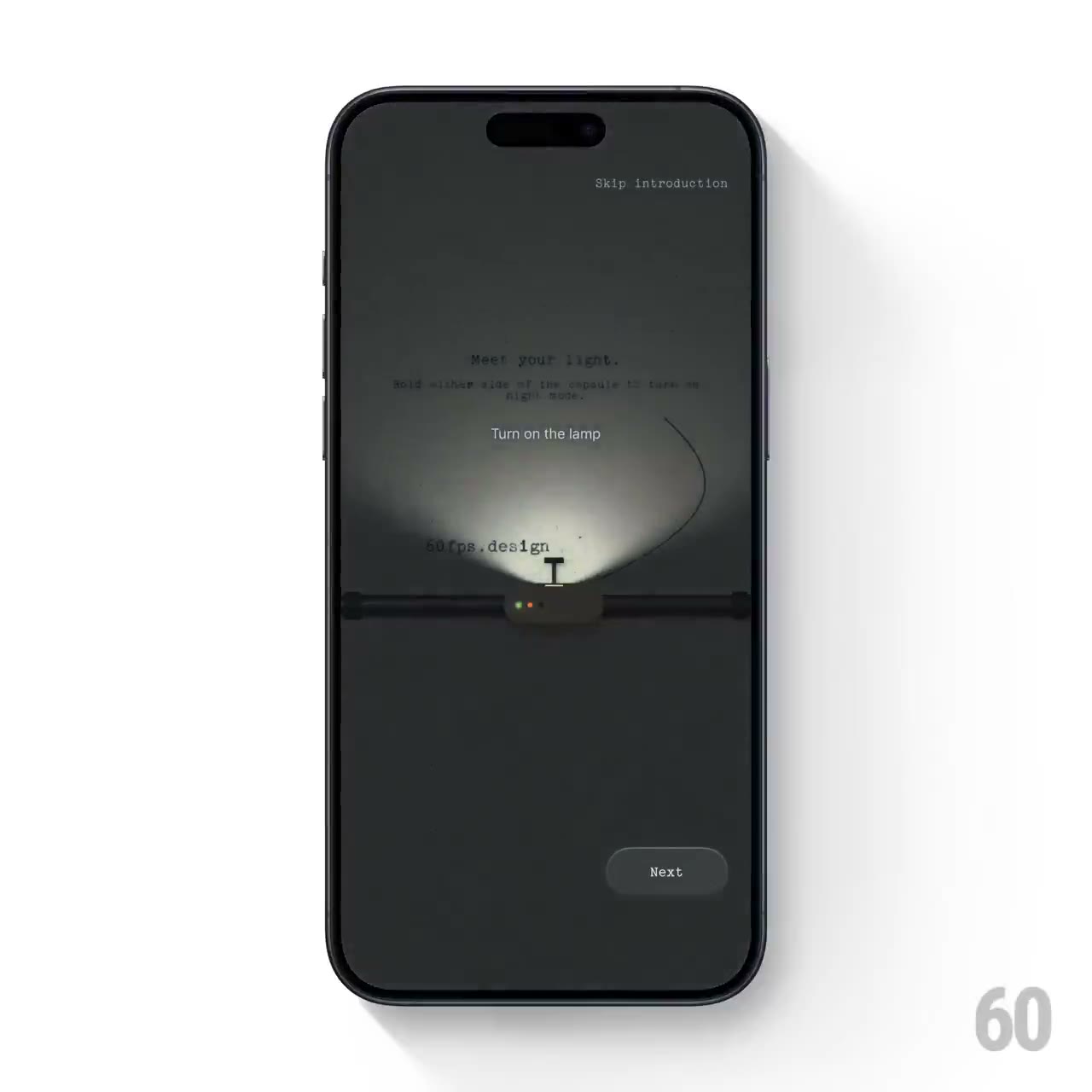
BUILD: Build a single theme-preview interaction with a small lamp-like control on a horizontal platen rail. Against a dim paper surface, pressing the control illuminates a compact cone above it; completing the action changes the surface into a pale paper theme. Rebuild only this interaction, without phone hardware or an entire onboarding app.
DESIGN SYSTEM: Use a contained 360 by 560px demonstration surface with responsive max-width, #30312F dim paper and #E6E8E1 light paper. Center short 12px monospaced instructional text above a thin near-black horizontal rail. Place an approximately 54 by 24px ivory control on the rail with a tiny dark central indicator, 10px radius, a narrow highlight and a soft 0 2px 6px shadow. Above it, draw a soft ivory #F4F0D6 cone roughly 210px wide and 100px tall, fading toward its outer edges. Keep any paper noise barely visible and all text original.
MOTION: On press, fade the light cone from opacity 0 to 0.85 over an estimated 240ms with cubic-bezier(0.22,1,0.36,1), making nearby typed text readable. On activation, crossfade the paper and text tokens to the light theme over 400ms using cubic-bezier(0.4,0,0.2,1). Return the glow to a resting state over 200ms. These are suggested reconstruction timings, not measured source timings. Avoid bloom, particles and full-screen spectacle.
SECTIONS: Dim paper with short instruction; narrow horizontal rail and central lamp control; local lit preview; completed pale-paper theme; an optional small Next button below. Keep the rail, text and control stationary during the appearance transition.
IMPLEMENTATION: Use CSS gradients and an SVG mask for the light cone; use Motion to coordinate opacity and theme state. No WebGL is needed. Implement the lamp as a real button with an accessible name, visible focus ring and aria-pressed. Support keyboard activation with Enter or Space without requiring a sustained hold. Keep the glow bounded within the component and animate opacity rather than large blur filters. With prefers-reduced-motion, change appearance immediately with no glow animation. Do not rely on the glow alone to communicate state.
ADAPT TO THE PROJECT: Reuse existing design tokens, components and fonts; map the palette to the nearest project tokens. Never copy logos, brand names, photos or illustrations from the original; use original placeholder text and procedural CSS or SVG surfaces.
SUCCESS CHECK:
- Pressing the lamp produces a restrained local illumination and a clear light-theme state.
- The control works with mouse, touch and keyboard and exposes its current state.
- The layout stays still, small-screen content fits, and reduced motion changes the theme instantly.